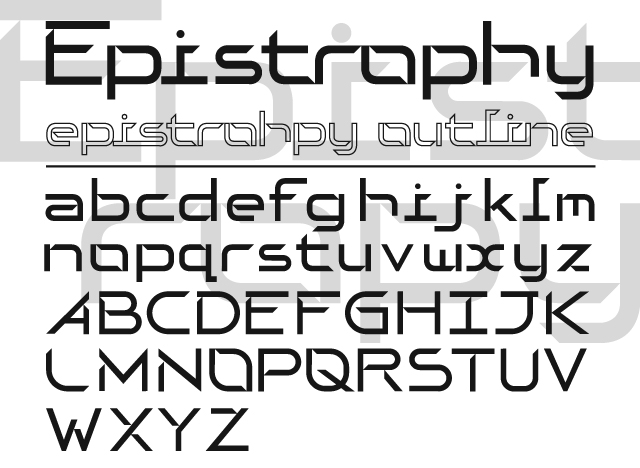
I wanted to get some feedback from everyone before I move on to different weights/finalizing in FontLab. This is an odd sans serif I am working on. This is obviously more of a display face, not sure how legible it would be at small sizes. I look forward to your thoughts.
Thanks
| Attachment | Size |
|---|---|
| EPISTROPHY_CRIT.jpg | 137.23 KB |