Typophile

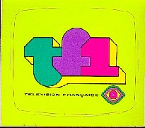
Television Francaise logo type circa 1975

jaan

Hey everyone. We need help IDing this typeface. The logo it's from is circa 1975. I know I've seen this face, in fact I know I have it, but I still haven't recovered from the OSX install font file relocation disaster.

We've ruled out bank gothic. Thanks!

AttachmentSize
television_francaise.gif1.73 KB

Your sample image is only 73 x 12 pixel 'big', thats quite small for an ID, dont you think? :)

Dav

Whoa. That graphic is really, really, really too small. Can you post a bigger image? If we can't read the type, we won't be able to identify it.

Bank Gothic Medium ;^)

you guys are totally right about the teeny size. but that's really the only decent sample we can dig up. i apologize.

whatever typeface it is, it was commonly used from the 50s to 70s in the US. i've seen it on a lot of old print work, doors and signage from the era. uniform thickness in stroke, non-angled terminals, generally identical lengths for arms. if anyone has some hunches, then it's probably the obvious.

it reads "TELEVISION FRANÇAISE".

thanks again,
jaan

the only decent sample we can dig up

and it's not even decent! i think unless you can find a higher-rez sample, you're on your own for this one.

For some reason I'm remember this ... why? I have no idea.

Check Eurostile: http://www.myfonts.com/fonts/linotype/eurostile/bold-extended-2/

sorry, i'm not trying to incite a riot or anything.
again, i apologize for the small size, but it's an image from tv graphics, from france, from 21 years ago.

kinda explains the lack of printed matter or 800 x 600 gifs of this logo floating around the internet.

thanks tiffany for the eurostile tip, though i think it's not quite it.

thanks again,
jaan

Ok. I am thinking for sure this time it is Microgramma: http://www.myfonts.com/fonts/urw/microgramma/d-bold-extended/

:^D

TIFFANY! bravo!

i owe you one.

thanks!
jaan

Aldo's other one ey?

ChrisL

I was going to say it was definitely Microgramma! Or Bodoni or Garamond. Well done Tiffania! Give that woman a gold medal!

If you're going to use it at that size, you may want to use something a bit more legible.

I don't know... I think it is Venus Black Extended. Very popular back then.

Is this any better...?


It looks too rounded to be Eurostile or Microgramma. Look for example at the 'O' and 'C'

Cosmos--BUT probably stretched. Here is one straight and one stretched:

ChrisL

>>> disscussion continued in new thread:
Television Francaise logo type circa 1975, Part 2

thanks,
jaan

Captured from web.archive.org on 29 Aug 2014. view this capture