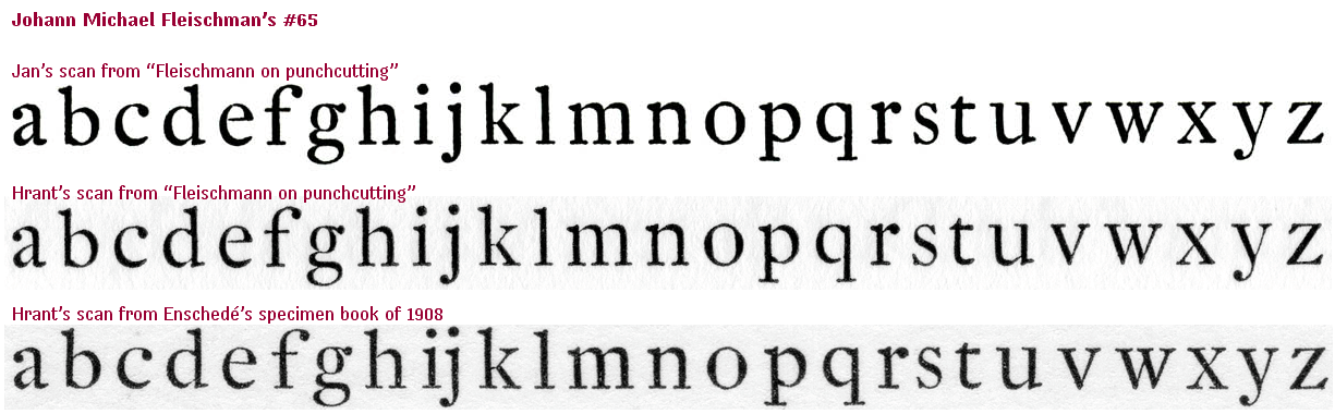
Fleischman 65 has some functional features - bowls shortened, bracketting lightened on horizontal serifs, oblique serifs cupped, o's stress made vertical, the crotch of y deepened and v widened, different dots on i and j - which I've applied to a vanilla Baroque roman, Bitstream Aldine 721 (actually a slightly narrowed Plantin), for analysis by comparison. A few other tweaks were made: lachrymal serifs were nudged towards balls, bars on f and t were thickened, o and f were widened, extenders were lengthened to approximate Fleischman's proportions, serifs on s were emphasized, the axes of e and c were moved a little towards the vertical and caps were slightly lightened to match the colour of the lowercase. This is not meant to be a usable or original face! I hope you don't zoom in too hard: it's quick and dirty stuff, and it needs to be printed.
This is the eleventh version. It's architectural superiority to the original at 12 point is I hope now clear, though it's a bit rough.
| Attachment | Size |
|---|---|
| Generic 65.pdf | 28.64 KB |