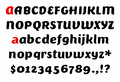
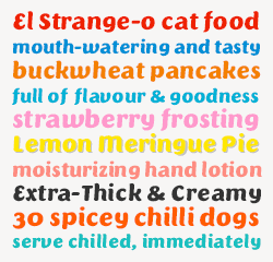
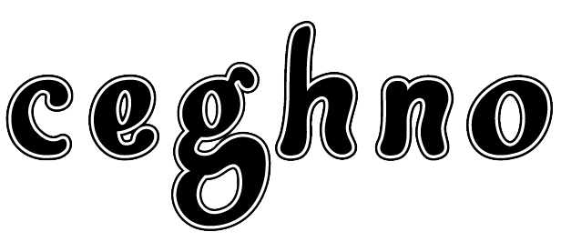
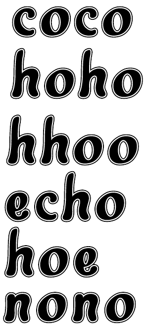
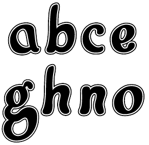
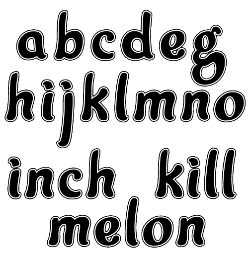
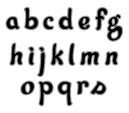
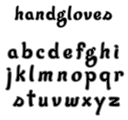
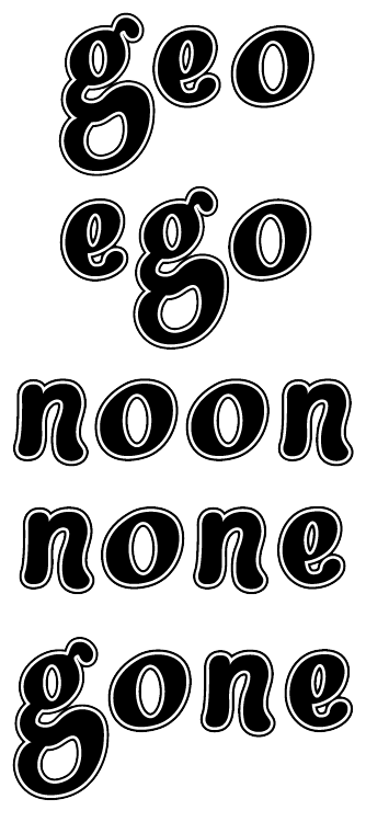
This project stems from here: http://typophile.com/node/17647 the 'G's ayone?' thread. After James' enthusiasm I was motivated to continue on with the project based upon the original 'g' glyph that I drew out. Here is my progress after a few glyps. Does this look cohesive and going in the right direction? Ideas/Comments/Crits are welcome! Thanks.
| Attachment | Size |
|---|---|
| friendly.grotesk.030806.pdf | 163.75 KB |
| friendly.grotesk.031306.pdf | 302.73 KB |