
Found this typeface on a flyer in Amsterdam. I'm sure I've seen it before, but I can't remember where. Any help ?
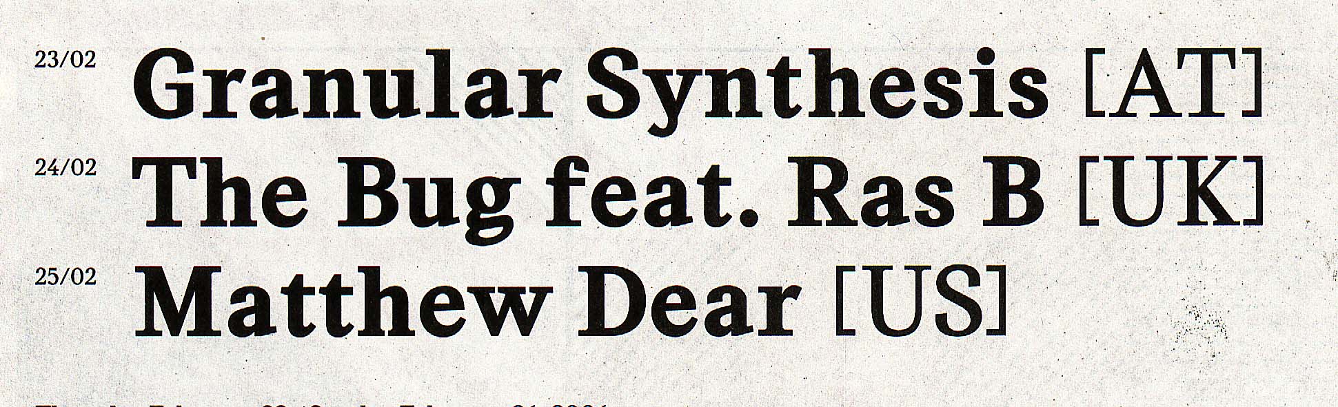
Found this typeface on a flyer in Amsterdam. I'm sure I've seen it before, but I can't remember where. Any help ?

don't know what exactly this is – if it is "something" at all – the upper part of lc "a" and "f" look very martin-majoor-ish though…?
Mmh… Not contemporary enough — the stem/serif transition makes a very awkward 45° angle which reminds me of Charter or Matrix, fonts dating from the era of memory-saving designs with as little curves as possible.
I didn't mean to imply this was an actual Majoor typeface, this looks very much like somebody tweaked/decomposed and put whatever together again, a "deconstructivist" thingy. The lc_s completely falls out of the overall seriffed appearance, the whole thing has a very hybrid feel to it, as if it was put together from different fonts, etc. I don't think this is a released typeface, but I might be proven wrong in a minute :-)
But again, some parts, as mentioned above, remind me of Majoors approach to the respective shapes/chracterforms or parts of…
The typeface was designed about two years ago by Ludovic Balland (studio: the Remingtons, Basel, Switzerland). He named it »Stanley« in honor of Stanley Morison.
He also used it in a series of bookjackets for »Das Magazin Schweizer Bibliothek« which can be seen here.
Captured from commoncrawl.org on 19 Apr 2015. original URL