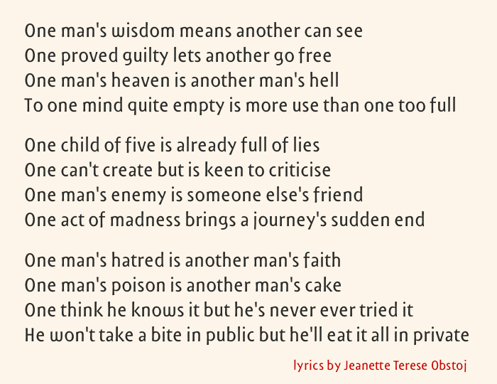
A recurring ideal of book typography is transparency, which allows the author’s verbal style to takes precedence over the typographer’s visual styling. This ideal only makes sense when the author is not also the type designer. When an author is making type for his own writing he is free to make the type fit verbal style more closely than would otherwise be possible. Should he, then, add to the ordinary typographic marker for stress - the clearly differentiated italic - one or more fonts much closer to the ordinary roman, so close, in fact, that their perception as different would to the common reader be merely subliminal, in order to intensify or direct the reader’s experience of the words?
Some options: modulating horizontal proportions, thus doing more subtly what Shaw and Gill did in letterspacing lowercase for emphasis; switching the architectural forms of some letters (as in aeyg) - too indiscrete because in the mathematical sense too discrete, I think; modulating between historical traditions (ie from Neoclassical to Baroque by changing the predominating axis, or from Humanist to Baroque by changing the degree of variance in axis); and (my initial preference) massaging the subtler “feel” of the alphabet, as if, for instance, moving between Storm Jannon and Storm Serapion.