
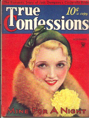
Help needed in identifying the font used for ‘True Confessions’ http://www.philsp.com/data/images/t/true_confessions_193311.jpg
Thank you.
Help needed in identifying the font used for ‘True Confessions’ http://www.philsp.com/data/images/t/true_confessions_193311.jpg
Thank you.
Now that is almost certainly hand drawn. In those days it made much more sense to have a lettering artist custom design the nameplate of your magazine, as well as type for advertisements and such. Furthermore there was no way on earth they could have done the overlapping T and C and the negative leading with type.
Okay, but how’bout a font or two close to that style.
(toke…toke…searching myfonts.com…mmmm…)
Conserif is sorta-kinda close.
(…toke…mmmm…)
no way on earth they could have done the overlapping T and C and the negative leading with type.
And the larger point size in metal would have much heavier strokes. The T you’d have to chop and channel with a welder to get the length.
j a m e s
Captured from web.archive.org on 13 May 2006. view this capture