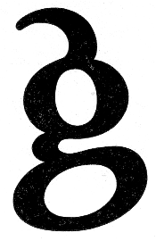
I think the fixation might happen because some characters are open to more interpretation than other letter.
Note: I'm not a type designer, but one test that a typeface (more often than not) has to pass for me is if I like the way my name looks. I know that is odd, but I know many typefaces that forget the double-f ligature and fail to draw a nice cap W.