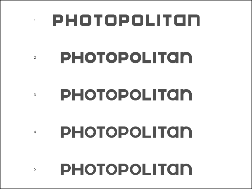
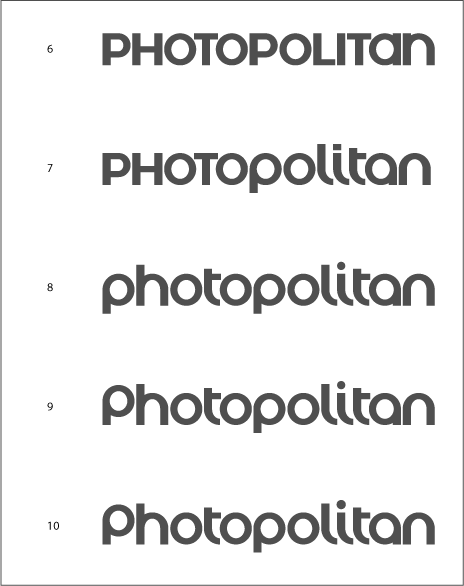
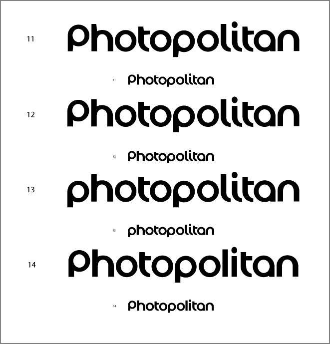
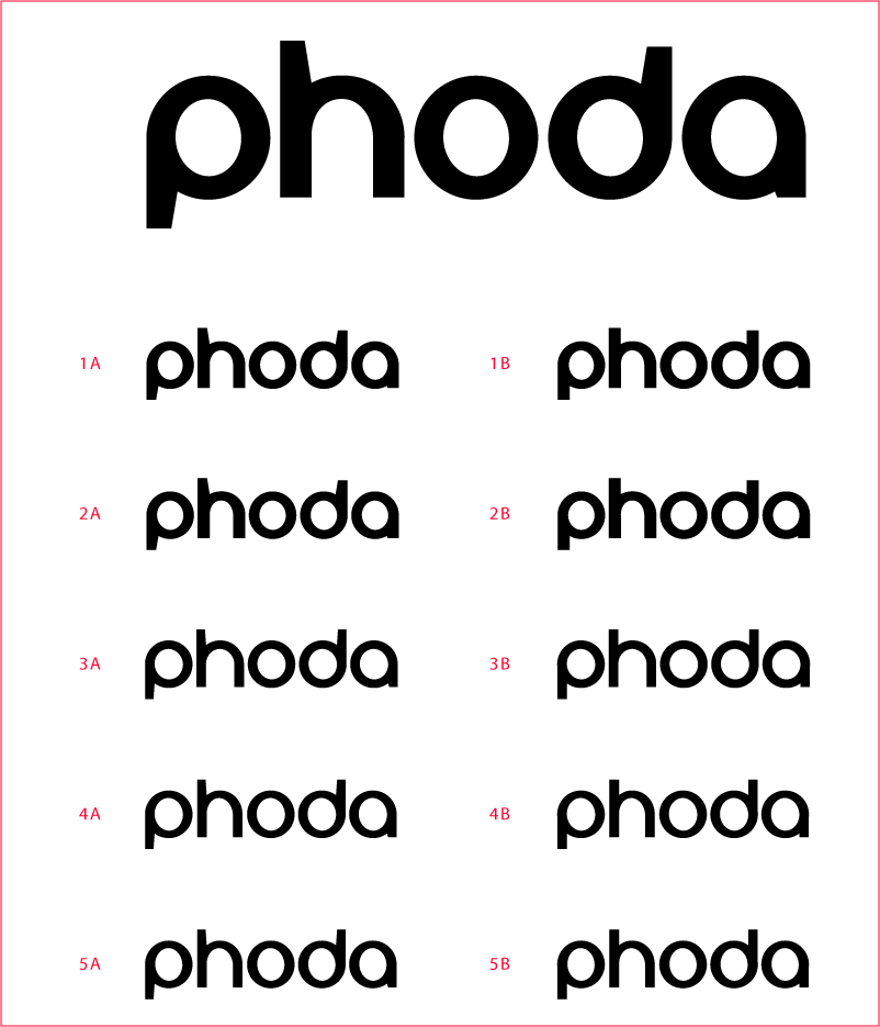
although this is a logo (attempt), it really represents my first foray into non-pixel based type design.
the result of this first effort is nothing spectacular, and yet i need some feedback to see if my instincts are good or bad.
item 1 is a direct adaptation of one of my pixel fonts.
item 2 adds perfect circles into the mix
item 3 airs everything out
item 4 adds some flair to the interior shapes and trims the horizontal elements
item 5 is a step in the wrong direction
i'm going to continue working on this logo until i get it right: i'm not going to shop for a font that might fit the words. why? because i need to make the leap into bezier designs sooner or later, and i've been putting it off for a long time.
that said, if anyone has suggestions on creative directions i might take, i'm all ears. i'm looking for something modern, but not necessarily cold. i want panache, without being cute or clever, and i want a semi-bold look.
trust me when i say i do not mean to imply that this first step of mine embodies all the qualities i just listed. it is, as i mentioned, just my first stab at things.
the logo and tag will probably go something like this: set your image apart. the idea being, a uniquely edited photo catalog is available here.
any help, as always, is considered a supreme act of friendship.
:)
| Attachment | Size |
|---|---|
| logo_02.png | 8.59 KB |
| logo_03.png | 2.14 KB |
| logo_04a.png | 9.12 KB |
| logo_07.png | 15.64 KB |
| logo_13.png | 19.3 KB |