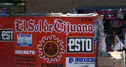
I just completed the MA Typo/Graphic Studies at LCC in London. My final project was about the use of blackletter in Mexico. I explored the possible reasons for its use, historical facts, and the shapes and tendencies of Mexican blackletters. From the photographic research performed in Mexico I found patterns and deviations in Mexican blackletters. Then I deconstructed each signage, ending up with more than 1500 individual characters. I removed the letters from its context and colour, transforming the colourful typographic elements of the original signs into black silhouettes. Afterwards I overlaid all characters of each letter in order to appreciate the most popular shapes, line strokes, elements and ornaments. The result is an X-Ray look-alike alphabet, that conveys the essence of Mexican blackletters.