
gimme critiques for this logo pls. this is for a publishing company
anyway:
-the curly things is to represent papers
-editura=publishing in roman
thanxxx =D
| Attachment | Size |
|---|---|
| editura.jpg | 21.08 KB |
gimme critiques for this logo pls. this is for a publishing company
anyway:
-the curly things is to represent papers
-editura=publishing in roman
thanxxx =D
| Attachment | Size |
|---|---|
| editura.jpg | 21.08 KB |

The mark looks haphazardly put together. The sloppy curves of the "papers" really distract from a potentially good mark. It has potential as I see what you were getting to, but work on simplifying the mark, taking the balance of the strokes and how they look together into consideration. Also, consider the role of positive to negative space play together. These paper overlap each other and create minor distracting negative spaces.
I think you should sharpen that up first, then resubmit it for review. The forum functions much better when everyone thinks you put some effort into it.

I agree that this has potential. I think the way you're portraying the paper now looks more like waves than paper though. Maybe you can try some different angles, or show a bit of the surface of the paper, and not just the end to give it more form? Keep working on it...

The name appears a little weak to me. A bolder weight, perhaps ?

I agree with Chris and blackbirdsings, it's a good start but needs work.
Keep refining the paper. It doesn't read as paper. Maybe that is not important, and it is just supposed to look interesting and abstract, but the paper crosses over itself, which makes the design confusing. Paper cannot pass through itself like that. It looks more like wood or metal shavings than paper. Also, the books use the flat side of the paper sheets, not the edges, so that adds to the confusion.
Keep playing with the paper design. You've got an interesting start.
is this getting better?or worse?
Just a note about saving simple one color logo web files:
You should really consider saving your images as .gif / or .png files, instead of .jpgs, the sample quality will sure be better, that way
I like the first version of the 'paper' better than the last
( Maybe you should try cleanin' up the first version, instead of trying something different / another 'shape' )
Dav
hehe thx for the info dav *never get this info in school hahaha*
this???

Do you not want to make the swirly papers into an italic l/c 'e'? Your second version came pretty close to that anyway...
I quite like the regular Gill rather than the bold. Here's another quick sketch.
Try taking the paper out of the box and try to make it curl like a lower case e. Try another face for Editura, it looks to stiff and unflexible. Your not making boxes or some other product you are publishing. Loosen up the design
i like the idea of making the paper as "e". i've try this.... any idea? >>>
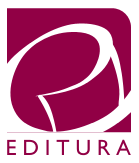
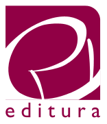

With the last two that you posted the "upright" of the edge of the paper is conflicting with the e-ness of your icon, I think that the version with the lowercase editura where the righthand upright is not quite connecting works better, might be worth trying to move the upright on the left down slightly away from the e. I also like the look of your first post where the bottom of the box was implied.
Tim

I have remembered this logo:
http://www1.edita.fi/english/company/logo_bank/

I know you don't want to be too literal, but that is one thick piece of paper! I think the you need to bring down the contrast between the thick and thin parts of your "e". Also, the perspective is too severe. You are forcing the viewer to imagine a rolled up piece of paper held from something like a 60 degree angle above their head and then read the text at no angle. It's not harmonious.
Get some tape and roll up a piece of paper into the shape of an e. Take some digital pictures at different angles and then use them as references while you sketch. For instance, I see a lowercase e with horizontal lines flowing left.
Also, Gil Sans feels to cold and corporate compared to the style of drawing you have shown. A nice serif would probably serve the mark better.
Captured from web.archive.org on 23 Oct 2013. view this capture