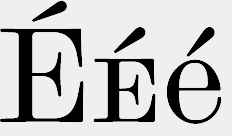
I was playing around with diacritics in an opentype font of mine, and came to the conclusion that the marks on Uppercase Letters need to be a bit bigger than the ones on lowercase. At the moment, I gave them just a scaling of +9% compared to the original size, but I guess that in some designs, this isn't the best way...
Do you design special versions for uppercase? Where do you place them in Unicode, is there a special place for them?
What about smallcaps (here I did use the LC original size) and titling (here I designed new, more detailed ones, but do not exactly know where to place them in unicode).
Thanks for your suggestions
Sebilar