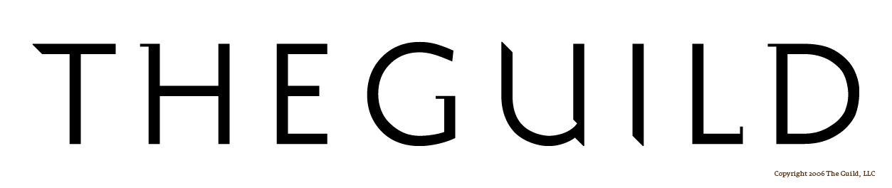
First of all, hello everyone. I’ll come clean that this is my first post, but I have community aspirations… honest. I’ve had a long look around and I love what I see here on the boards.
Please have at me on this one. I’m quite close to the project, which has worked both for and against its success. So far as the type design has gone, I’d love the eyes of a master or two before it hits signage and letterpress plates.
I’d very much appreciate a technical focus, which is why I’ve kept the background/design brief ambiguous (for now). I think there’s plenty to discuss in the type itself. A few relevant details:
- I drew the type from scratch in response to other identity elements. The proportions of the H and the 45-degree cuts were my starting points in common.
- The application will include letterpress cards, glass etching, and metalwork.
- Screen readability is very important in the final product. I’d very much like advice towards that goal.
I’m looking forward to your thoughts. Please, tease apart the nuances, chew on it, spit it back at me. Below the image is an attached version at a larger scale in b+w.
-Nicholas

| Attachment | Size |
|---|---|
| theguild_large_v1.png | 7.65 KB |