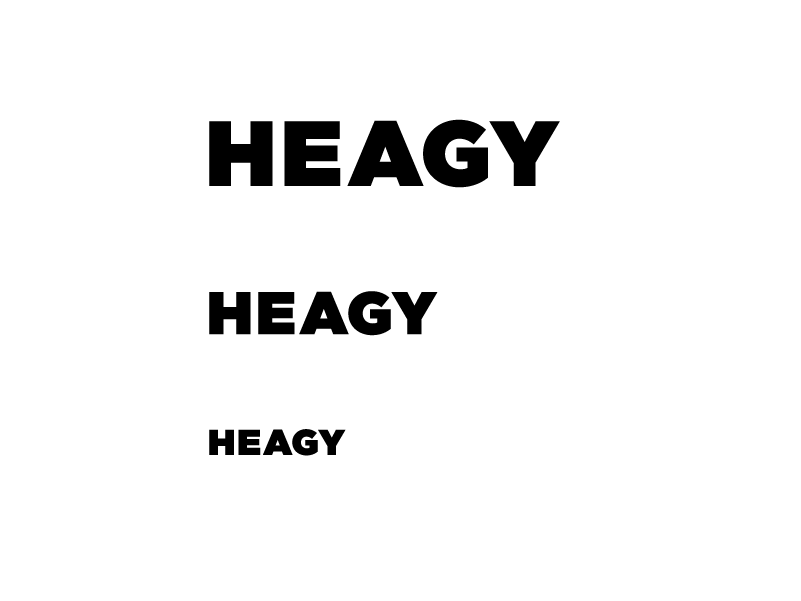
I’ve got a logo and the letterforms are a nightmare for perfect kerning. Here’s what I’ve got right now. Anybody got suggestions for improvement?
(and yes, “Heagy” is a last name and it’s terrible. Pronounced “HAY-gee” where the g is hard like in “goodness gracious that name sounds like you’re spitting!”)
| Attachment | Size |
|---|---|
| heagy_kerning.gif | 7.77 KB |
| heagy_kerning_2.gif | 7.71 KB |
| heagy_kerning_3.gif | 4.85 KB |