Typophile

Type Battle! week of 1/16

This thread ran to 3 pages of replies and only 2 were recovered, so replies are missing.

Jared Benson0 votes

We’re kicking off a new game!
TYPE BATTLES

Here’s your chance to stretch your type muscles on a weekly basis. Each game kicks off on Monday with a new challenge, and closes at midnight PST on Friday. Anyone may submit a design response to the challenge. You may enter as often as you wish. Post anytime. Critiques and comments are welcome throughout the game, from participants and spectators alike. Smack talk is encouraged.

Winner take all, no holds barred. May be the best designer win.

Requirements:

- Size: 600 width x 400 height.
 — Color: Black and white only
 — Format: Please save your graphics as PNG
 — Only respond with the characters posted in the challenge.

// THIS WEEK’S CHALLENGE:
// Design the characters in the word “battle” as a slab-serif blackletter.

This challenge is now closed.
View the next battle:
Franklin Swash (Week of 1/23/06)

In true hip hop form:
- There will be no judges and no prizes. Everybody involved will know who the winner is, solely based on who laid down the quality work.

- Anybody can talk smack, but it will only be taken seriously if you also post your own stuff.

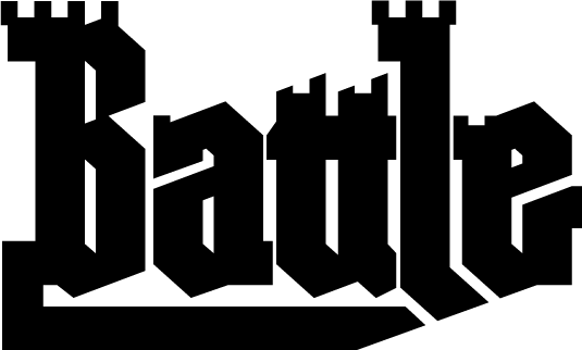
I am not sure what this game is all about, not having participated before, but here is an "Entry" that I don't even know is qualified as a Slab Blackletter (whatever that is).
I figured one hour would be my time limit:

ChrisL

I am not sure what this game is all about, not having participated before, but here is an “Entry” that I don’t even know is qualified as a Slab Blackletter (whatever that is).

That is because it is a new game, and you are one of the very first participants! I'm not sure I know what a Slab Blackletter is either, but I think we shall soon find out. :)

Nice work, I might have to join in on the fun.

I should mention that I have been kicking around the idea of a geosans blackletter for a long time, so it wasn't a big leap to geoslab blackletter.

I'll see if I can sketch something up and scan/digitize it tomorrow at work. No desk in my apt to work at :(

Not extremely battle-ish, but I just spent WAY too much time on this to not post it.

I want to play.

> anybody can smack talk, but it will only be taken seriously if you also post your own stuff

Awww! :^(

O:^)

:^P

:^D

Zara,
That's gorgeous!
The battle-axe "L" is a nice touch.

ChrisL

You know I had to.

Whats look really like battle... like tank tracks. :-)

--astype.de--

Ooh, James, bringin' the heat.

bombs away!

Haha. Nice stuff to wake up to. James is that Super Duty Blackletter?

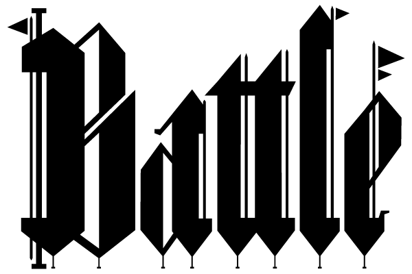
Made this a little more difficult for myself...Slab Serif, Black Letter, Ambigram! (I'm not entirely happy with the 'b' of the b/e combo but I gotta get back to work! I'll post an update later.

James is that Super Duty Blackletter?

i'll answer that: it's Gothic Gothic customized by the designer.

Oooooh. David. Nice.

Show-off. :^P

Where's the slab people?

The battle-axe “L” is a nice touch.

Thanks! Better to cut my opponent's stems off.

Ha! In true hip-hop form.

you want slabs, Christian? I got your slabs!


Dav

> Where’s the slab people?

Yup, that's what I was wondering myself. Some of these entries are in danger of being disqualified for conspicuous lack of slab serifs. :^/

Can I participate with a grunge-style remix?

Dav,
I'm lovin' it! Make that one into a new typeface?
But fix the "a" so it looks less like an "o"?

ChrisL

"Ha! In true hip-hop form."

What is Hip-Hop form?

ChrisL

Thank you, Chris
( I never even thought about doing a blackletter typeface, maybe I should :)

My personal favourites so far would be the ones by Gabriel, David ( Bailey ) and Zara, of course :)

Dav

A little more serify:

What is Hip-Hop form?

This is what you might experience in a free-style rap battle (because, you know that is totally my thing), where competitors call each other out with lots of verbal "b*tch-slapping."

"free-style rap battle"

Now I see, I am too out-of-it a geezer to have heard any of it but I get it.
In the 1950s, we called this a "Capping Battle" where two guys would face off and say evil things about each other's mother like, "Yo' momma 'so ugly, she look like she been in a hatchet fight and forgot to bring a hatchet!"

I see some things don't change (except for what it is called).ChrisL

The lowercase is a little ho-hum, but I kinda like the B.

Ooh, James, bringin’ the heat.

Christian, I gotta give you props for yours, both slab and black. And on a curve for style points. I think mine may be lacking some slabness.

David H... nice.

… and Zara, of course :)

Dav, do you say this out of the fear you have for my intimidating and oh-so-sharp & and dangerous l?
:)

I sure do :)
( Nah, I really think, at that time, those were the ones I liked the most )

Dav

A little more slabby, perhaps...

This is a nicely remastered version, James :)

Dav

Ooh, DB had to invoke the ambigram. Hence, I must throw down.

oooh, very nice Kevin.

Nice Kevin..seems a little more grafitti-esque though. Here's my last tweak to hopefully make the letters a little more authentic to the black letter style, I'm heading home. It's still not perfect but it'll do!


Come on people, enough of your puny little doodles, let's see ya put some ******* ink on the page.

Here's my version:

Ooh, it's getting blacker!

Back to Battle! (in my parapitiful way:-)

ChrisL

great idea guys, and some pretty nice pieces so far!

Hey Chris, you forgot the swoosh and the dropshadow.

"you forgot the swoosh and the dropshadow"

Dang! Now I know I will never make it as a logo designer today!
:-)

ChrisL

Well, that one is a little too much in the pits for me so here is one a bit cleaner but still Battle ready.

ChrisL

Only respond with the characters posted in the challenge.

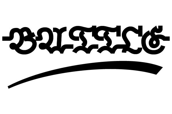
Chris, I'm calling foul on the New York Battle.
Game misconduct for illegal use of an underline.

That underline, well it ain't no scam,
It's a flourish that you nourish not no ambigram,
Check the book on swash cause it's a glyph by gosh,
Even OT from my goatee let's you pump that slosh.
Don't be callin out what you don't call stout,
cause yo binness be drinkin Guiness BRILLIANT talkin Bout!

ChrisL

That was my take on "hip-hop style" --at least what I gather from what little I know about it :-)
I hope Zara will tell me if my rap is true to form?

ChrisL

It’s a flourish that you nourish not no ambigram,

Don't be dissin' just cuz my 'gram be ambidextrous yo!

I be diggin what yo friggin on the underside,
it's the coolest of the game the one that's got yo name,
so don't be thinkin I am stinkin with yo sense o pride!

ChrisL

Word to your mother.

(May she RIP ;-))

Why yo' dis my Mama while I'm wearin my pajama,
I be goin' sleepin' till the mornin' come a creepin',
Yuall kin chill young fella catch a wink with a trim that's bella,
cause this old dude be droppin' out while you keepin glued!

ChrisL

Jared/Joe, zebra guys, a ruling please on whether Chris' flagrant use of a carefully trimmed underline constitutes "swash" behavior.

The nerddom is strong in here.

Chris, your rhyming skills are impressive. You must have watched 8 Mile like I advised. :) BTW, I only pretend to know anything about hip-hop -- add a "hizzy" and a "double-story-G" here and there, and the cool factor skyrockets.

Nick, who are the zebra guys?

Because I am naturally a very mean-spirited bully, I'd like to go ahead and say that DJ Dezcom's B-swash is unnatural and too close to an underline to be considered a legal entry. However, then I risk my danger-swash piece to be omitted as well, and my delicate ego shall be squashed and I will be forced to hang my head in shame for all eternity. Or not.

Tough call. What does everyone think?

Zebra guys refers to the shirts worn by referees.
You're too legit to quit, Zara, that's an "L".

Kickin' it Licko style -- strictly 45 degrees, y'all.

If you call a crime you must make it rhyme
or be pickin' what yo stickin where the sun don't shine!

:-)

ChrisL

No need to drop a dime, I can chuck the underline,
and it still be breakin, and lookin’ fine.
If you think what you saw, makes you call the law,
Yes I can be the man and still fall you-all!

ChrisL

The Sistah's flags and nails wit' da sand-box pails,
just as much a crime as my underline!
Since yo' "L" past musti'd y'all can not be trusted,
to be samin what Nick namin as a traffic fine!

:-)

ChrisL

I did not see no flick like what said dat chick,
I jus' rhym'n to be chimin' and to make it slick!

ChrisL

Here y'all go Saint Nick, does that do the Trick?
I refined it and de-lined it just to make you sick!

ChrisL

Lookin good Mark, it kinda has that Chess Piece look to it with the angled slabs.

ChrisL

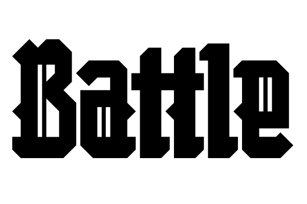
I took the traditional Fraktur form and tried to dress it in 19th century slab serif clothes. I imagine something like it exists from back then, but maybe not. It would be fun to do it as a whole font.

(Sorry, I just can't do the hip hop banter thing.)

Mark, you should do the new font with it! It has both a retro and a modern flair.

"(Sorry, I just can’t do the hip hop banter thing.)"

No sweat, I am just faking it. I don't know what the real McCoy is like.

ChrisL

I don't know; Mark may have shown us up with that one.

It would be fun to do it as a whole font.

It would be tiresome for readers, however, with every lower case letter having the same snap-on serif.

The serifs at the bottom were in some of the Frakturs I looked at. I exaggerated it, but I didn't make it up. The serif at the very bottom left could be removed without destroying the general slab-serif effect (better for immersive reading :-P). I can't imagine setting text with such a font, but it would be okay for a logo or title or something.

Like this:

Football battle?

ChrisL

Dan, the drop shadows ruin it for me. :)

What the?

Change that "b" to a "c" and you've got yourself something to brand cattle with.

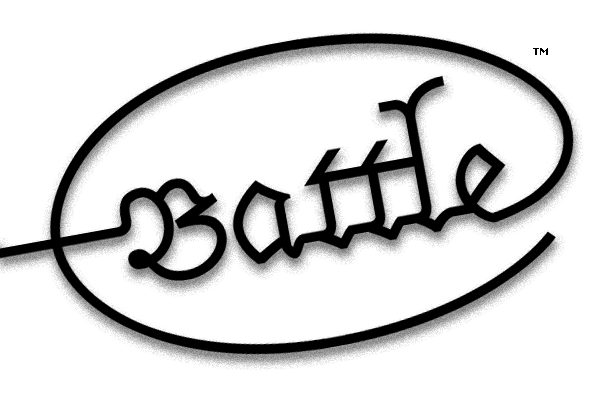
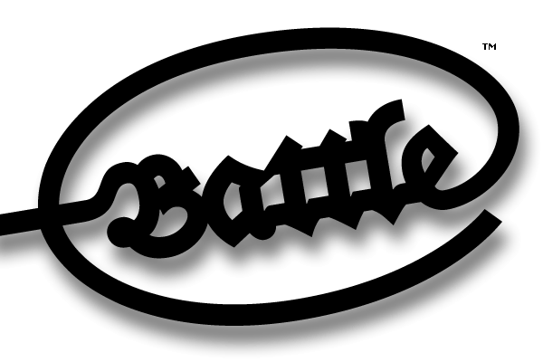
At least Dan has Trade Marked it :-)

Me thinks this is in response to Nicks comment about "Swoosh and Dropshadow" earlier. :-)

ChrisL

Zara, here it is without the drop shadow:

First post for me; hi y'all.

I'll leave the rhymes to those with more gusto. I had some good ones though, I promise; the phrase "deacon of decon" was in there, and some rhymes about postscript errors... anyway put up or shut up right? This one took up just about all my spare time at work yesterday.

Now that my Battle Lines have been drawn (and CSI is over) I can go to bed :-)

ChrisL

Simonson is in the hizzouse!

One of your earlier drawings looks like the top of a castle tower, Chris! I like!

Zara, that last one you posted is positively goth!

I can't see David Bailey's images, or Mr. Shinn's. :-(
Is it just my crappy old machine that's making me miss out?

Dan, I want to see yours as neon.

All you people have way too much free time.

Ahonetwo, ahonetwo...(snare, kick)

Which one, John, I'll work it up for you in a snap!

What does "hizzouse!" mean?

ChrisL

I think Dan needs to drop the "e" down until the crossbar touches the baseline :-)

ChrisL

Captured from web.archive.org on 21 Sep 2017. view this capture