hey,my opnion
'the graphic mark is not readble,the face need more style
i like the idea of the colors but not the colors they are a little
kindegarden oriented,bottom line,i think u need to find a sulotion
that will collect all ure ideas into one,now it seem too complex for my opnion,i like the thin/bold typo',and for the sketch u show
i prefer the upper one with the vertic hirearchi.
Dear typophiles,
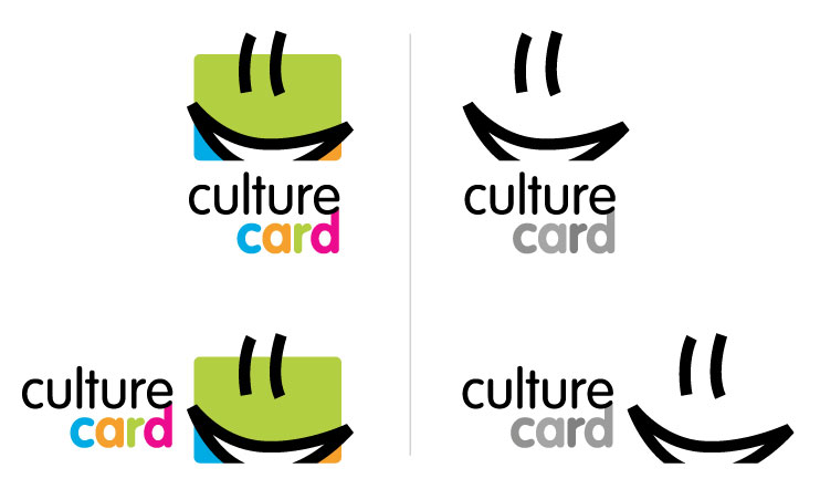
I've been asked to design a logo for the "Culture Card", a credit-card format card that'll give high school students discounts on the ticket price of musea, movie theaters, concerts et al.
I'm not too sure of the type treatment quite yet, but I like the graphic mark.
Please tell me what you think, thanks!