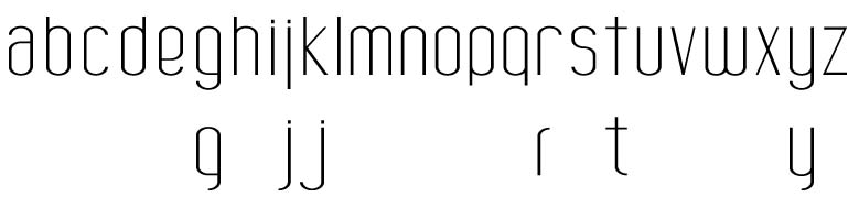
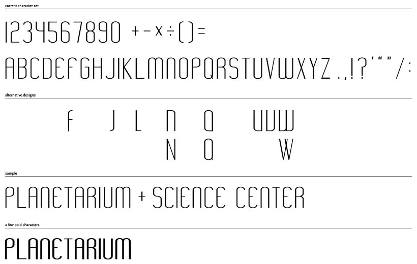
The other day I drew some characters for a cover I was working on because I didn't have any type in my collection that served my needs. Some folks around the studio seemed to like what I had done and suggested that I complete the set to create a simple display font. I went ahead a drew some additional characters.
I'm a rookie. I would like some feedback.
I have attached a PDF so that anyone who interested in taking a close look can get a better feel of the amount of contrast, etc.
Thanks in advance
| Attachment | Size |
|---|---|
| morecond.pdf | 463.5 KB |