Hello people,
I need some crit on a logo that I am doing for a personal project (don't they seem like the hardest ones?), it's a website that is basically a web zine. The topic is vegan/vegetarian/DIY/indie subculture with accent on recipes and basically food and drink, but what's more important--education of people here (Serbia) on the topic of veganism/vegetarianism, because when you tell someone you don't eat meat here you look like a freak. So I want it to be very appealing visually, I am not looking for "deep meaning and clever" here, just plain sweet and mild, therefore the ferlauf (sorry--gradients). :)
The concept is that I took the word "herbivore" and played around with it resulting in "herbiv.org" for both the internet adress (obviously) and the mag name, it's in the pronounceation where you'll find the most similarity between those two. :)
It's shorter than herbivore.org and I think more clever and memorable, at least for me, but I'm interested what do you guys think?
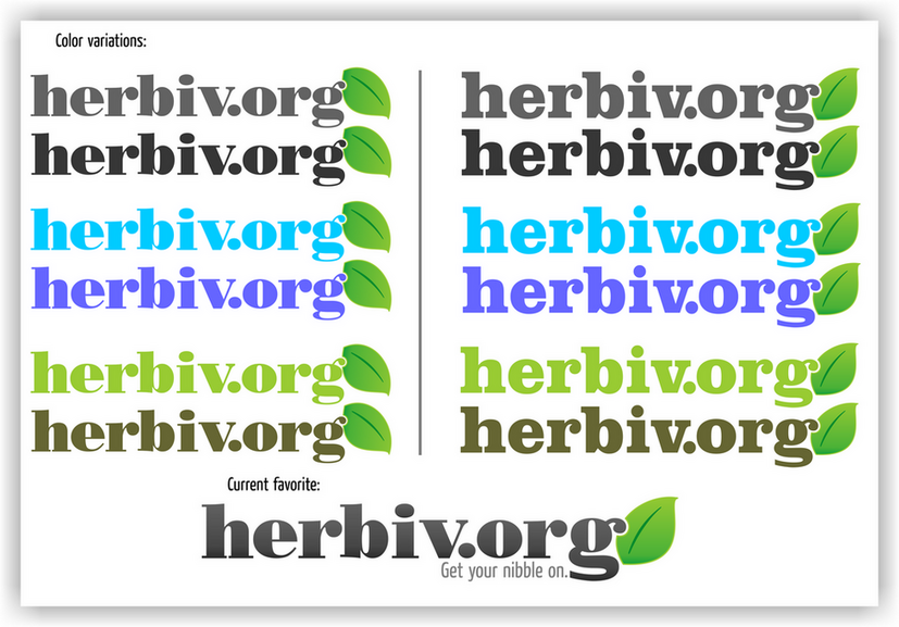
As far as the logo itself is concerned, I just made the "g" nibble on the leaf--as the last logo says itself.
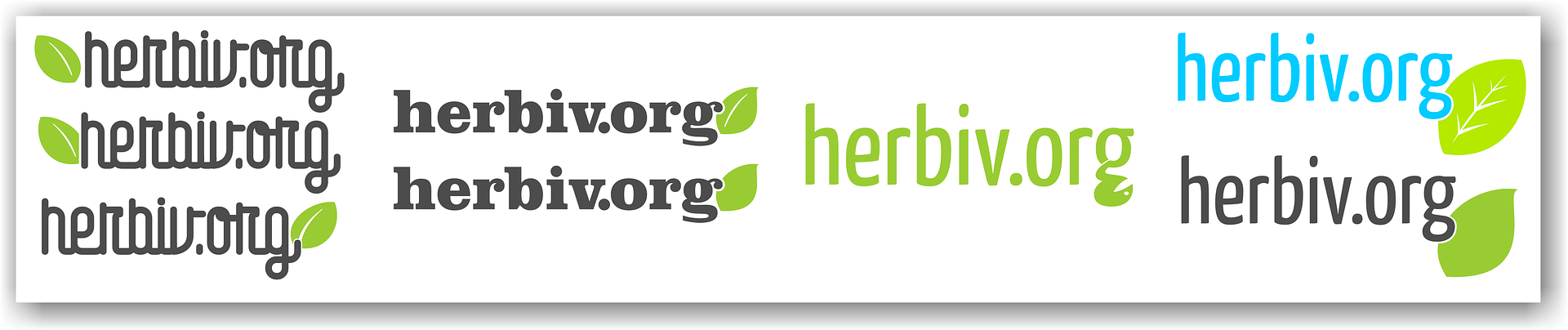
(For claricication here are the logo versions (213kB) and here is the direction I have decided to go along with the color versions (518kB), the last bigger one is my current pick.)