Typophile

Register.com Rendered Font

Hrant H Papazian

I just renewed a domain and went to Register.com
to see if it worked, and stumbled on this curiosity:
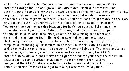
That's a canned paragraph, but it's followed by
some dynamically-generated text, rendered
on-the-fly certainly.

I assume this is to prevent textual copying by
robots (or just by humans). Anyway, not that the
rendering is very good (the JPEG haloing for one
is pretty bad) but I'm curious as to the mechanics
of this. What kind of font, and software?

hhp

The simplest cross-platform way to something like that would be to use FreeType, possibly in conjuction with an image manipulation library such as the one that comes with ImageMagick.

I've used FreeType in the past to write a full-fledged text renderer for the TiVo Series 1 platform. My application took arbitrary input text and presented it in a "dialog box" on the user's TV screen. Here's a screen shot:

I had to implement some of the fancy stuff (such as word wrap, kerning, and input text parsing) myself; fortunately, FreeType makes all the necessary metrics available to the programmer. Some of the hardest parts -- parsing the TrueType files, and rendering the actual glyphs -- are done by FreeType itself.

Register.com's use of JPEG compression instead of PNG or GIF is just silly. Saving the rendered image to a proper PNG file can be done pretty simply by using libpng.

Cool - and thanks!

Edward, if I send you a "special" TrueType font, one that renders out
grayscale bitmaps, would you be willing to test it with your setup?
For one thing I think you might be impressed with the rendering
quality of handmade gs bitmaps - but mostly I'd like to test it, and
maybe even have a showcase for it.

hhp

I'd be happy to test your TrueType font on my TiVo setup if you want. I've actually been following some of your progress, and I've been looking forward to seeing the results in action.

Note that at the glyph level, the output will essentially be the output of the FreeType rasterizer.

The FreeType rasterizer has many internal options that can be tweaked; for my specific application, I spent a lot of time experimenting in order to determine out the combination of options that best approximated the text rendering of the native TiVo software (which, by the way, is probably using FreeType itself). My goal was seamlessness rather than optimal subjective rendering quality. That's the reason that, for example, the tracking is too tight (in my opinion).

Therefore, if I test your font under that particular setup, it may not look as good as it possibly can. Additionally: I'm not sure what you mean when you say that your TrueType font is "special", but if it uses esoteric TrueType features, it's possible that FreeType will choke on it in some way. The only way to know for sure is to try it.

I've not looked at the text too closely but at a guess it looks like Lucida or a similar hinted TrueType font with both gridfitted hinting and grayscale antialiasing applied.

You see very similar rendering on Windows under regular antialiasing if you hack the 'gasp' table of a hinted font like Tahoma using the TTFGasp tool. http://www.geocities.com/SiliconValley/Lakes/8162/

Great - I'll send you Mana-16 Regular, since you
probably need to do larger settings. What email?
Mine is hpapazian thatsymbol gmail dot com

> best approximated the text rendering of the native TiVo software

OK, I get it - good to know.
Because yes, the tracking is too tight. :-)

BTW, if they're using FT as well, weren't they
willing to reveal their settings/tweaks to you?

> it may not look as good as it possibly can.

Well, if the grays get shifted a little bit that's OK.
If they get shifted a lot (which is hard to quantify)
then it all backfires... Questions: does FreeType have
consistent "defaults"; how often do [you think] people
change them; and by how much?

"Special": nothing fancy at the TT level, in fact the point
is to make it all fool-proof and consistent (something no other
font technology provides btw). Although maybe the apparent
flexibility of FreeType might make total consistency harder.

hhp

Simon, yes, I've done that sort of thing myself, although only
for testing, certainly no redistribution. Because: it's not legal,
is it? Do you think Register.com is really doing that?

Or maybe: they didn't actually modify the font,
the renderer is deciding what font features to
use and not.

I wonder why they didn't just leave it 1-bit though,
since the font is clearly not designed for gs. Maybe
it's part of the security aspect, since it might be
harder to OCR?

hhp

Captured from web.archive.org on 12 Mar 2012. view this capture