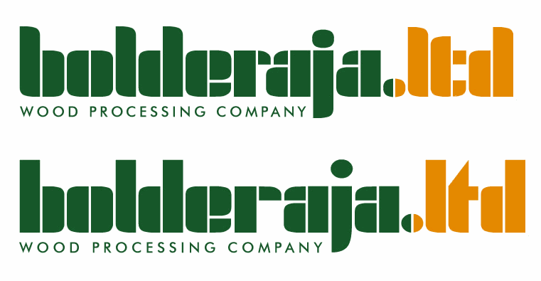
This is the logo I am working with currently. The company it belongs to is a part of big wood processing group in Eastern Europe. All logos of the companies that belong to it look the same, so I can’t do anything about the letterforms or colors.
What I don’t like about it but don’t know how to correct is the negative space between character pairs r-a and t-d. I have taken the strictly geometric approach, spacing between all elements is the same. I tried to loosen all the letters, but it starts to look “fallen apart”, and loosening only the “ltd” part attracts too much attention to it, although it has the least importance.
What should I do or probably I shouldn’t do anything at all?
| Attachment | Size |
|---|---|
| bolderaja wpc.jpg | 71.73 KB |