Typophile

New Typograhy (Not Typefaces)

michaelcina

Does anyone know anybody doing interesting work with the letterform? I am not talking about new typefaces or anything, but more like someone making chairs out of letterforms or someone doing typography in a non-conventional method. More in the Art realm...

Right now I am gathering names for a possible exhibit on typefaces so any ideas would be welcomed! :) Thanks in advance.

Hi Michael.

A Swiss company just released some pretty cool letterform cabinets. Hopefully someone has a link.

http://mocoloco.com
http://mocoloco.com/archives/001037.php

Is this what you are talking about Stephen? If anyone knows the answer to my question it would be you... help! ;)

I think this might be what Stephen meant: http://www.set26.ch/.

www.youshouldliketypetoo.com should be online by the end of January.
It is all type related art.

Rob

Man, I wish I could remember the name of the guy from TypeCon this past summer that I helped setup his exhibit. He had all sorts of art created with type glyphs made out of kiln fired clay. He was from Illinois if I remember correctly. He did the Alphabet City display where he took bitmap images of a glyph and projected it onto a board where the negative space was the glyph and the positive space were vertical clay structures of varying height. Anyone else know what I'm talking about?

The typeworkshops by Underware have produced some really interesting typographic works.

David,

That was my stuff.

Rob

Agreed on the Typeworkshops, have them down already, they are amazing. Rob, you did the clay work? You have any pictures?

I totally just e-stalked you Rob. Hope you don't mind.

http://flickr.com/photos/80034866@N00/sets/649816

I assume this is you? Flickr is my new google.

Texas-sized.

Barbara Kruger of course.

Carlos "Mare 139" Rodriguez.

Although it was rendered in the font medium, my Panoptic alphabet is more in the Art realm (judging by font sales ;-) -- I can send you a copy of the full "Diamonds" book, set in Panoptica, if you like.

Hey Michael, yeah that was TypeCon. I am working on better photos of those and newer work right now for the website. E-mail me if you want some more info before the site goes up.

Nick, I am surprised to hear that about Panoptic.

Rob

Rob, you've combined my two favorite things!

I didn't know anyone who was doing typographic+ceramic art. I'm so delighted to have found out about your work. Very nice. Love the double-sided 'G'. Looking forward to seeing the rest of your work when your Web site goes live.

Nick, I am surprised to hear that about Panoptic.

Well, it sold well when debuted at Veer, but otherwise sales are just occasional.
Really, I don't think experimental faces are a good retail proposition, especially if they're concept faces rather than outright display faces.

***

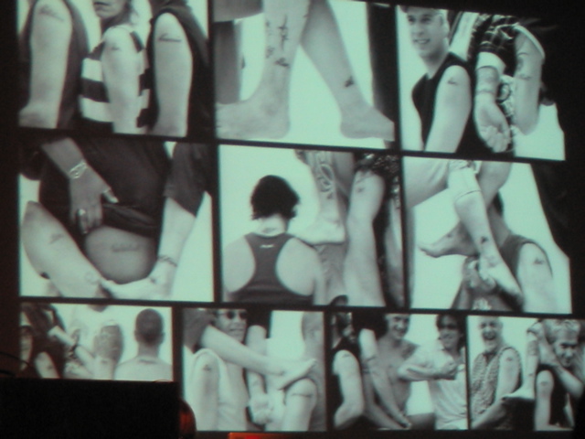
Tattoos.
Ina Saltz, who did a great presentation at TypeCon, is working on a book, I think.
One of the people she mentioned had done an art/literary concept, whereby a story of several hundred words was split up and individual people had one word tatooed each (they didn't get to choose or know the whole text.)

***

David Small's Illuminated Manuscript

Ahhh, when worlds collide and the internet works. MAGIC. ;)

Nick you are referring to Shelley Jackson's SKIN project.

http://ineradicablestain.com/skin.html

I am still waiting for my word.

Forrest: There's a nine-page article on Shelly Jackson's project in the January issue of The Believer magazine. Actually, you can read the whole thing online on their site at this link:

http://www.believermag.com/issues/200512/?read=article_mifflin

Check the products of Gebr. Knip
http://www.gebrknip.nl/

Hello again Rob! Sorry for forgetting your name! :-)

Michael Cina wrote: Flickr is my new google.

Amen. =)

Ina talked about another tattoo piece was dealing with the (I believe) Dutch national anthem. Whatever song, it was illegal to perform when not in the presence of the queen or royalty. So, like with the book, individuals were tattooed with words then various photos were taken to compose the entire song.

Here is an idea of it:


rob

Thank you everyone, very kind. I always feel like a leech posting and running but everytime after I post, I am glad I did.

My brain almost burst upon first seeing these.

oded ezer has done interesting works involving type
www.ezerdesign.com

http://www.amazon.co.uk/exec/obidos/search-handle-form/026-7719370-3784457

This book has some intriguing experiments in the last section, clothing in letterforms, 3D letters that cast shadows of different weights and letters grown in petrie dishes are some that I remember.
Tim

Tim, your Amazon link is broken (for me at least). What is the name of the book you're speaking of?

Type One
(subtitled discipline and progress in typography)
S. Bilz, M. Mischler, N. Thonen, Robert Klanten (Editor)
Broken for me too, sorry about that.
Tim

Michael,
you might be interested in this forth-coming project I've been involved with.

also, i'm assuming you are aware of this exhibit?

Now that logo of Red-Dot-Design-Preis looks weirdly familiar...

Amy, I was disappointed to see Helvetica as the main head for your sono site.
How 'bout a nice script font?

How ‘bout a nice script font?

ha! good one, nick!

"My brain almost burst upon first seeing these."

Wow. I..yeah, wow.

jonathan barnbrook's stonecarvings are pretty nice,
theyre at www.barnbrook.net under other.

That is lovely. Nice find.

An old issue of Baseline (should be one of the
20-somethings) had an article on some German
person who was making clothing out of letters.

Nick, as I've said before elsewhere: Panoptica can't sell well
because it's progressive. Culture and capitalism don't really mix.

hhp

a couple more people to check out, both are very successful, one you have heard of...

- - - Ed Ruscha

- - - Tony Hepburn

Tony's type related works are ceramic objects that are actually revolved letters (if you have a hard time seeing it).

Captured from web.archive.org on 15 Oct 2013. view this capture