Dear Forum.
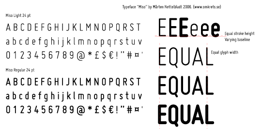
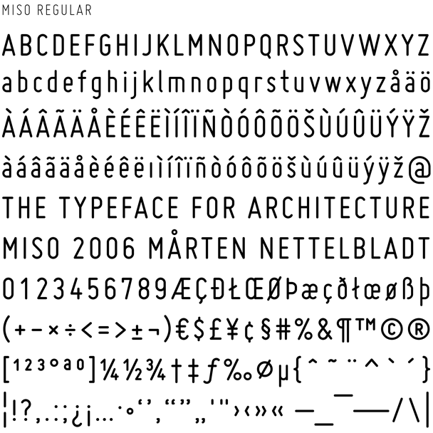
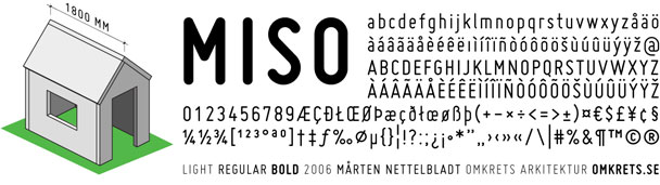
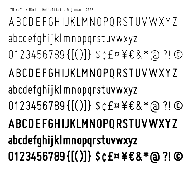
"Miso" is a lettering font intended for architects drawings. It is inspired by the standardized typeface "ISO", but with a blurred and yet geometric look. All three weights are derived from the same strokes - only line thickness vary.
I would very much appreciate comments on the glyph designs. (Haven't worked on spacing yet.)
Thanks!
| Attachment | Size |
|---|---|
| miso-v01.pdf | 175.83 KB |