Typophile

Photo Typesetting ... resource?

marian bantjes

Hi all, I’m about to start teaching typography again and one of the things i’ve never been able to find a simple resource for is something that explains, or preferrably shows the process of photo typesetting. I try to explain it to my students, how we used to have fonts on strips of film (and later, small cards) like negatives, and how these were mounted on drums, and the drums spun around really fast as light shot through the negatives for each letterform, exposing it at the correct size onto photographic paper.

Well, naturally, it’s bewildering, and I’ve long wished that there were a little movie, much like the numerous little movies there are out there showing metal type setting, lead casting, etc.

Does anyone know of something like this on the web, or ... ???

There’s this by Peter Bain on display phototypesetting:

http://stbride.org/friends/conference/hiddentypography/phototype.html

Hey Mark!
Didn’t you write an article about using Legos to use an old VGC Typositor film font?

Compugraphic CompuWriter IV, with filmstrip and width cartridge cabinet on the left.

Oh, yeah... I forgot all about the Staromat I also used to set headlines, but you had to use it in a darkroom like a photo enlarger.

Hey, and here’s a detailed diagram of the VGC Phototypositor.

FWIW, Marian, you might try contacting the Museum of Printing in North Andover, www.museumofprinting.org, to see if there are any period films from the original manufacturers (that could be converted). I’m guessing they might still exist. Frank Romano wrote a good capsule history of phototypesetting from the North American perspective in Printing History, the APHA journal, Number 46 (Volume 23, No. 2) 2003, as an eyewitness.

If you haven’t come across it already, download this article by Andrew Boag, on Monotype’s photosetting equipment, written for the Printing History Society, the graphics will help. www.letterpress.ch/APINET/IMMPDF/MONOPHOTO/PHS_journal.pdf

Hi all, Thanks so much for this. And I will indeed contact the museum of printing, thanks phil, as well as read your aticle (thanks mark), and the pics Norbert!

It’s funny to me how every time i try to explain any typesetting technology to students how mindblowingly laborious it all seems. I worked with a Linotronic 3000(??), among other things, and it always amazed me.

-marian

Glad to be helpful...Phil Baines (no relation, different spelling) & Andrew Haslam’s Type & Typography also has great illustrations of phototype artifacts, besides being an interesting textbook.

Good luck with your class.

...how mindblowingly laborious it all seems.

But just imagine going back in time and explaining to design students of 20 years ago how their future counterparts would have to sit at benches in sterile laboratories all day looking at computer screens, with a keyboard in front of them, preparing for a career as a digital drone.

preparing for a career as a digital drone.

For those who can remember...
JANUARY 23, 1884

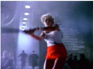
Apple Computer, Inc. introduces the world’s first user-friendly, Macintosh personal computer. Its dramatic, Orwellian,1984-inspired Super Bowl TV ad introduces the product as a world smashing alternative to Big Brother’s grip on workers in dull grey drone attire... APPLE — PLEASE SAVE US!

Maybe the attire has changed... but the drones live on.

FYI —


Before there was the Macintosh, there was the Apple Lisa as the first desktop publishing front end. I worked on the Lisa for about a year at Compugraphic before the Cg’s top management decided the hippies at Apple were crazy and that we would not support them in font development. The rest is history... and so is Cg.

Boy that was some commercial in 1884 the trouble was watching it on the soon to be invented radio. But the real question is who played in the 1984 Super Bowl and who cares.

Captured from web.archive.org on 8 Sep 2008. view this capture