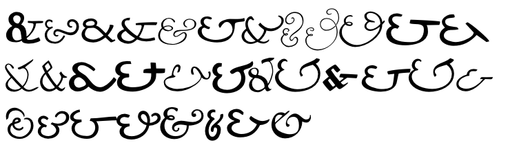
I am looking for types that have a particularly distinctive ampersand. I am grateful for your suggestions.
I am looking for types that have a particularly distinctive ampersand. I am grateful for your suggestions.

Jonathan you might be interested in this thread which asked the same question. :^)

I have a typeface that is nothing but ampersands.
This is a-z, 0-9:
Adobe Caslon Italic is a beaut and because it's upright and not slanted I tend to use it with Roman text as well.
Actually all the Caslon italics seem to have variations on that ampersand.
For the record I hate the shape of the Galliard ampersand in that other thread, Today sans uses a similar shape and I end up substituting another font for just that character.

jonathan, i hope you're ok with me using this thread for another question:
for a modern, humanistic sans (some would probably say its inspired by dax) im working on the & at the moment. the one i have right now is a Et-ligature.. i mean changed an all, but its inspired by the Et-connection and not by the classic & that evolved through time.
do you know other fonts that use this as the only ampersand? or would you only give this to the user as a alternative gylph?

kesh: well, Univers, but I notice that some of the digitizations have substituted a more "normal" style.
When you say the Et ampersand do you mean the one that looks like a backwards 3 with a flourish or the awful one that looks like a lowercase et?
pattyfab: its close to this one, a backwards three with a smaller lc t.

(sorry about the bad image and the stuff in front of the gylph i want to show, but its the best i can find right now)

I think you should start a Freestyle Remix Challenge,
like this one: http://typophile.com/node/14378
1800+ reads, dude - people want it.
hhp
Captured from commoncrawl.org on 25 Apr 2015. original URL