
No text setting just yet. All letters not done, But I'm on a tight deadline, so if anyone can offer anything, I feel at least comfortable showing them now.
Thanks
| Attachment | Size |
|---|---|
| letters.pdf | 86.11 KB |
No text setting just yet. All letters not done, But I'm on a tight deadline, so if anyone can offer anything, I feel at least comfortable showing them now.
Thanks
| Attachment | Size |
|---|---|
| letters.pdf | 86.11 KB |

Pretty good start Eric!
The balance of your x and k seem top heavy,
The lower arm of the k seems kind of floppy and looking for a home,
The left side of the g seems heavy enough to br troublesome at text sizes.
h and p seem a tad wide.
Anything you want to say todescribe what you are trying to do and the client?
ChrisL
Well, first off, I've been working on this on and off for about 7 months. This is for my senior project.
I rather arbitrarily said..." hey, basing my proportions on goudy old style should be fine!" Wrong. I was reading Lawsons Anatomy the other night, and it said GOS had only been used to set one book between 1924 and 74, something like that. So, I'm basically modelling my type on something thats not really a good text face. That said, my h and p pretty much are the same width as my model.
also, my ascenders are taller than my model.
But that could change, I've just been trying to get that stupid curve right forever. If you feel it would work better slightly thinner...or, I could thicken up the thins, that might make it at least look smaller.
The lc x being top heavy...I see it now. Dont know what you mean on the k. The g, deff. needs work.
Explain 'floppy...looking for a home" on the k.
Thanks
The k arm looks limp. This can work in a casual cursive to some degree but in a structured roman in does not sit well with the rest. It usually involves the negative space ballancing the black. It is hard for me to describe since it is such anincremental visual decision. Perhaps it needs to be more constructed in a manner keeping with the other curves in your alphabet?
"That said, my h and p pretty much are the same width as my model."
That may be true, but optically they feel too wide. The eyes are the final arbitor, not the ruler.
ChrisL

I think that the type is too light for text. Are you using a small optical cut for your reference? Maybe that would explain why the original was so hardly used.
Thanks for the input guys. It's been driving me crazy going this long without any. I'll do anything to make it better.
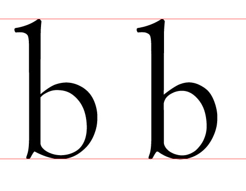
Question is, if a make the rounded characters less wide and heavier, I assume thats going to happen to everything else?
"if a make the rounded characters less wide and heavier, I assume thats going to happen to everything else?"
The heavier part is true. You don't want the thin lines to be too weak for text sizes. The narrower part is not really the same. The reason I said some of the characters were too wide was that they "appeared" wider than the rest. In your sample above, you may have narrowed the b too much. Balancing widths of glyphs is a subtle shift of incremental adjustments to make the proportions appear to balance each-other. It is very hard to see this at large sizes. I think you need to create a usable test font with a minimal character set to be able to test it out. You will also see how fitting letters to their neighbors affects the glyph design and you may have to revisit your outlines to compensate.
ChrisL
That makes sense.

> So, I’m basically modelling my type on something thats not really a good text face.
You can pick up a copy of just about any English-language magazine from the 1920s and find ads with body copy set in Goudy Old Style. It was considered a top-notch face in its day. Not as ubiquitous as Kennerley, but a classier development in the same vein.
Eric, you're just tinkering with Goudy's design, and don't have a clear design principle, other than "basing my design on..." You need to find a reason of its own for your typeface to exist, in a hurry.
As you have gone too far to abandon the project, and as what you're doing is cosmetic, I would recommend comparing your face with a letterpress-printed sample of GOS (not individual vectored glyphs), and basing your re-styling ideas on that.
Stop looking at the letters so big and in isolation: this typeface is all about fit, and the changes you are making to it, such as squaring off the bottom right serif of the L and E, work against the face's inherent fitting strategy. OK, if you are going to dismiss Goudy's snug fit and asymmetric serifs, and produce a chunkier setting with more discrete characters, then you should be testing settings of character-pair combinations, to see how you fitting scheme compares with the original.
Let's see a text setting now; get that right and the glyphs will take care of themselves.
Nick,
Thanks for the input.... I'm really lost now. The whole purpose of this was a for my senior project, being novice, with NO guidance at school.
Here's the question. I thought, since I drew all of these from the ground up, simply basing proportions on a face, I never really thought of it as an interpretation,nor did I want that. I guess thats not the ideal way to handle this.
How would you go about it, making in not purely cosmetic?
Good typefaces exist because they arise out of a certain need. Like most other sorts of design, they are there to solve problems not [just] to look pretty.
Drawing new letters based on the proportions of old letters really isn't design… Wouldn't you want to "design" something for your senior project? Your senior project isn't just a chance to show that you know how to use illustrator or FontLab or whatever, but rather to show what sort of designer you can be when you work independently.
You need to set a target audience and medium… and because this is small for a type project (at least in your fitted time range, I assume), you might want to limit output size as well. Really, after this point, its all up to you… maybe you could find some vehicle through school? i.e., new 11pt type for the student newspaper, new 9 point captions for the yearbook, or new font to be used in graphics on campus intranet websites, etc.
Your right, it's not a chance to show I know how to use the computer. I have stacks of paper/sketches/with all my brush work/everything. I didn't touch the computer until about a month ago for this.
As it stands, I have until april. I either A. Start over. or B. Work with what I have.
Eric, get your font functioning so that you can make sample settings.
Once you see which character combinations are not comfortable, then decide whether to fix the situation by varying the sidebearings, or changing a detail of the serif (eg width, sharpness, amount of bracket). Or vary a stem weight. Whatever -- the important thing is that you will be designing a typeface, not lettering glyphs.
Try not to look at GOS, and figure out a way to make your typeface set nicely.
Thanks everyone. I swear, i had no intention of it looking as close as it does. I set some of what I have, it's incredible. I must have absorbed too much Goudy Juice or something. I'll get right on finish the setting. I've got a few weeks for winter break, I'll try to bust it out.
Captured from commoncrawl.org on 19 Apr 2015. original URL