Typophile

Opentype feature for 'stress' with acute - in Dutch & maybe Danish

ebensorkin

Does anybody think it would be a good idea to deleop a 'locl' or 'ssxx' feature for 'dutch stress' the practice of putting acutes over letters & numbers. From what I have read on typophile this practice is a bit like using an italic.

Actually I have a bunch of questions about this:

Is it done in these countties too? Denmark, Sweden, Norway, Finnland. Anywhere else?

Do you know when the practice began?

What impact if any do you think it should have on the design/coding of Opentype fonts?

I think with TT & PS a typographer had to manually kern them into place. Is that right? Or how did/does it work?

Do you think Unicode should be expanded to allow these glyphs? From what I have read most people think this kind of thing should be done in Open type by using the 'ccmp' feature.

Can anybody expand on my very limited understanding of use? For instance, would a good dutch typgrapher choose italics in one case over what I am calling dutch stress in another? When & Why? What would the choice mean - if anything? Could he use both italics & dutch stress? If so, what would that mean?

I have gotten the impression from texts that dutch advertising uses acutes that point all over the place. But I haven't seen it. I also imagine that for a text face dutch stress acutes should create a more unified feeling even if the angles shift to accomodate differences in glyph width. But without looking at examples it's all just speculation! So -Are there any images on the web?

Thanks!

Eben,

this is indeed a good question which nobody yet solved convincingly. The practice of using acute as a stress mark is popular in many languages -- for eyample Russian uses it. The most intuitive way of encoding these characters might be using the combining acute mark (U+0301), and then using the "ccmp" OpenType Layout feature to display the glyph properly. However, I don't think it can work so well. Putting U+0301 into the text usually confuses text processing application. The letter "a" with acute is usually treated differently from the plain "a", because most ortographies threat them as separate letters. But if the acute is used to denote stress, the text processing application should "know" that for the purposes of searching and hyphenation, the marks should be ignored. Unfortunately, most text processing applications can't do that.

However, if you design an alterate set of glyphs with acutes, name the appropriately (e.g. "a.ss01", "b.ss01" etc.) and map them to the ss01 and salt features, the underlying text would not include the acutes, but instead, the user would have to apply formatting to the appropriate glyphs (through markup or some menu selections). I believe that this would perhaps be a better idea. At least, it would present less problems in making the text searchable and hyphenable.

You could still add a ccmp feature:
a uni0301 -> a.ss01
etc.

This way, you would ensure that the stressed letters would appear through both ss01 (without the acutes being encoded in the text) and through ccmp (with the acutes in the text). Perhaps this solution would be the most universal.

In the end, the user will need to make the decision: does he want to treat the stress denotation as part of text (then the acutes would be keyed in and encoded, and the ccmp would be applied) or as formatting (then the user would apply the ss01 feature on a per-glyph basis).

Best,
Adam

If it's used for emphasis, it should be formatting.
After all, if one considers standard practice, the text is the same in Roman, Italic, and Bold.
Therefore, "dutch stress" should be a separate font.

In fact, I think we're trying to cram too much into OpenType fonts. If a font has interesting, unique features, the foundry/type designer is quite literally burying them anonymously (down in the hierarchy of interface palettes) if they're put into a stylistic set (which BTW, a lot of end users still on Quark or CS1 don't have access to). It would be better to make a separate font, with an on-point, memorable name, and charge for this benefit accordingly.

Nick,

by "stress", Eben does not mean rhetorical emphasis. He means the word stress, the difference in pronounciation of the noun "object" and the verb "object". If you put the glyphs with stress marks in a separate font, kerning won't work inside of your words, which is not a good thing.

Adam

Thanks Adam! Actually, although I appreciate your confidence in me I was starting to compose a new entry to ask about just that kind of thing - use. The thing is I have no idea how the Dutch the Russians ror the Danes use this & what it means when they do.

I had started out imagining that the 'stress' might be like an italic and that it indicated a chasnge of voice. But I quickly realized that was an assumption and quite likely a wrong one.

The use you are describing - based on other things I have found where you commented on this 'dutch stress' sounds like the stress marks used for almost phonetic use or at least help in pronuciation. It also sounded like it was a kind of extra help for students and not a part of standard russian. Not that I know anything about russian! But it occurs to me that the meaning & use in dutch might be different & for scandanavians - I still don't know if it's just danes who use it. When I have read about dutch use it sounds like whole phrases are marked up in this way. I think even numbers can be marked. Which makes it sound like an italic or bold treatment. But again, I don't have any clarity yet on that point.

I am still wrapping my mind around the Open Type feature set and I see now that I was thinking about sometyhing else when I wrote 'ccmp'. I feel pretty silly. I will try to sort myself out better & rephrase my question. However before I do I think cultural considerations should trump technological ones. Put another way, before I really start to think about how ( or if I should ) think about offering this kinds of stress as a feature in an Opentype font I had better get clear on what is intended by it's use & how it's seen by the cultures that use it. I have have sent out a few emails to folks who might be able to help me & if it's okay with them I will quote them here.

Adam, can you expand you comments in this area?

Can you suggest people to ask?

Accents are occasionally used even in English to specify pronunciation, e.g. in traditional poetical works to assist metre by clearly indicating that a typically silent vowel should be pronounced: belovéd. In this case, I would say that the accented character is very much part of the text and it should not be considered a layout issue. Linguistic stress is an aspect of language, not of typographic design, and if it belongs in a text it should not be something that can be lost through a change in formatting, e.g. switching to a different font.

I agree with you about linguistic stress. But is that what's happening in the other cases? It doesn't sound like it to me. Not yet anyway.

BTW - Gerard Unger wrote back to me & said:

Yes, it is a fairly common practice, although it is hard to find any rules.
It is not old fashioned. To find out when this practice began, you would
need to consult a linguistic historian.

Thanks for the correction, Adam, but I actually understand the concept (although I may not have explained myself very well!)

Let me try again.

This kind of "pronounciation" emphasis is no different than the emphasis that writers and editors use when they "highlight" a word or phrase in bold, Italic, or caps. It is a text decision, made by the writer, which he/she executes by formatting. The only difference is that it is a single character or syllable that is being emphasized.

A "stress font" should contain every character with an acute accent over it.

Therefore, text set in a stress font would behave ordinarily when reset in an ordinary font.

The text would be searchable and hyphenatable, but you'd have to apply Optical Kerning over the "cross-font" pairs.

Also, it would be easier for writers to select e.g. the "Minion Stress" font to stress a glyph, rather than to drill down to an OT stylistic set, which is the more likely behaviour of typographers.

Eben --

I'm not Dutch (so I'm not an expert on this) but I lived in The Netherlands for a year and observed/enjoyed this "Dutch stress" as you call it. As far as I've seen the extra acute marks will almost always be applied to only the vowels of the syllable being stressed (example: néé, géén). The only consonant exception that I've seen is the lowercase j in the word jij ("you") where all three letters might be able to be emphasized, though I don't believe there's a unicode value for "small letter j with acute" so I'm not sure how it would have been applied in text unless if it was done manually.

-- Andy

Andy, where did you see it used? That is to say what kinds of texts? Or text on or in what? What did it mean when it was used? Was it an aid to pronunciation or something else?

Eben --

I really didn't master learning the language while I was there so my Dutch reading diet consisted mostly of newspaper headlines, billboards, posters, TV commercials, advertisments/marketing speak -- all of which are the kinds of places that I got the feeling it would be normal to throw a couple extra acutes above the vowels when necessary.

I think it might be better to think of this feature as being used more in the case where you might set one or two words in all caps or if you would underline it for emphasis, like "NO money down!" or "that's what HE said." But then again, I didn't do a lot of reading of long texts, so I'm not sure if it would be acceptable to do this in long passages.

-- Andy

"Dutch stress" is as much Dutch-only as "English weather" only occurs in England. There is nothing mystical about it. The Dutch use the acute over a vowel (or two vowels of a diphthong) in homographs: words that are written the same way but bearing different meanings, depending on which syllable is stressed. Not including the stress mark in such situations would make the word ambiguous, e.g. vóórkomen (occur) vs. voorkómen (prevent) or achterúítgang (deterioration) vs. áchteruitgang (back exit).

Russian uses acute in the same way but not in daily writing but only in schoolbooks. In Russian, the stress varies heavily so in schoolbooks the stress marks are written out to ease the learning process. In normal literature or newspapers, they're not included.

The phrase "Dutch stress" is also used to describe the constant life in fear that the dams will break and all Netherlands will be flooded in seconds. Or maybe not.

A.

I *think* prosody is what is under discussion . . .

The mark referred to as “Dutch Stress” is, I suspect, the ictus, used to denote stress in Latin languages. I don’t believe there is any such Unicode character. If you are going to do prosody, you minimally need an ictus, a longum (sort of a macron), and a breve. The breve is not the same as the accent, and does not look the same. I’ve always felt that they go over syllables, but practically speaking, you find a letter in the middle of the syllable & put them there.

Modern practice has generated all sorts of *symbols* to be used in the display and analysis of poetry (for example, in the journal POETICS TODAY). We now have a *reverse ictus* and hard & soft syllable marks. None of these is in Unicode, and using a different character (acute, grave, macron etc.) seems to me equivalent of using the LATIN CAPITAL A for the Greek CAPITAL LETTER ALPHA – worse really, because they don’t even look quite right.

But what to do . . .

So Adam you are saying it is used only to distinguish words rather than as a way of setting off or emphasize a whole phrase. So the Whole Phrase or Whole sentance or Whole Paragraph model is mythic then? It doesn't exist? If so that would really change the way you would approach things technically. I got the idea that it could be a whole phrase from somewhere - I'll dig it up & post it here. Ahhh here it is....

peter bilak : Not only vowels, but also some consonants: jacute for example. It indeed is used for stressing the word, same like italics. Most often it is used in Advertising and in expressive text, not in handwriting, as far as I know. In words like JIJ (you), one could put an acute on all characters.

http://www.typophile.com/node/2764

So he is saying word not phrase or sentance. But that is where I got the idea it might be like italics. Okay, so I wasn't going completely mad.

This is from today's (12.15.05) wikipedia which as we all know aught to be taken with a grain of salt ( a bit of skepticism) but here is the entry anyway

In Spanish and Dutch, the acute accent is used to disambiguate certain words which would otherwise be homographs. In Spanish, this covers various question word / relative pronoun pairs, such as cómo (interrogative how) & como (non-interrogative how), dónde & donde (where), and some other words such as tú (you) & tu (your), él (he/him) & el (the); in Dutch, this is mainly één (one) & een (a/an).

In Dutch, the acute accent can also be used to emphasize an individual word within a sentence. For example, "Het is ónze auto, niet die van jullie." ("This is our car, not yours.") In this example, "ónze" is merely an emphasized form of "onze".

Interestingly it isn't letters being changed in the example but rather one.

In Danish, the usage of the acute accent is very similar to the Dutch usage, for example én (one) vs. en (a/an) and fór (went) and for (for). It can also be used for emphasis, especially on the word der (there), ex. "Der kan ikke være mange mennesker dér," meaning "There can't be many people there" or "Dér skal vi hen" meaning "That's where we're going".

In Norwegian, the acute accent is similar to Danish. In Norwegian bokmål, it is also used for the imperative form of verbs ending in -ere, which lose their final e and might look like plurals (most often ending in -er) of some noun: kontrollér is the imperative form of "to control", kontroller is the noun "controls". The simple past of the (disused) verb å fare, "to travel", is fór, to distinguish it from for ("for" as in English).

Many words of French origin retain an acute accent, such as allé, kafé, idé, komité, diskré. Popular usage can be sketchy and often neglects the accent, and there exists a certain degree of interchangeability with the grave accent.

In Swedish, the acute accent used only for the letter e, mostly in words of French origin and in some names. It is used both to indicate a change in vowel quantity as well as quality and that the stress should be on this, normally unstressed, syllable. Examples include café ("café") and resumé ("resumé", noun). There are two pairs of homographs that are differentiated only by the accent: armé ("army") versus arme ("poor; pitiful", masculine declination) and idé ("idea") versus ide ("winter quarters").

Eben, this topic greatly interests me (partly because I dislike italics) but to be honest I've had trouble finding good examples of actual use. And that makes me suspect that some -too many- people would simply not know what's going on when they encounter it. For example, is it taught in school in the Netherlands?

> If it’s used for emphasis, it should be formatting.

Not if it's part of the language - like it is with Armenian. And as has been pointed out, some languages like Spanish actually require it to be fully intelligible. Here's a passage from Jorge de Buen: "Véase el caso de estas tres palabras: cántara, cantara, cantará. Significan cosas diferentes y la tilde es la distinción."

BTW, the case with English seems different, since it's about pronouncing a letter that would otherwise be silent, not emphasis.

hhp

I think it's interesting too - I think it may turn out that there isn't any significal cultural use to setting a phrase using acute & that it really is just the odd word or oven letter here or there. Still, what Peter wrote intrigues me & I think got the idea that phrases and sentences could be set somewhere... I think it wasn't just Peter. But then again I have not been able to find examples online or any way to confirm it. So maybe I had better just get used to the idea being really no big deal. I am hoping some addition dutch type maven come cruiosing through & teach us a bit more.

And as always, thanks again Adam for giving us such great examples and such useful and complete info!

> is it taught in school in the Netherlands

More & more I suspect it is a pop/ad culture thing. And not just because of what Andy said. If so it would (maybe) make a text face less of an appropriate place for a 'acute stress' OT feature, and a Display face more of one. But basically it seems to me that we still don't have quite enough info yet.

Peter wrote to me to say that the only constanant that uses the acute in dutch is 'j' - so I over-read into his statement. If it is just some volels & the odd j there is no point in making a feature I think. Oh well, I was hoping I had come across up something wacky & fun. Cheers everybody & thanks again.

Danes do use Dutch stress. Not very often, though and there are other ways around it:
"én" instead of "en" (meaning "one") is used to emphasise the you mean "ONLY one, nor more, no less".
"én" can also be written as "een" (which actually looks a bit Dutch). I think "een" is the older way of writing this, but both work.

Some things I know about the usage of accents in the Dutch language.

The accents are mainly used to emphasize the sound of words. Example: Dit is ónze website / This is oúr website.
We usually don't use acutes with caps. You will not see words like 'Één (meaning '1'), but 'Eén'.
We don't use acute on numbers. But because we write the numbers 1-10 as words, we write (1) as één. This because we have a word 'een' (meaning 'a').
Most accents we use are on french words. Damn them. :D All french words that are beeing taken over in the dutch language loose their accents. Only in case of pronounciation the accents might be kept.

Because of technical limitations the second accent in the word 'jij' can't be used. Write this word as 'jíj'.

What we dó use more often is the dieresis for words like 'officiële' (meaning 'official'), or 'skiën' (meaning 'skiing'). We do this in two cases:
1 to read the vowels seperate from eachother. We write 'reünie' because we read and pronounce 're-unie'
2 to verbalise the connection of multiple words (sorry, don't know the english word for this). Single verb 'olie' becomes 'oliën'. 'Financie' becomes 'financiën'.

Perhaps these pages might help you out. I tried to look for english pages, but didn't find any. Perhaps you can decypher it when you read it:
http://www.mijnwoordenboek.nl/spelling-accent.php
http://woordenlijst.org/leidraad/4/1/
http://woordenlijst.org/leidraad/5/1/
http://home.hccnet.nl/c.phielix/
http://home.hccnet.nl/c.phielix/#accenttekens

And yes Adam, Dutch stress ís about the fear of our dams breaking. We díd have that some years ago. You are só right. ;-)

I hope this helps.

Best regards,
®ené

*** www.characters.nl { Typography to express yourself } ***

There appears to be a difference between prosody, involving a range of marks, and simple stress emphasis, where only one kind of mark is required (although some languages use the acute, others the dieresis).

For simple stress emphasis, I wonder why the underscore is not used: it is a device which is supported at the word-processing level of the typographic production flow, font-independent. The only downside is that it's a bit messy with descenders, but that perception is probably a residual metal-type aesthetic, and not relevant with digital type.

I think the accents are more elegant than underscore would be.
One explanation for the acute could be that it makes the character lean forward a bit, like a small italic element.
just a thought.

There are indeed various forms of emphasis, and expressing the
variety visually would surely help (most of the time). To me
we really haven't thought enough about this issue, and tend
to brute-force everything with italics.

Underscore: besides the clash with descenders it's
too intrusive in terms of parafoveal distraction.

hhp

Hi everyone.
I'm trying to create the stressed IJ. Looking on the internet I've found how the Glyphs App people suggest to do it using locl feature http://www.glyphsapp.com/tutorials/localize-your-font-accented-dutch-ij
The feature works well, but when I insert them from the glyphs panel on Adobe Apps and I change between family weights they don't change, the behavior is the same when you change the font and some glyphs are missing on the new selected font.

Any help?

Best regards

Have you set the language of the text to Dutch? If not, you can manually insert the glyph, but I won’t be surprised if it does not work reliably.

Hi Thomas.
When the language is activated all works fine, but I was wondering what happens if the user don't activate language and insert the glyph via panel and later change between weights.
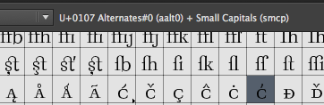
The curious thing is some other locl glyphs like ckreska (and the others) work fine even with language not set. In the Glyphs panel they are marked with the unicode of the cacute + feature. Stressed ij don't figure attached to any unicode + feature. See image.

Sorry for my bad english. Thanks in advance.

Captured from web.archive.org on 21 Apr 2015. view this capture