Hi,
One of the glyphs that's giving me trouble in Inconsolata (see critique thread for more discussion there) is the beloved at-sign. The problem is, of course, that in the classical shape there are four vertical stems that need to be squeezed into the width of the glyph. In most fonts, you can make the @ wide to accommodate all those strokes, but in a monospace font that is not an option.
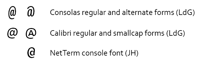
There are a number of 3-stem variants, notably that of Courier and Letter Gothic, but I find them kinda plain, and I feel that the central bowl lacks a-nature.
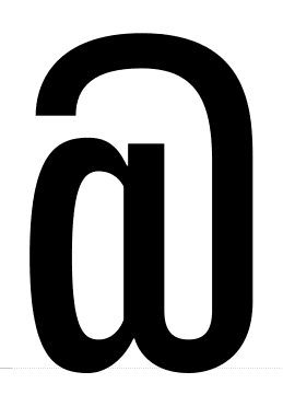
I sketched a bunch of 3-stem variants, and this is the one I liked best.
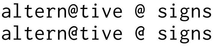
Since I haven't seen this particular variant before, my big worry is that it's too strange, and will stand out when people see it. Any opinions?