
Hello. First time poster here. Just curious to see what opinions and forecasts are floating around here in regards to typographic trends to look out for in the coming year. Any insight?
Hello. First time poster here. Just curious to see what opinions and forecasts are floating around here in regards to typographic trends to look out for in the coming year. Any insight?

I think we are going to see lots of Arial and Comic sans the coming year.
(sorry, couldn’t resist :)

Are you talking about trends in the use of type (graphic design) or type design?
I’m a graphic designer, judging from the top selling font lists I’ve seen on myfonts, veer and t-26, scripts are a big seller. I think there is always room for unique display types, and is something I look for personally.

Half gut feel and half educated guess:
I believe we are in for a big change in the way typefaces are made available to the graphic design market.
Also, we are still waiting for the shakeout/changes by Adobe on Macromedia product line.

I don’t think anything earthshaking will happen in 2006. Typography will evolve at its current rate. My only gut feeling is that type designers will more-and-more sell their own wares.
ChrisL

Towards the end of 2006 we’ll be seeing more and more of the new Windows Vista fonts. You won’t have to use Arial any longer!

>we are in for a big change in the way typefaces are made available to the graphic design market.
What new way did you have in mind?

Modern Times: The Age of the Machine.
“>we are in for a big change in the way typefaces are made available to the graphic design market.”
I think he means they will be available on iPods and designers will have Cellebrity Designer “Playlists” :-)
ChrisL
Educated guesses:
More bundling of font packages aimed at non-professional markets (like the Ascender Creativity Font Pack for only $19.99) which will in fact degrade the per font perceived value within new markets we potentially could sell to.
More font bundling within software packages aimed at non-print professional and consumer markets (web, video, digital imaging).
More font bundling within multi-software packages (like Adobe CS2. Surprise, surprise... I got fonts I never had or installed before).
Gut feel:
I just have a feeling that TypeExpertise.com wants to do more than just create a “universal type classification” system based on touchy-feely search criteria. Why the hell go through all that effort unless you want to start selling fonts to non-type oriented markets.
And there are other distribution modes in development and on the drawing board for getting old and new markets to use more type.
I agree entirely that the method of distributing type will change drastically sometime in the nearish future, and I am also looking forward to the day when Arial packs it’s bags - but to clarify my initial intent, I am more interested on usage to come. Am I out of line by saying Trade Gothic is reaching overuse? Thoughts?

More Avant Garde Alternates? haha
Hopefully distressed faces will go away. You know the ones I mean...
Balonius Funk
R.I.P. grunge. I’ll miss you.
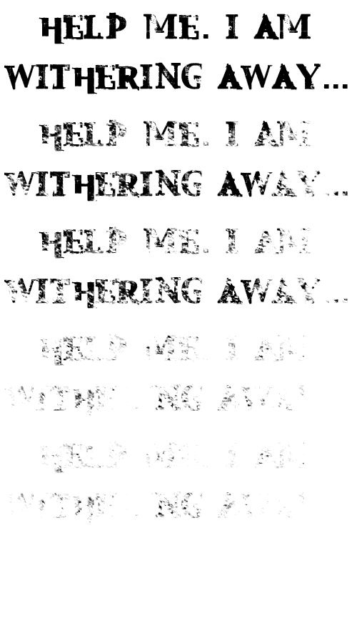

1) Art fonts...
2) The newest technology and how you use it is always big.
Rob

Maybe more fonts that designed with specific pt sizes in mind.

Aquatoad Design is forcasting a big year for PMS 1665U. Grunge will not dissappear in 2006. It will gain strength and make landfall with reknewed vigor online (this time at standards compliant force). In other news, 2006 marks the beginnining of a rennaissance period for illustrators. The fledgling trend of funky handlettered headlines continues. Century and Clarendon will make a strong showing as lowercase a’s with monster tails abound.
Yo Randy, you are, like, Nostradomus man!
You just left out the “World coming to an end” part :-)
ChrisL
Lauri,
Lovin your grunge EULAgy man:-)
ChrisL
I think the highlight of 2006 will be Mark Simonson’s release of Courier Flair.
>More bundling of font packages aimed at non-professional markets (like the Ascender Creativity Font Pack for only $19.99) which will in fact degrade the per font perceived value within new markets we potentially could sell to.
Hmm. The Ascender pack it seems includes two of four weights of Font Bureau’s Eagle, and one of three weights of Mark Simonson’s Coquette. Perhaps what is going on—and will continue to—is a segmentation of the market, with fonts aimed for the professional market being very full families and Open Type features—with correspondingly higher prices. And then the bundling of selected weights as a marketing tool. Adobe seems to be different here, as their bundling is aimed at enhancing the value of their production software, which nobody else producing fonts has to sell.
“I think the highlight of 2006 will be Mark Simonson’s release of Courier Flair.”
Is that the one with swash caps and flourishes? :-)
ChrisL
Aquatoad Design is forcasting that the world will come to an end. Possibly in 2006 (PMS 433U). But, maybe not (PMS 2905U).
LOL!
ChrisL

I think the highlight of 2006 will be Mark Simonson’s release of Courier Flair.
Actually, it will probably be my release of Courier Flair, or something that could pass for it: an as-yet-unnamed face based on an old MacKellar, Smiths and Jordan classic called, somehat prosaically, “Lightline Italic.” Look for it in January 2006.
And Aquatoad has it all wrong: the world will not end in 2006. However, be forewarned that the Mayan calendar ends rather abruptly in 2012...
However, be forewarned that the Mayan calendar ends rather abruptly in 2012…
I was thinking the same..
“However, be forewarned that the Mayan calendar ends rather abruptly in 2012…”
That was the Mayan version of Y2K :-)
ChrisL

— I think we are going to see lots of Arial and Comic sans the coming year.
So I should just ride out the wave and not re-design my bl**dy publication because it’ll come back into typographical style? ;)
Maybe I should just quit. *sigh*
Kristina
“Arial!, you’ve been to the surface again, haven’t you!?”

So Mark, are you going to Courier Flair?
Acually a while ago they predicted magenta would be the next orange & it pretty much was. That is of course over now. Does anybody know what colors are actually being circulated as the next big direction? I see ink spots & drips going out. The huge use of those stylistic tropes by comedy central & apple ipod ads are rapidly making them passe.
In my dreams: lots of odd japanese greens in blue green & yellow green & green brown that we never see. With some pink bits. But that could be because winter is so deep here in Alaska.
Of couse the next big thing in type will be flipdot fonts.
...but typographers will be left out in the cold - they will be made by graphic designers to work in flash & by plug ins for motion graphic packages. Fontlab will introduce a fancy version of photofont ( v3) that makes animated bitmap fonts but it will already be too late.
I think Mark’s Courier Flair will replace Helvetica/Arial as the web standard. (I can’t wait for Mark’s comments)

Will happen in 2006: More grubby fonts will come bubbling up through MyFonts and more people will buy them. The best seller list will become uglier than ever. This can only be a good thing for the industry. Some snobby type designers will thumb their noses at the great unwashed buying “type”. (And they’ll pronounce “type” with just enough emphasis to make it clear to everyone that they are smart enough to call it type, and not fonts). Other companies will seize the opportunity and make wads of cash a-la Wal-Mart. In short, the markets for non-professionals will continue to expand. At the same time, professional users will become even more addicted to OpenType features, and continue to pay a premium for beautiful work, driving sales and encouraging creativity in type design like it’s never been possible in the past.
Wishful thinking: Software makers will realize that hard coding a control panel into each application for each OpenType feature is ridiculous. They will simply implement an engine to read the available features out of the font, and allow the users to turn them on or off. People setting type without the help of Adobe’s multiline composer will either finally go completely insane spacing by hand in Quark or will actually die of old age. Everyone else will finally dump Quark for Microsoft Word, and not know the difference.
Will happen in in the future but not necessarily in 2006: Adobe will become all powerful and start to atrophy, though it won’t be completely obvious to everyone. Then, after a few years, Adobe will have become a blubbering glutton, unable to move under it’s own weight, gobbling 10,000 calories a day of fried food. Since nothing has changed inside their software in years (though a lot more code will be added to top of the pile), open source apps will finally have copied every piece of functionality in each app. Smaller, smarter companies will invent new paradigms that promise to revolutionize the industry. They will, of course, be purchased and dismantled immediately. Finally, Adobe will start to crumble from within, as all empires do, with pressure from the barbarian tribes (open source) and the next round of smart, nimble companies will carve them to pieces creating a lot more work for open source to copy.

Courier Flair
It was a joke! Still, if you think there would be a demand... :-)

Christian, well said — and very funny.
Courier Flair
It was a joke! Still, if you think there would be a demand… :-)
Well, I wasn’t kidding...

Gee, Nick, that’s a completely different thing than what I did.
For those who missed it the first time around:

If that doesn’t make you feel even a little bit woozy, don’t be surprised if I don’t come to you for typographic advice. :-)
C’mon Mark, you are not getting off the hook that easy—where is the swash OTF and contextual ending strokes? :-)
ChrisL
Well, it wouldn’t be the first time I made a font on a lark that turned out to have a market.
That is far better than doing a font that you thought DID have a market and it turned out to be a lark! I’ll bet the Flair pen company would like it.
ChrisL
That is far better than doing a font that you thought DID have a market and it turned out to be a lark!
Sadly, that scenario is much more common.

Hey man, Courier flair already happened in the form of a custom face for Martha Stewart Living. Okay, so I’m only half joking...
At an AIGA talk with Jonathan and Tobias in SF this past summer Jonathan described the creative direction for a new face that MSL wanted. The AD wanted to start with an existing face but weren’t sure what it was. It turned out the face they were talking about was Courier. The new typeface carries a cousin-like resemblance, but is actually a very nice take on an old typewriter face. (Of course there isn’t a lot of flair, unless you count some nice ball terminals.)

In 2006 Hrant will release his Baskerville. Raph will make his curves a real alternative. I won’t be doing much typography-wise.
Sorry about the joke Mark, but I couldn’t resist. I detest flair faces because a lot of designers don’t know how to use them descreetly. Its like the Avant Garde alternatives.
Sergej,
LOL!!! That was your best ever!
ChrisL

i’m suspecting that scripts and OT fonts that reproduce the handlettered look will fare well in 2006. sans faces will remain a staple of the top font sales at MyFonts, with Interstate eclipsing Frutitger mid July, but it won’t be able to knock Helvetica out of the #1 sans spot.
Sergej, not only will Hrant release his Baskerville but it will have worse kerning pairs than Mrs. Eaves. Paul Helvetica is doomed to Courier Flair.
When I laugh at the jokes, that I’m finally getting from hanging around here I sometimes think to myself ’Am I seriously laughing at typography jokes?’ and then I just keep browsing looking for more gems.
Seriously though, enough with the handwriting typefaces, if that’s the look you want then just write it by hand. I know there are some beautiful script/handwriting examples out there but I guess I don’t understand why all these people are coming out of the woodwork with their first type face attempt being a handwriting face?
/continues off in search of more jokes
oh, i didn’t mean scrawl handwriting, but stuff that looks like it’s been handlettered by a lettering master.

More Ed Benguiat Reviving! Give me Plinc! or give me death.
oh, i didn’t mean scrawl handwriting, but stuff that looks like it’s been handlettered by a lettering master.
Oh! Here, here! My neighbor’s dad has been hand lettering signs and vehicles/pinstriping for over 50 years and his work is amazing. I’m totally down with that style. :-D
2006
Typecon in July will be even hotter than it was in New York. But hotter in which ways? You better go and find out!
Veer will be bought by Getty and Getty will be bought by Corbis and Corbis in turn by Macrodobia.
Macrodobia will announce that it’s getting back to its roots by making mud homes in the desert. These eco-friendly dwellings will be renamed Flashmud and be entirely made out of recycled PDF and straw.
Microsoft will continue to gain cool points with the Xbox 360 even though the aptly named Halo 3: Guess What, Another Mysterious Ring in Space! will flop. The franchise will drive itself into the ground with a Halo live-action movie that only makes records by doing worse than Hulk in box office receipts.
Somebody in North America will buy a game for their PSP.
FontLab Studio 5 will be ported to the Blackberry. Type designers will be seen on subways everywhere all thumbs making kerning pairs en route to their day jobs
ChrisL

Looks like Chalkboard died a quick death in 2005. It was a new born but I’ve never seen it ever used. Poor little bastard child.
“Chalkboard died a quick death ...I’ve never seen it ever used.”
Maybe because it gets erased too quickly:-)
ChrisL
Re.: Joes ’2006’.:
Aldus / AltSys will, well, return and re release TLTFKAFH ( The Lovely Thing Formerly Known As FreeHand ), now named ’Aldus Blatt’ ( ’Hedera’, which also translates to ’Aldus Page’ / ’Aldus Leaf’, as well.. :)..
And I may even be pretty thankful for it.. :)
Dav

To see the future you must consult with the spirit world. I have asked the Mystic Font some questions based on predictions already made here. The fonts has been pretty good in the past, but the answers this time seem dubious.
Brilliant Richard!!! :-)
ChrisL

In other news, 2006 marks the beginnining of a rennaissance period for illustrators. The fledgling trend of funky handlettered headlines continues.
I wish! Randy, if that’s true you’ll be my new god.
not only will Hrant release his Baskerville but it will have worse kerning pairs than Mrs. Eaves.
LOL!
Terry,
Judging by your new avatar, you are not in a holiday mood?
ChrisL
Remember Chris Terry turned blue when he was a south park character. But shouldn’t he have Norbert glasses?

Chris, that avatar is from his new website, which you must go see.
Judging by your new avatar, you are not in a holiday mood?
On the contrary, I love Christmas. But let’s not forget it is cold outside! :)
“Ive got to go” “but baby its cold outside” Terry I bet you didn’t miss the last three days in NYC average 19º F. Finally broke today mid 40’s.

2006? the stock, gold, and commodities markets crash. Money becomes useless, making software the new currency. Fonts become the small change, like pennies, nickles and quarters, handed about on keychain USB drives shaped like like the letters they contain. Kerning becomes obsolete, along with hints and uniform formats as counterfit coins proliferate. The number of type designers skyrockets into the billions, so The Netherlands is renamed Shriftijdonia and extended, with the purchase of the top half of Mt. Saint Helens, 200k into the north sea to make room. 07? don’t ask ;)
The geniuses that proposed the memorial (that can’t work due to enviromental concerns) and the first WTC that is faitaly flawed will eventually have to admit it. Mayor Bloomberg will take the project over and make it work. Since 9/11 nothing, I repeat nothing has happened at that site and it sickens me everytime I pass it. 2006 is just 2 weeks away.

In 2006 ,Helvetica Flair will resurface and destroy the newly incubated Courier Flair.
Sorry Mark.
in 2006, Schmelvetica will finally reach its promise and unseat its semi-namesake from the top of the “Most Overused” list. Chester won’t know whether to cringe or cheer :-)
ChrisL
Geez, people! Talk about going off on a tangent. Is this some kind of contest with the winner being one with the lamest, geekiest joke?
I was serious about Hrant, and Raph, and me. I don’t know how realistic my prediction is, but I am hopeful. Because you know what? Because I do believe in people,
especially in people like Hrant,
especially on a winter day like this,
especially when my boss lets me go home earlier,
especially when it’s quiet outside
and I have food in the fridge
and my body doesn’t hurt,
especially when I don’t read Typophile
or today’s newspaper
or my own diary,
especially when I have time to write a silly poem
and a letter to a dear friend,
especially on a winter day like this,
I do believe in people,
especially in people like Hrant.

Cool and funny stuff guys!
My sole prediction (historically I’ve made too
many) is that fancy bitmap fonts will go big.
> Does anybody know what colors are actually
> being circulated as the next big direction?
Any color as long as it’s notan.
> it will have worse kerning pairs than Mrs. Eaves.
Sheesh, I’m not prepared to put THAT much effort into it.
hhp
“Is this some kind of contest with the winner being one with the lamest, geekiest joke?”
Gosh, I sure hope so or I have really wasted mucho ascii characters on this thread :-)
ChrisL
In 2006 Hrant will release his Baskerville. Raph will make his curves a real alternative.
Hrant, Raph, you’ve got two months... >^P

anyone working on Comic flair?
Captured from web.archive.org on 25 Aug 2008. view this capture