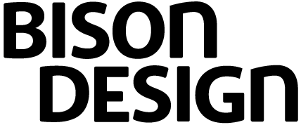
Hi
waddaya think? It's for my own company. There's something that bugs me about the 'E', but i can't put finger on it.
| Attachment | Size |
|---|---|
| bd_logo.gif | 5.24 KB |
| bd_logo_2.gif | 4.91 KB |
| bd_logo_3.gif | 5.12 KB |
Hi
waddaya think? It's for my own company. There's something that bugs me about the 'E', but i can't put finger on it.
| Attachment | Size |
|---|---|
| bd_logo.gif | 5.24 KB |
| bd_logo_2.gif | 4.91 KB |
| bd_logo_3.gif | 5.12 KB |

looks cool. here's my two cents:
the S looks like it needs to be heavier and wider at the bottom. your E seems upside-down and the inside stroke is a little thin. The B is looking a little small (could be a bit wider). to make it more balanced, you might want to match the counters of the B to the those of the O,D,N, and G.
a good resource (that someone recently told me about) is:
--------------
nc

Just my two cents...
I kinda like the upside-down E... but what would happen if you made the middle stroke as long as or longer than the top and bottom strokes?
Its boring. Mark Simonson has an article in general forums about "a cleaver use of a g" You might look at that article and see if it stimulates you to try something creative.

You might try making your N less wide. It distracts me.
Dan - That's pretyy heavy eh? I would agree that it isn't Sooooo distictive as yet. A nifty G might be a good way to fix that.
Flip that B! And while the miniscule "N" is unique and all, it doesn't make a ton of sense. It's not a "traditional" unicase with that majuscule "E".
Thanks a lot! I have to finish our christmas card, then i'll work on the logo again. I'll post a new version during the weekend.
As for boring – don't worry, the logo as a whole isn't finished yet. The obnoxious parts are in the works.
Here's a revised version. i made the the middle stroke of the 'e' and the n's stems a bit fatter. i also made the b wider and its counters a bit bigger. what do you think? (I put the attachments in the first post in this discussion, as i couldn't figure out how to put it in this one)
Under the text box there is a link to 'insert image' *if* your have the latest version of flash (8?) installed. It works. See?

I think it's getting better. The N does not distrart as much now. BTW Why Bison? Your letter shapes remind me of Jeremy tankard's stuff. Intentional? But his n is set in a more modern feeling face. Your B E and N seem to be pulling in differfent directions. What are you getting at with this combination? It seems hodge-podgy. But maybe I don't get it. Can you explain?
Captured from web.archive.org on 21 Oct 2013. view this capture