Typophile

typographic holiday gift?

shecky

i am trying to find something typographic (other than a CD of typefaces) that i can buy/steal/make/acquire for my graphic designer girlfriend for the holidays this year - any ideas? i have already been through the Veer catalog, as well as some of the foundries, and a T-shirt is not really what i am looking for. something unique, beautiful, and made of or insipred by typography. It does not neccesarily need to be super cheap - id like to get her something nice. jewlery? handmade typographic clock? i am at a loss here.

any thoughts?

How do you feel about giving books? How does she feel about receiving books?

As seen on Typographica:

ViaLetter

You could buy her name. Or a cute message like your intials plus her initials (AB+CD).

Also: http://typographi.com/001040.php

If she has any sense she will probably love the Kern Zipper Hoodie.

Ooo... also seen recently at BoingBoing:

SET26 (Giant letter bookshelves/cabinets) (though that site is in German and I'm not sure if they're actually for sale in the US).

I would move ahead with the "typographic clock". Find out her top 12 faces, and assign one to each hour (ransom note style). Or make all the digits in the same one. Or no digits at all -- assign letters and reinvent her concept of time. I'm sure she'll be into meeting you for a date at L:RC o'clock. Plus, making it yourself beats anything you'll find for sale at veer (sorry veer).

The best typographic gift I recieved was the "CTS Photo display catalog" (a phone book sized type specimen collection). Not the most obscure collection, but for graphic designers, seeing a face in print helps with type choice far better than screen previews. Plus, there's a perverse collection of swashes and unseemly ligatures.

Doesn't Veer, FontShop or MyFonts have gift certificates?

Pentagram has a typographic calendar that is pretty swell. Here's a link to a description, and a link on the page to order as well.

http://www.moleskinerie.com/2005/11/pentagram_2006_.html

If she is interested in historical modernism you could consider the Stendig Calender, I loved having mine. (Funny: They photoshopped the new year into the image. ewww)

Or this calendar if she enjoys routinely flipping pages every day. Never have to buy a new one, I guess.

... and I second Tiffany's "ewww"

I missed the "unique" bit.

These guys have some nice letterpressed posters and notecards:

http://www.sternandfaye.com/g_posters.html

http://www.sternandfaye.com/gnj_Garden.html

Also, since I'm in Nashville, I would like to mention Hatch Show Print, which has been around since the late 1800's. They have a wide range of posters and reprints which are great because most of them are printed with antique wood type.

http://www.hatchshowprint.com/

There was a young lady named Mica Wickersham here on Typophile who does very lovely inlay work with letterforms (mostly for guitars but she may also do jewelry).

ChrisL

So Shecky, is your last name Greene? :-)

ChrisL

Depending on how much of a typophile she is, she might like:

http://search.ebay.com/search/search.dll?sofocus=bs&sbrftog=1&from=R10&s...

For the gardener, with a sweet little message...

The Word Sprout Magic Bean

There's nothing cooler for a designer than the GMUND Cool Gadgets.

I've posted 11 typographic gift ideas so far this season...

http://www.microsoft.com/typography/links/news.aspx?NID=5318

Si

eBay, under Business and Industrial > Printing and Graphic Arts > Graphic Arts Essentials has LOTS of letterpress cuts and woodtype up for auction at ANY given time. There's something charming and captivating about these "artifacts," and they can make quite attractive decor as well. Of course, going the auction route is always hit or miss -- someone else may REALLY want that item that has caught your fancy but, as often as not, some real gems gets overlooked and can be had at a VERY reasonable price.

I once gave the typographic quartett as a gift to somebody, and she loved it.

your friend needs to be quite a geek though ;-)

http://www.typografie.de/verlagsverzeichnis/typografie/628-2.html

We have some letterpress-printed holiday cards, books, and other good stuff here: http://wally.rit.edu/cary/Holiday2005/index.htm

Custom-made Wire Name Jewelry

A CD of typefaces will *still* rank high on her wish-list, I think.

The whole Storm Type collection, for example, catalog, poster and all.

Nothin' says lovin' like about 1,000 Euro's worth of some of the best typefaces on the planet. Hell, you can even have the CD autographed by Frantisek Storm himself.

Stop trying to be unique and different. Just be predictable and extremely generous. ;-)

Type geeks are a curious bunch. I think it is sweet that Mitch is trying to be original.

Dang, the wirename jewelry is really cool (kitsch meetss hip script face).

Or you could do Shakespeare's Romeo and Juliet set in Bembo on a set of bed sheets.
http://mocoloco.com/archives/000329.php

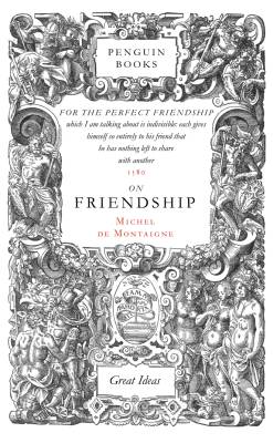
I think any graphic designer would definitely love the entire Great Ideas set from Penguin. Loverly typographic covers adorn some inspiring—if not downright revolutionary—texts from smarty-pants know-it-alls like Nietzsche, Woolf, Freud, Orwell, Marx and others.

Michel de Montaign's essay On Friendship is so moving I almost cried... in a laundromat. IN A LAUNDROMAT.

You, my friend, will be a romantic hero when this gift is opened, and I want royalties on all the love you get.

Ha.

Your impassioned description almost had me crying!

"...and I want royalties on all the love you get."

I don't think the EULA will allow THAT :-)

ChrisL

Two of the best type books of the year in English seem to be 'Printer's Types of the Twentieth Century' and 'The Stroke'. If Hrant doesn't buy them for me, I'll have to get them myself ;-)

I have lowered my cholesterol but I still got "The Stroke" :-)

ChrisL

If you got the bucks or win the lottery you can get her one of Eric Gill's praised engraved illustrations with type, printed from the original blocks!

His prints first appeared invariably in tiny editions or as illustrations in limited edition books, such as those he illustrated for the Golden Cockerel Press. We are fortunate that in 1929 his friend and publisher, Douglas Cleverdon, produced a book of his prints, all printed from the original blocks. This was followed 5 years later by a second similar book, this time published by Faber.

And they already framed!

I guess I would have trouble owning anything Eric Gill touched.

ChrisL

Whats the joke with Eric Gill ? I missed something.

I certainly would not like Mr. Gill to touch me Eric...

What about an Octavo classic books such as Manuale Tipográfico (Bodoni) or Hypnerotomachia Poliphili (Aldus) or Chaucer (William Morris), etc...

You could even make a big print of a page for wrapping paper.

Héctor

i didn't get it too. maybe they're talking about the paraphilia to his daughter.

There was a lecture at TypeCon this year where the presenter described Gill's life using his personal letters and writings. Lets just say that Gill made me ill and no father should do anything like that to their daughter. That is the first lecture I have ever walked out on and it had nothing to do with the man giving the presentation.

ChrisL

When I was writing my essay on Perpetua, I found it very useful -- and necessary -- to separate his life from his work. For reference I had to read a few of the biographies, some of which did not have proper indices. Let's just say I found myself learning a little more than I needed. :^/

Another option might be something like this ring

http://www.etsy.com/view_item.php?listing_id=42072

or this one from the same artist

http://www.etsy.com/view_item.php?listing_id=37753

I know that I'd love to receive either of them. Good luck. A.

There's a new calendar product called a whomi, the target audience might be parents but there is a "solo" version for the non parent. for the Typophile I of course am recommending the giant 06 version (called "modernist"). http://mywhomi.com/

thanks for the ideas everyone - i ended up getting some lead type on ebay that i think she will love.

now........... creative present packaging!

"now……….. creative present packaging!"

Wrapped in specimen sheets?

ChrisL

Try Linotype - I got a very cool T-shirt from them on some convention which reads "Type and the City" and is made up of fonts which make up some skyline. New York, if I am not mistaken. My girlfriend simply loves it ;-)

Maybe the typographic version of "Pull my finger" called "Letter RIP" :-)

Gee, I even have to aplaud myself on that one even if someone else might think I didn't cut it :-)

ChrisL

It's not too late (12-15-05 at 10:30 CST!) to get the final issue of Emigre.

Mostly shameless (but still with a good bit of shame) promotion of type related decorations and cards. Just in time for all you procrastinators to probably not get this by the Holidays, but there might still be time. For the rest of you, start your shopping early for next year, or just give a late gift this year.

Happy Holidays!

http://www.youshouldliketypetoo.com

> If Hrant doesn’t buy them for me, I’ll have to get them myself ;-)

William, tell you what, when I publish my full formal
rebuttal to The Stroke I'll send you a free copy... :-)

BTW, give me your ground address and I will send you something [modest].
hpapazian at gmail dot com

hhp

my full formal rebuttal to The Stroke

oh my… I tremble at the thought. Really? Is it so bad that you need to formally rebut it?

Where and when?

Bad? No, I’m familiar enough with GN that I presume it’s very good (I haven’t read it yet). In fact I owe GN a lot: he’s the reason my anti-chirographic thoughts have become crystallized.

> Where and when?

Place: Cyberspace of course.
Time: Right after I take care of my New Year’s Resolution.

hhp

So, wait. You haven’t even read the book yet, but you are planning to publish a rebuttal? Isn’t that putting the cart before the horse? What if its better than you think it is? ;-)

I know what’s in the book because: I’ve previously read virtually everything he’s written in (or had translated into) English; and I’ve discussed his view extensively with many others for a while now. In fact his ideas are pretty obvious once you think about them (although it takes an eloquent expert like GN to put it into clear words). What’s not obvious is the “dark side”.

BTW, a lot of what GN says I agree with - in fact some of the things he says make me want to hug him! But it’s certainly ironic that I agree with the things he says in proportion to their distance from type.

hhp

Re. Gill. Yes, a badly broken man in many, mostly sexual, respects. My friend Alan Wall described Gill’s attitude as ’priapic adventurism’, which I think is a fair assessment. To be fair to Gill, his diaries do indicate remorse over what he did to his daughters, and they for their part seem to have forgiven him and not ceased to love him. [One of Gill’s grandaughters, Petra’s daughter, lives in Vancouver, by the way, and sent me a very nice catalogue of the paintings, drawings and engravings that David Jones had done for her mother.]

I was disappointed in the article to which Chris linked, since the author seems intent on using Gill’s pedophilia and Penty’s socialism — which he clearly thinks on par morally — to dismiss the distributist movement. In fact, neither Gill nor Penty were ’founders’ of the distributism, as the article claims, and the economic philosophy was formulated in England by Chesterton and Belloc and based on Leo XIII’s encyclical Rerum Novarum and other Catholic social justice teachings of the 19th and 20th century. What Gill and others tried to do was apply this philosophy in the particular context of rural communal life: a kind of Catholic back-to-the-land movement. The philosophy of distributism, particularly its dual critique of both capitalism and socialism, shouldn’t be dismissed because of the moral failings of one of its advocates. [Also, as someone who has recently moved to a rural community and is giving a lot of thought to the differences between life here and in Vancouver, I think the critique of industrial urbanisation in, for instance, Fr Vincent McNabb’s The Church and the Land has a lot of merit.]

Hrant, I think you might find very little to rebut in The Stroke. While some of what Noordzij wrote in the occasional pieces that comprise Letterletter may be taken as a kind of chirographic design advocacy — although I’m not convinced that it is intended as such —, in The Stroke he is explicit in stating that what he is outlining is a way of analysing and describing what one is looking at in writing. There is almost nothing in the book about type design or typography: it is really presenting a new methodology for palaeography and other studies of specifically written forms that focuses on deciphering how strokes were made during writing rather than on the classification of the resulting letterforms. There is an adaptive functionality available to type designers from this methodology, that can be utilised to aid judgements that affect, specifically, uniformity or harmony of structure as it contributes to the overall style of a typeface. That is, it is a methodology that assists in aesthetic decision making, and is not intended or promoted as something that overrides or undermines other methodologies, whether focused on the aesthetic or functional aspects of type. Noordzij doesn’t even go this far — this is my own formulation of what I find useful to my work in his analysis —; as I say, he barely mentions type at all.

“I was disappointed in the article to which Chris linked”

Sorry John, I just googled for something on his life that mentioned his problem. I did not intend to vouch for it as a recommended source. A prior poster wanted to know what the “problem” was and I did not want to discuss it in this tread. Is it possible to remove the link if it is so inaccurate?

ChrisL

John, I do need to read the thing.

But you seem to again be invoking the “GN doesn’t prescribe, he describes” escape clause, which I don’t buy: he makes fonts in a certain way, and he has encouraged others to do likewise via the classroom. Of course, it’s only natural for somebody to teach what he believes; but I hope it’s also natural for people to look beyond the charisma and intelligence and see the anti-typographic emotions fueling the whole operation.

hhp

You were talking about a rebuttal, specifically, to The Stroke, and this is what I think you will find, when you read it, a misplaced notion, because The Stroke is not a book about type design or typography. It is a much more narrow piece of work than Letterletter, which covers a broader application of Noordzij’s theory. I think there is stuff in the latter to which your critique applies, but I think you will not find it so in The Stroke. It is a much less polemical work than Letterletter — excepting when he briefly gets onto the subject of how reading and writing are taught in schools —, and basically consists of an analysis of a number of different stroke patterns in writing to determine how they are made and how to describe them. It is a book about looking at written forms.

Because Noordzij’s books have been published by typography and design oriented publishers (Hartley & Marks, Hyphen) and he has taught in a type design programme, I think we are tempted, as a community, to presume that we are Noordzij’s audience and that he is telling us something about how we should do what we do. But what strikes me about parts of Letterletter and basically all of The Stroke is that he directly addresses palaeographers and students of writing systems. If you drop the presumption that he is talking to type designers, and read the books as a critique of assumptions and methodologies in the study of the history of writing, I think you get a truer picture of Noordzij’s engagement.

Captured from web.archive.org on 19 Oct 2013. view this capture