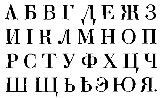
The serifed Cyrillic alphabet uses many Latin forms, several of which are the same in both upper and lower case, but styled differently, with different kinds of serif -- for instance c has a straight serif in upper case, a ball in the lower.
However, Cyrillic-only characters are generally "serifed" the same way in both upper and lower case.
There have been some departures from this orthodoxy, in particular Vladimir Yefimov's "Kis" typeface, where the upper case K form has a straight top right arm and serif, but a curved-with-ball form in the lower case.
So I'm wondering, if I were to design a Cyrillic extension in a traditional (Western) genre, and introduce subtle differences between upper and lower case serif treatment, would indigenous readers think:
- damn foreigner doesn't know what he's doing
- that's cool, just like Yefimov
- didn't notice, as long as it reads smoothly, not an issue
Also, what has been the reaction to Yefimov's Kis? Is it considered a quaint anomaly, or as a provocative new direction?