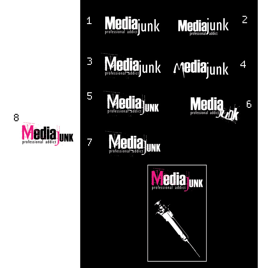
As i’m about to creat my personal playground, i thought i would create a new personal logo.
My personal is n° 8.
any opinions?
thanks!
| Attachment | Size |
|---|---|
| mj.jpg | 72.78 KB |
As i’m about to creat my personal playground, i thought i would create a new personal logo.
My personal is n° 8.
any opinions?
thanks!
| Attachment | Size |
|---|---|
| mj.jpg | 72.78 KB |
Hmmm I agree about #8. What about a giant extra fat ‘J’
Maybe even put ‘media’ inside the extra fat J. The J could have texture/s.
What is this going to be? A blog about media?
I agree, go with 8.
Well, I work as a professional interactive media designer, but i’m planning some personal projects that i would like to display as a digital media/art collection. Breaking the daily commercial thinking with a hidden abstract thounghtstring. That in it’s turn would help me out on a professional level and in a way it would build my confident to advice clients and to pursuade them into “going off the path” designs.
Using all media as i daily get soked with it ;)
What do you think about the J in number 8, it feels a little small.
I agree the j seems small in 8. Junk is ther Key Idea - no? Which is why I was wondering about a bigger j. I also thought of another idea.
What if you had a railroad spike & then bent the end to make a J? A spike is of course slang for the needle so it would be less direct but still connected. And you wouldn’t need the needle then either… Also a bent spike is junk in some sense -litterally. Because it’s useless - unless you use it as a J in a bit of media…
Anyway. I encourage you to keep playing with it until you get a set of size & spacing relationships that gel for you. 8 Is good as a purely visual design but I think it deemphasizes the key idea so you should keep going.
I agree with everyone that #8 is the strongest design. The only thing bugging me is that the J is set using a serif font while everything else is sans. Is there a particular reason for doing that or is does it appear like that purely because of the distressed effect?
As an aside I also like #6 but it’s offputing because the “junk” has slid right off the boundary of the logo. While I do appreciate the metaphor that the junk is being sort of disposed of you do not need to overstate this. Just by setting the text in a grungy distressed type you have established its feel. Try #6 with the “junk” text aligned similarly to #8 and let’s see how that looks.
-mmilo
some variants keeping the comments in mind.

Well I dunno about you but I really like the way #11 turned out, particularly how the junk text looks splattered on. Actually I pretty much like all of these latest ones they all have their nice qualities, but my personal favourite is 11. The only thing I could suggest is to perhaps consider different colours and see how those look.
thanks mmilo, I made same colour variations, my personal favorite is 13.
As i’m new to this forum and logo-design i sure appreciate these imputs!! thanks!

that’s a really provocative design…
but the name… an acquaintance of mine in ireland has this site:
http://www.mediajunk.com/public/
i remember once searching for it and noticing there are a few “media junkie” and “media junk” sites, so i was confused trying to find his.
but it’s probably ok to have more than one. and you are probably very different types of projects/ideas… i’m sure you had considered this just thought i’d mention it in case you hadn’t.
Those look fantastic, and you’re right about #13 the colours look great. Personally I like all of the duotone ones, 13, 14, 16 and 17; I think they all work really well. Nice work buddha I really like how it’s turned out, let’s see what some of the other folks think.
-mmilo
I like it knocked out of the black rectangle because it really jumps out at you but it’s not smart to put it in a shape like that for no reason. I like 16 and 17 the best other than that.
It’s gonna be a purely personal, non-commercial design and interactive media playground. I’m belgian, so www.mediajunk.be is already mine.
I also like the idea of Junk in the two meanings of an addict and trash. This leave a room for ideas.
By the way, provocative isn’t bad is it?
thanks for the comments
yep, i put in the white logo to see it as a mono-color print. For stickers or other print material in mono color. I’m pretty new in creating logo’s but i always keep in mind that it hase to be in vectors and i can be used in the worst possible print conditions(mono-color for instance). That way you don’t run into to many problems in the end(print/web).
Buddha,
Looking pretty good. I wish the J was a little bit bolder though. I like the hot pink, and maybe try lime green with black.
Junk = trash, drugs
Junkie = addict
I like the new stuff too. I think 10 might be stronger but it’s a question of preferred association too. 10 reads as ‘junk=drugs’. But 11 reads m ore as ‘trash’ to me. I have no idea if reads that way to you too or which association you want to play with more or why. In any case I agree with Lauri ( antiphrasis ) that the J should be bigger.In a way it’s the hook bothe letterally ( it’s hook shaped ) and figuratively - because it’s first letter in the the odd/interesting word. I think making more of it would jive you a stronger result. And lastly, I don’t know that you need to enhance the M in media with the color of the J. I like having just the J be in color. Making all the spotches & scratches be colored too might be cool.
- antiphrasis -
Junk = trash, drugs
Junkie = addict
- /antiphrasis -
In the dutch language a “Junk” is a more commonly known anglo-abbreviation of Junkie.
Gonna make a few addjustments to all comments next week to end-up with a typophile-inspired logo ;)
thanks for the comments
Captured from web.archive.org on 22 May 2006. view this capture