
Avant Garde Gotchic Book Alternates doesn't have an SA ligature, so I'm looking at this.

So I tried this?

or this?

What do you folks think and do you have any suggestions? Any help greatly appreciated... I just can't seem to get it right!
Avant Garde Gotchic Book Alternates doesn't have an SA ligature, so I'm looking at this.
So I tried this?
or this?
What do you folks think and do you have any suggestions? Any help greatly appreciated... I just can't seem to get it right!

i would suggest to use the other A,
the one with the first stroke vertical,
but again, that depends if you have other characters following...

i prefer the second one. But then again, what's the context of this?
Hmmm,
Why use an unreadable type face. Is it free?
Gerald Giampa
Both are ok. #2 if it's going to be large. Any smaller than that sample and you'll clog the little counter.
Gerald - Perhaps you're looking only at the Alternates font. Here are the standard weights of Avant Garde Gothic.
Be afaid of Avant Garde with alternates. Only a few people could handle them without looking just terrible. The ligatures have that 70' feel and I'd hate to see the days of negative leading and negative kerning come back. I like being able to read type.
>Avant Garde Gotchic Book Alternates doesn’t have an SA ligature, so I’m looking at this.
Probably because they try without any satisfying result.
BTWI like your first one
Here one suggestion:
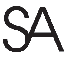
More suggestions:

Stephen Coles,
Correct me if I am wrong, but the trouble seems to be with the alternates. My advice is not to kern, but letterspace. And forget the alternates. Have you ever read Stanley Morison's opinion about setting italics in uppercase? I don't care if the slope is as backwards, as backwards as attempting to make this work. The problems are identical to Morison's description. It won't work, we all no it won't, so give it up!
Even without the alternates, "letterspace".
Certainly you agree.
Gerald Giampa

>Correct me if I am wrong
GG, you are right, but in the wrong universe.
Herb Lubalin invented his ligatures to enable him to tighten up and square off display settings, such as this cover from 35 years ago.
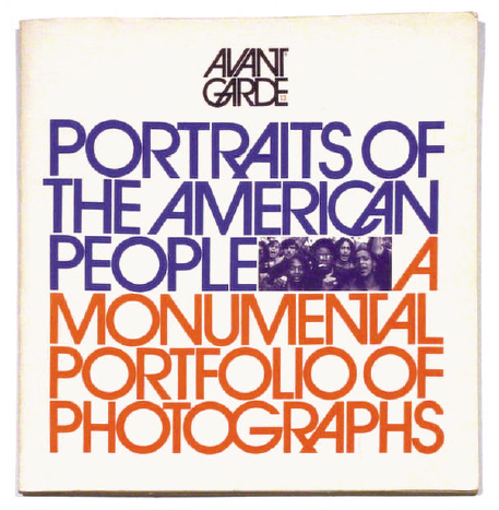
Nick Shinn
Herb is character and so are you.
This face stinks and as much as I have complained about Hrant's ubiquitous pursuit in his attempt to design the "Ferrari of typefaces", he, and I, would agree this face is far from the mark. If you can't set a word without a committee where are you?
Leaving the reader behind.
Get over it Nick, don't suffer from “Lettraset” nostagia?
Gerald Giampa

Giampa is BACK :-)
ChrisL
Chris,
No one loves me, I am going to go eat worms.
Gerald Giampa

Stanley Morison was talking about typography for books. Avant Garde was quite obviously designed for display purposes.
The beauty of having the alternates available again is that they can be re-discovered and enjoyed all over again. It isn't fair to warn people against using them. It is better to show them great examples of use and then let them play.
Perhaps more to your taste GG, Matthew Carter's Mantinia provides alternate small forms and strange double-letter contractions. The purpose is the same, "let them play", as Tiffany says.

I don't like Ferrari.
But yes, many of those ligs do suck, including on that cover.
hhp
Not the most constructive criticism, Hrant. :^} Can you tell us why they suck?
The "GA", "RA"s and "CA" create patterns out-of-character in their
distractiveness. Also: the stem-to-stem (and diagonal-to-diagonal) tightness is dysfunctional; the "T" is too narrow; and the middle bar of the "F" is too long (except in that "FO"). I would also make the "U" wider and give the "P" a bigger head... Although not as big as that of people who would use AG for more than one word at a time... maybe.
You know what makes me happy? That I'm not about 10
years older: I might have ended up actually like this stuff...
hhp
That's better. :^}
Tiffany
"Stanley Morison was talking about typography for books"
I am referring to Stanley Morison's diatribe about setting italics in uppercase.
Although, that said, he spoke of not liking italics in text. He thought a sloping italic made more sense. I agree Tiffany, Stanley Morison must have been an idiot. Why would he have designed "Times Italic" (1931) after his dissertation in "The Fleuron" (1926)? Did Morison read, or even believe his own article?
Makes one wonder if Stanley Morison designed Times Italic? Think about it!
Take a gander at the SA ligature in the illustration somewhat above. Failure—yes? But not any worse than Nick's ephemera. Avant Garde with Alternates would make blindness a pleasure.
Shucks Chris, putty is for toddlers, hot lead is for typographers.
Gerald Giampa
Avant Garde ligatures: Making God into dog.

I don't like the cover--too clunky, the criss-cross ligatures too distracting--but I admire its confidence and daring. The C and A, though, should really have the sense of decency not to do that kind of thing in public!
Chris,
Better quality putty, Matthew Carter’s Mantinia. It is a novelty when I am just—almost right.
Gerald Giampa
As someone born in the early 1980's, I tend to like Avant Garde and its alternates, probably because I didn't live through the '70's.
Avant Garde
Black velvet paintings, turquoise livertables, lavalamps all those things I hated when they were "hip", why I ask, would I like Avant Garde now? "Mid century antiques?"
Am I missing something, do you folks strut ducktail haircuts, white socks—beehive hairdos?
Am I about to suffer through my past, "young bubblegummer chicks"? I say whoa to that! Thank god for womens lib.
Gerald Giampa
Typophiles,
Also, that is why Miss Tiffany is such a breath of fresh air. My hat is off for her.
Gerald Giampa
Also, I miss wrote,
lthough, that said, he spoke of not liking italics in text. He thought a "sloping italic"—(read: sloping roman, sorry) made more sense. I agree Tiffany, Stanley Morison must have been an idiot. Why would he have designed “Times Italic” (1931) after his dissertation in “The Fleuron” (1926)? Did Morison read, or even believe his own article?

Regardless of anyone's critique or feelings about AGG with or without alternates and ligatures, I bet Herb Lubalin and Aaron Burns (and maybe Ralph Ginsberg) would be laughing their venerable arses off about the continuing releases, re-releases and re-marketing of what NEVER began a "typeface" to start with.
'The dedication page of the first issue of Avant Garde magazine reads: 'As most of the world's ills are traceable to old imperatives, old superstitions and old fools, this magazine is exhuberantly dedicated to the future.'
'For one who finds the present almost impossible to contemplate, the future is absolutely beyond my realm of understanding. So when Ralph Ginsberg asked me, in early 1967, to project myself into the future and design an avant garde logotype for Avant Garde magazine, I felt entirely inadequate to the task.
'I had three alternatives: (1) reject the job, which would automatically admit defeat; (2) reveal myself as a failure, which wittingly I would never do; and (3) make a satire of the name (which I felt was the only avant garde way to interpret what avant garde means — and what avant garde means is meaningless, since once it is seen, it is no longer avant garde. ) I chose alternative no.3)
'I submitted the logotype in Old English, Bank Script, Cartoon Bold, Dom Casual, Flash italic, Wedding Text, Monastic, Buffalo Bill, and a last-ditch effort reflective of Coca-Cola.
'Ginsberg said, 'Stop kidding around!.'
'I then tried to dazzle him with a multitude of ornate swashes which usually does the trick. He said 'Cut it out!'
'It was clear that I had to produce a piece of typography unlike anything done before. The juxtaposition of the letters AVA with their related slants was evident in several of my sixty abortive attempts, and it became critical in the cockeyed lettering of my final sketch. As soon as I worked out a pencil rough, I knew I had hit on the ultimate solution. I can't really remember doing it. I only remember it being there on my layout pad.
'When I looked at the lettering there was a feeling that I only remember having once before in my graphic lifetime, and that was when I designed the 'Mother and Child' logotype. I knew the Avant Garde logotype would stand the test of time and remain avant garde for a long time. It was a subconscious or intuitive feeling that you get only occasionally — a feeling that you have created some thing that cannot be made better — by anyone.'
The logo was the basis of the typeface design we know today as 'Avant Garde'.
Now, obviously, Herb "prettied-up" his tale about how "Avant Garde Gothic" came into existence for marketing purposes. Basically he would have said, "Jeez, Ralph... quit your f*?king whinning and use the goddam mother-f#@king logo and stop being such a big a@#hole!"
Meanwhile, time passes, and Aaron is scratching his forehead thinking "How are we [ITC] going to make money with all these half-drawn designs from PLINC?" or something like that.
"I know, let's get all of our friends and design buddies MAKE them popular by using them in high-visibility ad campaigns! Hmmm, and the logo that Herb did for Ralph, some folks have been asking what font they used... well, let's quickly make it a typeface so we can license it to Linotype, Monotype and Compugraphic! I'm sure they might stay popular for a couple of years while we start building new designs."
Truth is always better than academic posturing. =o
Thanks for sharing that. I love it.
Who is posturing?
Gerald, it seems Morison lead a dual life as his advertising design attests. He may have been a fine typographer, but his design -- that which I've seen -- wasn't so good. I'd guess that he might have wanted an oblique but new that it wasn't going to fly. An besides, even Jan Tschichold has been forgiven for waffling. =^D
> Who is posturing?
Actually, no one on this thread. It's just that I've been visiting a lot of graphic design and design critique sites/forums, and it was just a bad taste I still had when I wrote about the true-novella origins of AGG.
Phew. I was worried you were calling me on something.
=^D
>Herb “prettied-up” his tale
It's a great story, which may even be true. Not knowing any better, here's what I assumed: he was fond of ultra tight, squared-off settings, and Futura demibold. So I imagine he would have tried this, and then taken it a step further...
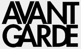
Also, I believe that Lubalin, with the assistance of Tom Carnese, had developed the logo as a font for use in the magazine prior to ITC -- may even have had a typositor filmstrip made.
Avant Garde bears some interesting parallels with Neville Brody's Industria. Both were developed by magazine art directors (with alternates) for specific publications, both becoming instrumental in giving face to new type technologies.
> developed the logo as a font for use in the magazine prior to ITC
It was, Nick.
I don't have my source material at hand (some early sketches for the magazine logo) but AFTER the logo and after an issue or two of Avant Garde magazine, Ralph Ginsberg started bugging Herb to use the logo-face for captions inside.
Apparently, according to legend, AGG was expanded character wise hastily and new characters as needed. Though I do believe when the oblique characters were finally commissioned and developed by Christian Mengelt and Erich Gschwind in ’77, they were all designed together.
I guess that "S" in AvanteGarde has always bothered me. I have always wanted to take an auto-body hammer to it and bang the dents out.
ChrisL
I'm afraid of how younger designers who haven't a clue about its history will abuse the alternatives. It should be a horror show.
Do not fear, Dan. Most of the printed world is already a horror show. Never mind the bollocks.
In my mind, introducing new tools is only a positive thing.
The skill of the user can overcome the failings of the tool. The Failings of the user can overcome the skill of the tool.
ChrisL
Or as Herb Lubalin would have said,
"Holy sh#t! What kinda crap are you designing now?!
Were you sleeping in my class again?"
Stephen I would agree but the slanted (fake italic) version of this face is an embarasment. I agree alot of print about fashion and not thinking about the end user.

Does anyone else have a problem with the Academy bus line logo? horrible spacing because of the second alternate A makes it look like AC ADEMY :-?

It's interesting to hear how much older generations have a distaste for the overuse of Avant Garde. I see it with fresh eyes, so it doesn't have the same baggage for me, although I can't think of any application for it besides being a display face.
I'm wondering what modern-day overused typeface from the last 10 or 15 years is going to make a comeback 30 years from now and drive me crazy.
Arial?
ChrisL
Is Comic Sans has 10 or 15 years old?
André ;^j

> I’m afraid of how younger designers who haven’t a clue about its history will abuse the alternatives. It should be a horror show.
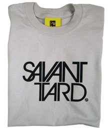
Dan, you could always award this little booby-prize for those who misuse the alternates/ligatures (or accidentally use them well?) :
I agree that is a horror show but you haven't even seen the worse that will happen. Its scarry.
I love that Savanttard!
ChrisL
Horror show? It's beautifully done.
Hm. I wasn't implying this usage was a horror show itself.
However, it was in response to Dan's orginal comment about young designers discovering the possibilities of the typeface for the first time with no contextual awareness of its orgin... perhaps to the effect of a horror show, or possibly even for greatness (as an idiot savant, which this is playing off).
---
This does use an 'SA' ligature, which was the original intent of this thread. Didn't notice that when I posted it! More appropriate than I thought...
Just a couple comments:
- Lubalin is one of my design heros. So to say that young designers are unaware of the context of Avant Garde is a bit obtuse.
- You guys realize that we did that Savant Tard shirt, right? It was for that graphic that this thread's question was intended.
> You guys realize that we did that Savant Tard shirt, right? It was for that graphic that this thread’s question was intended.
Ha! That's too perfect. (So, no -- I didn't realize it was the same source.)
> I’m afraid of how younger designers who haven’t a clue about its history will abuse the alternatives.
I guess this applies to ANYONE "without a clue" young or old.
Even during Lubalin's lifetime during the '80s, seeing alternate ligatures running amuck was as bad as a sharp stick in the eye.
Postscript (meaning p.s.)>
ITC Avant Garde was just one of several typefaces with multiple ligatures, alternates and swishy-swashy characters -- ITC Lubalin Graph, ITC Benguiat, ITC Bookman, ITC Zapf International, ITC Serif Gothic, ITC Ronda, ITC Gorilla, ITC Grizzly, ITC Busarama, ITC Zapf Chancery, just to name a few.

does anyone have any examples of ITC lubalin graph's ligatures and alternates? Just Curious...
maybe somewhere here

The record label Great Stuff has been using the ligatures heavily, what do people think of this?:
http://www.discogs.com/image/R-1036601-1190411238.jpeg
http://www.discogs.com/image/R-1022849-1185711980.jpeg
http://www.discogs.com/image/R-888483-1169485761.jpeg

I’m sure I show my foolishness by commenting in this thread, but look at the writing of the time. Paul Krassner was one of many pranksters that wanted to violate the reader. How could Mr. Lubalin not rise to the occasion?
No wonder David Carson set that Bryan Ferry interview in dingbats.
Captured from web.archive.org on 27 Dec 2010. view this capture


