Typophile

Dense text!

From my 1911 Encylopædia Britannica:
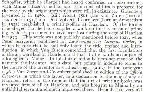
Here, the double space after a period is a helpful marker to a reader of the tightly leaded text (look at the attachment to see the whole page). Modern book designers would never use 2 spaces after a period, but in a set of books that even densely set expands to 30 volumes, I can see why they would want to economize.

Fortunately we now have the benefit of much more economical type, so we can avoid such tight leading. That typeface there is pretty wide.

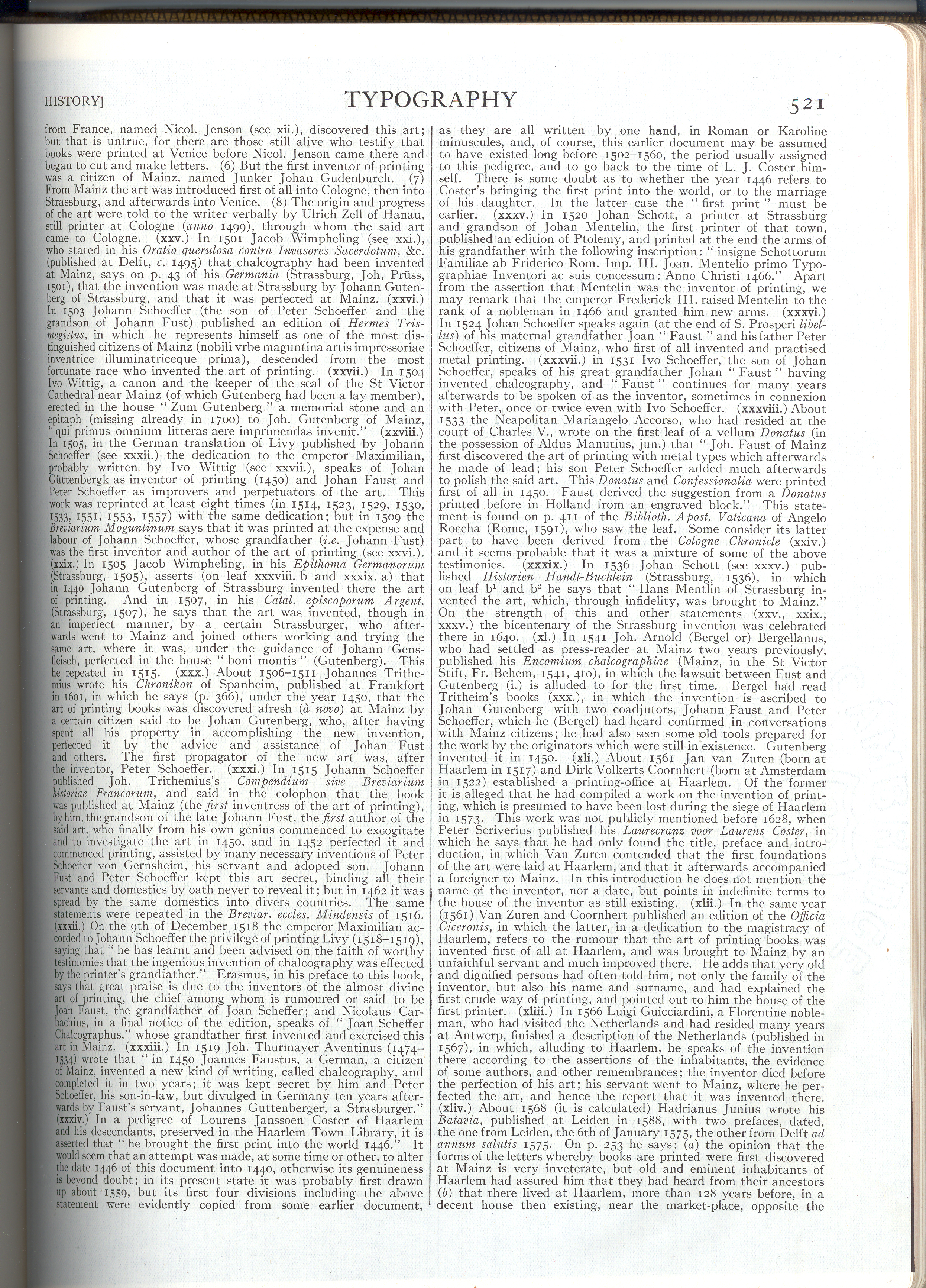
The whole page:

Big version

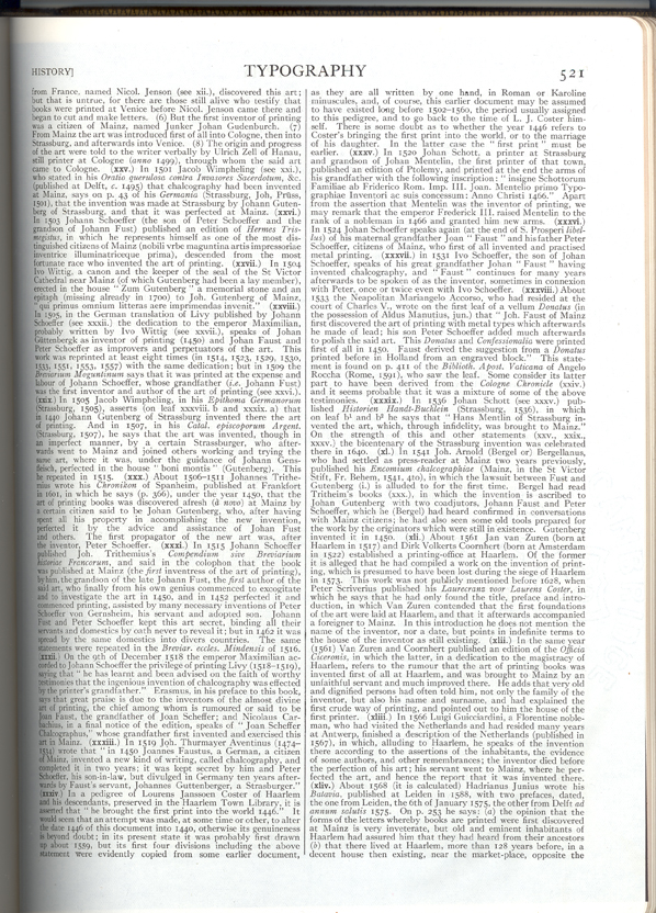
Little version

If the paragraph weren't justified, I might say maybe...

But:
1) What's the point size?
2) Multiple columns, anyone?

And Stephen:
1) We've always had economical type.
2) Much more than the width, it's the depth.*

* http://typophile.com/node/15367

hhp

A river runs through it.
Actually, several rivers. It looks like rill erosion.

ChrisL

Captured from commoncrawl.org on 25 Apr 2015. original URL