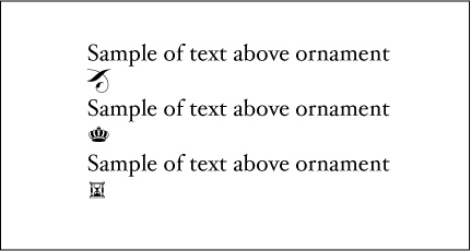
I am currently working on designing a book of poetry and photographs. The author and I have been discussing using a small illustration or ornament to mark the end of each poem and we would like it to reflect the central theme of the work: time. The text will be set in Hoefler Text, so I'd like the illustration to work well in conjunction with this typeface. I've attached two PDF's (page view and detail) of my idea and would appreciate your comments/suggestions. I'm not a type designer, so I feel like I'm a bit over my head on this one...
In addition to any comments on this particular ornament I'm designing, I would love to hear more about how (or even why!) type designers go about designing ornaments for their typefaces? I've had a look at some of the Hoefler Text ornaments, but I don't really understand their unifying characteristics. Is there anything in particular that I should be looking out for?
Cheers,
Scott
| Attachment | Size |
|---|---|
| hoefler_text_ornament_page.pdf | 182.18 KB |
| hoefler_text_ornament_detail.pdf | 33.64 KB |