
Came across this in an event guide. The “h” and “g” redesigns are personal favorites.
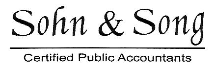
Came across this in an event guide. The “h” and “g” redesigns are personal favorites.

The lowercase characters are just Monotype Corsiva (a.k.a. the Zapf Chancery stand-in) rotated backwards a few degrees. It looks like the “ng” was rotated as a unit. The ampersand is Times New Roman. The two S’s appear to be Garamond, stretched a bit horizontally.
This is not what I would call fine typography. An interesting amateur effort, though. (Sorry for the dismissive tone, but that’s my honest opinion.)
Sorry Mark, I forgot to add the “sarcasm emoticon”. Impressive detective skills, though. I only got as far as (slightly squished) Monotype Corsiva.
This was in a guide for an event I attended with my girlfriend’s family — who thought I was kind of nuts for going off about “crimes against type” for several minutes.

Haha I missed the sarcasm too. Understood now though! Squished type is all too common. ::shudder::
Sorry Mark, I forgot to add the “sarcasm emoticon”.
That’s a relief. I thought it was hideous and I was starting to feel sorry for you. You’re new here, so I wasn’t quite sure you weren’t serious. People sometimes do think such things are cool.
It’s difficult to convey a sense of humor online. In person (or even on the phone), people can (usually) tell you’re kidding. I resort to emoticons more often than I’d like. They are useful in a dumb kind of way.

“I resort to emoticons more often than I’d like. They are useful in a dumb kind of way.”
I feel the same way Mark, If we didn’t use them people would have a longer double take before getting the joke. The downside is, some people would perhaps be hurt or insulted so I err on the “dumb” (most of the time).
ChrisL
Perhaps we need a new system of “emoticons that don’t suck”. I occasionally think of using existing ones, but then for some reason feel like a 14-year-old... and then there’s the occasional and unwanted addition of jittery graphical icons. (shudder emoticon)
[:=+I
Some of them make me feel like a blockhead. I hate the automatic GIF variety which interject themselves without being asked.
ChrisL
Captured from web.archive.org on 9 Apr 2008. view this capture