Hi,
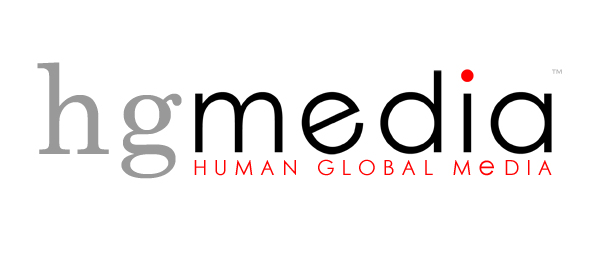
Just wanted to get feedback from everyone on this logo...
Thanks,
Brady
| Attachment | Size |
|---|---|
| hgmedia_logo.jpg | 31.2 KB |
Hi,
Just wanted to get feedback from everyone on this logo...
Thanks,
Brady
| Attachment | Size |
|---|---|
| hgmedia_logo.jpg | 31.2 KB |

The lowercase 'e' in HUMAN GLOBAL MeDIA is out of place. Being just a scaled-up lc, it appears to become a different weight than the other characters in that line of text and so it sticks out.
I agree. It does look a little out of place! Thanks!
First what is Human Global Media. That is a meaningless statement. You will have to have explanitory copy or a tagline to make it work. I agree the lowercase e in the red Media looks like a mistake. Look at a unicase typeface, something from Emigre comes to mind. I don't understand the kick e In the black media. It seems out of place and doesn't have any apparent meaning. The red dot over the i is meaningless, either make it black or eliminate the dot. Its a good start keep going

Yes, keep going. This one isn't sure of itself. What's the business? This logo reflects nothing. It looks superficially like a logo but it won't do the work of a logo. A logo can only work if it has a task to perform. Define that task & you have a chance to make something decent.

I don't mean to be harsh, but this one is off on all sorts of levels. The two primary fonts are in conflict, rather than providing contrast; that is, the "style" of each of these fonts simply aren't working together (you've got a neoclassical serif with a geometric sans, which are more or less on diametrically opposed sides of the fence). Then the kerning is pretty much broken: the "g" here seems more associated with "media" than the "h," and all of the main letters have too much letterspacing goin' on. The red dot is disproportionate to the letter "i" and is thus too obvious a gimmick. The "e" in the primary "media" looks to have been rotated for no real reason other than to be "different," which is compounded by the fact that the "e" in the tagline "media" ISN'T rotated (plus the weight issue mentioned above). Then there's a proximity issue in that the tagline is too conveniently shoved in to align with the descender-line of the "g". And then there's that floating trademark that isn't really aligned with anything. Again, I don't mean to be a jerk, but this design seems to be ignoring all of the basic principles of typographic design, even by good old Robin Williams' rules (see "The Non-Designer's Design Book").

I agree with Jason on many counts, particularly the mismatching of the fonts. Also, type shouldn't have that much of a size contrast in a logo, when it gets small, the 'human global media' will turn into little red dots.

Neoclassical & a geometric sans can have a lot in common. Moderns, though, are even further engineered and would probably match best. Most importantly whatever you choose should serve a specific purpose.
Captured from commoncrawl.org on 19 Apr 2015. original URL