
Long story short: My grandfather wrote a book a few of years ago about his experiences in WWII. I helped him set it and get it published, but, frankly, I didn't do a very good job. Young, inexperienced, etc.
For his Christmas present I'm re-setting the whole thing properly and publishing a nice hardback through Lulu.
I've done the interior (and will post it up for crit soon, in a different thread), but I'm struggling with the cover. All illustrations were done by my grandfather for the first edition, and I'd like to re-use them for sentimental (his) reasons, but don't be precious about critiquing them too, I'm not. I've chosen Gill Sans as the book's titling face for it's obvious historic references. It definitely evokes war-time britain IMO (though the book is of course set mostly in France and Germany, so maybe I've goofed there...)
Here are two directions I've taken, any and all comments would be wonderful and welcomed:
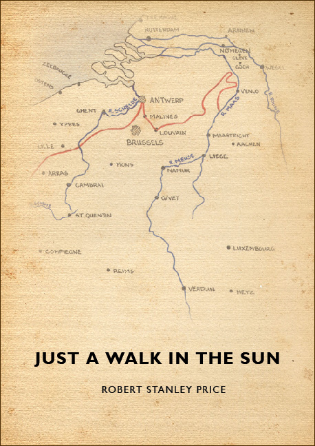
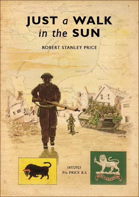
Thanks in advance,
Jordan

