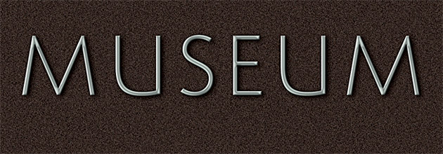
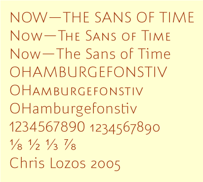
"Now" is the "other" face I have been working on since Typecon (I alluded to it in my posting of "Align")
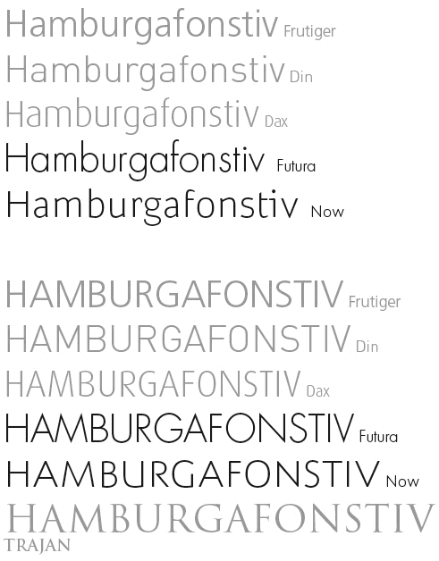
I started it with the capitals, trying to achieve classical Roman proportions in a light monoline sans serif. I then did the small caps since I like to use caps and small caps together in heads and subheads. The caps, with or without small caps, might be usable as inscriptions when used alone but my intention from the start was for the lower case to be a text face. The proportions of the lowercase follow Roman as well.
For Now, I have only done the Light weight. The other weights will follow.
Below is a quicky GIF and I have also attached a PDF showing text sizes down to 6 point in several languages (English, German, French, Italian, Czech, and Polish.)
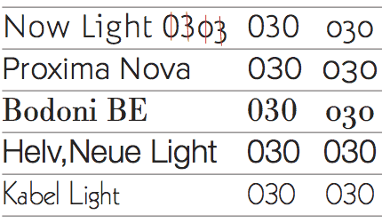
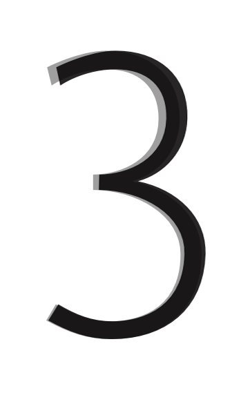
OTF features include ligs, small caps, oldstyle figures, and fractions built from the nom/denom.
The Now name and Time concept come out of the use of classical proportions in the context of present-day sans serif.
Please let me know what you think.
ChrisL
I have posted version Latvian text . See bottom PDF:
| Attachment | Size |
|---|---|
| Now_postTpfle.pdf | 139.15 KB |
| Now_postTpfle2.pdf | 140.78 KB |
| Now_postTpfle3.pdf | 89.44 KB |
| Now_postTpfle4.pdf | 70.04 KB |
| Now_postTpfle5.pdf | 142.46 KB |
| Now_postTpfle6.pdf | 91.15 KB |
| latvian_un_text.pdf | 34.3 KB |