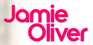
Hey folks,
I know, I know... I'm a type philistine and should really know this one, I also seem to recall cropping up in a few places actually... but they escape me at the moment.
Anyhow... any guesses?
G
| Attachment | Size |
|---|---|
| jamie_oliver.jpg | 50.21 KB |
Hey folks,
I know, I know... I'm a type philistine and should really know this one, I also seem to recall cropping up in a few places actually... but they escape me at the moment.
Anyhow... any guesses?
G
| Attachment | Size |
|---|---|
| jamie_oliver.jpg | 50.21 KB |
A mix of Chalet fonts from House Industries?
http://www.houseind.com/index.php?page=showfont&id=4&subpage=viewfonts
New York 1970 meets New York 1980

Sorta based on ITC Ronda except for obvious character difference of J-a-e and r. Can't remember if the old film font had alternates the way many display ITC faces had.
I'll keep looking.

I agree with Patty, although I would have said Chalet New York 60 & 70 would provide the right mix of letters.
Norbert, maybe you are thinking of Blippo Bold, which had many alternates in its film type version. See the image in my Bauhaus-style Font ID Guide, which was taken from the old Phil's Photo book.
- Mike Yanega
Yup, Mike. I originally looked for Blippo specimens with alternates, your sample gave me "flashbacks" of old acid trips. I also recall a similar version called Bubble from VGC.

The logo could be achieved with Ronda, slicing the g to get the a, the U to get the J, and futzing with sizes to achieve the x-height. Oliver's people have the money, I'm sure.
Or it could be another face altogether.
Oooooh, Chalet New York 60 & 70 are very close aren't they. Thanks for the prompts Patty and Mike.
I'm sure I've seen it used for other logo's... hmmmmm. I'll zapp Jamies site designers and see if they'll cough up details, before I drop the £... $... €... and a couple of hours in Illustrator. heh.
G
Captured from web.archive.org on 3 Jan 2012. view this capture