Typophile

New Akzidenz Grotesk?

Hello,

i´m looking for an alternative of old Akzidenz Grotesk. I`ve desigend an fashion identity with it and i miss thin and ultralight cuts now. After that the capitals are bigger than rest letters, that isn`t beautiful. Of course, i can use Helvetica, but "s,c,e" of extended Akzidenz Grotesk give main charakter to my creation and Helvetica Extended isn`t so wide than extended AG. Question: does it exist "New Akzizend Grotesk" or somethink similar, even with my specifications? (thin, ultralight, wide extended, clean). Thanks a lot.

That's a tough one.
I'd say if Font Bureau doesn't have anything that fits your bill, you're outta luck.

hmm many typefaces were inspired by Akzidenz Grotesk most notably Morris Fuller Benton's 1903 Alternate Gothic is a condensed design directly inspired by Akzidenz. Lightline Gothic, News Gothic and Franklin Gothic were also ATF's grotesk typefaces inspired by Akz. (ITC Franklin Gothic is the bastard child of this ATF family).

Could we see an image of what you've done so far?

FF Bau? It's just that it has neither thin nor ultralight weight. Otherwise, it is very close in style to Akzidenz-Grotesk.

LL Akkurat by lineto maybe?

And here is an example of what I`m looking for: http://www.kahlkopf.com/files/example.gif Temporary www: http://www.christinefuchs.com

The point is LL Akkurat by Linetto for example is fine draw, clean typeface. You can see that AG Wide unclean face even at bigger sizes. And for fashion purposes it needs to be ultralight to affect as "normal" at big sizes on banner, poster or website. Light cut isn`t enough. I`m surprised that nobody tryed "contemporary clean up" of this typeface till this day.

I'm surprised you don't want an altogether different supporting font family to give ultimate strandout to the Christíne Fuchs 'label' which is exquisite (especially the 'f') and should not be competed against, but rather complemented to the full. There's a real danger of trying to give the same look all over which may not help with the recognition of a logotype.

>I’m surprised you don’t want an altogether different supporting font family to give >ultimate strandout to the Christíne Fuchs ‘label’ which is exquisite (especially the ‘f’) and >should not be competed against, but rather complemented to the full. There’s a real >danger of trying to give the same look all over which may not help with the recognition >of a logotype.

It's hard to make a call about dilution of the mark without seeing the various executions.

Should be another topic, but I'd love to see a survey of Clarendon types that pair well with Akzidenz.

Wadim, did you have a look at
AG Book by Berthold?
http://www.bertholdtypes.com/bq_library/90031.html
http://www.bertholdtypes.com/bq_library/90033.html
This font is somewhere between Akzidenz Grotesk and Helvetica.

I personally found myself using Foundry Sterling for some projects
for which I initially thought I am going to use Akzidenz Grotesk.
http://www.foundrytypes.co.uk/

You might also try Imago.

ChrisL

@ nick job

"...different supporting font family for akzidenz..."

any idea what that should be?

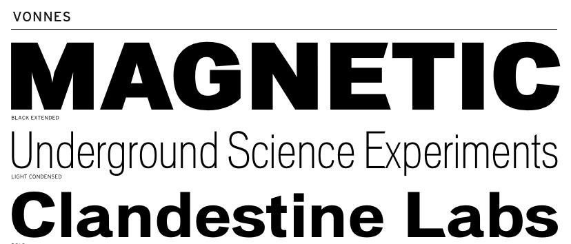
Only Font Bureau font in that ball park is Vonness.

Hey, wassup with that inconsistent trapping in the "M"?

hhp

Vonnes I dislike a lot, specially those wacky "a" which make me wanna trhow up.

Héctor

Some inconstancy things in that typeface. The trapping of the M compare to the A and the opposite slant arm in the E seems out of the style. However thoses slant are less visible in the light weight and to me works well with the lower case t.

"Does it exist “New Akzizend Grotesk” "
soon.

FB Titling Gothic is closer to your illustration than AG'll be though...

Captured from commoncrawl.org on 21 Apr 2015. original URL