Typophile

Business Card for the Inbetween Life

AlisaK

Introductions all around:
Hello, I’ve been a lurker once removed for a while, now. My spouse is a frequent poster, Chris Rugen, and I’m nosy, so I’ve given the site a look. I’ve been working on a business card for my new professional incarnation.

Background:
I am currently an interior designer for IKEA.
I used to be a freelance set designer and scenic artist (plenty of lettering).
I am now taking classes in graphic and web design, so I can start forcing Chris to split his fees when I help him on a project. :)
I have a terminally crafty streak and I’m trying to play that up.

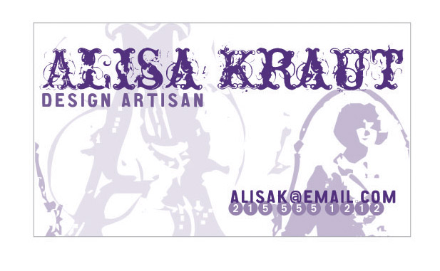
I used the typefaces Nasty, CA Aires, European Pi, and CA After Midnight Sale Junk. Once I have better mastery of Illustrator, I have dreams of switching out the image of the stylized woman and tossing my own silhouette in there.

Here it is:

Comments and suggestions welcome.

I like the card it has a wonderful retro feel. I’m not convinced about the word Artisan. Why not just Designer or Artist

I don’t think this is a business card, I do think it’s a personal introduction card.

There nothing about the card the says business, and for that matter nothing about the card says design, ( actual word “design” noted ).

To me it looks like it’s all about ALISA, which is ok by me.

Hiroshige

I would be interested in seeing the grid you are working with.

Sometimes grunge can be nice. What would make this better is if the grunge could be bound to something a little more organized. A strict grid might accomplis this. Or possibly some ’cleaner’ elements.

Repeating the A in the grunge font is a bit too much of a good thing. It kills the impact of the type treatment for the name.

Loose the silhouette, it accomplishes nothing — in fact it is actually confusing.

Develop a (more visible) grid. Allow it to dictate your elements size and placement. Introduce, or change some of the elements to something more organized or ’clean.’ Be prepared to to have a solid explaination for the moniker ’design artisan.’

Ohh, and welcome to Typophile. ;)

I don’t see anything wrong with this per se - It’s cheeky & fun and the word ’artisans says ( to me) that you also want to good work & that your serious about that. The split seems to be:

not serious about yourself / serious about your work.

If

Captured from web.archive.org on 8 Sep 2008. view this capture