
Any general rules for forum topic?
Thx
Any general rules for forum topic?
Thx

see smallcaps how-to.
Ok, this was less a fontlab question, more a general rules. I’d settle for just general guidelines for making a Titling version, ex. Thinner, wider, taller, whatever...
Fill in the blank... Titling caps, in general, are _______________________ ...

Titling caps are essentially a large optical size. The thicks get thinner, but proportionately speaking the thins are getting even more so. The spacing is tighter. The characters may be a tad narrower.
Cheers,
T

>essentially a large optical size
I don’t think this is accurate. Jonathan Hoefler pointed out in an interview that regular caps are designed primarily to go with the lower case, whereas titling caps are designed for an all-caps setting. This is the essential difference. For example, Hermann Zapf did two versions of Titling Caps for Palatino, one thinner than the roman and one thicker—Michaelangelo and Sistina, now with different names in Palatino Nova. In both cases I believe that they have a greater variation in width from the regular roman caps. This is a tendency in Titling Caps, following the Roman letters on the Trajan column in Rome. Also titling caps will generally be spaced looser because of the intended all caps setting, I believe.

Titling caps can be set either looser or tighter depending on the font. A classic roman face would in most cases be set looser.
Generally, the things that change are those that are needed to be typeset well at text sizes. Contrast can increase at large sizes and there is less need for trapping. You can also have a true hairline sans because it won’t be used small. The width may be a tad more condensed as well.
ChrisL

Eric, there is clearly no consensus on what defines titling caps stylistically.
Historically, in a practical sense, they were simply capitals which used the entire type body (i.e., including the descender space). Thus, in a 60 point titling font, the caps would be nearly 60 points tall (minus overshoot space and other design considerations). Also, the J and Q would be designed not to extend below the baseline since there was no metal down there. Etc.
Titling caps in modern fonts are not really the same thing. I know of none that are designed to fill the em square in the way that traditional titling caps did.
A couple of other things:
You might wonder why they would have made titling caps the way they did in the first place. One reason (probably the main reason) was for large inset initial caps on paragraphs. Since there was no extra space for descenders below the cap, you got a nice snug fit.
The other thing to keep in mind (and this relates to Thomas’ comment about optical size), titling caps were made only in display sizes, not text sizes.

The design conventions for smallcaps are pretty clear, because of the height and weight relationship to the lowercase and regular caps.
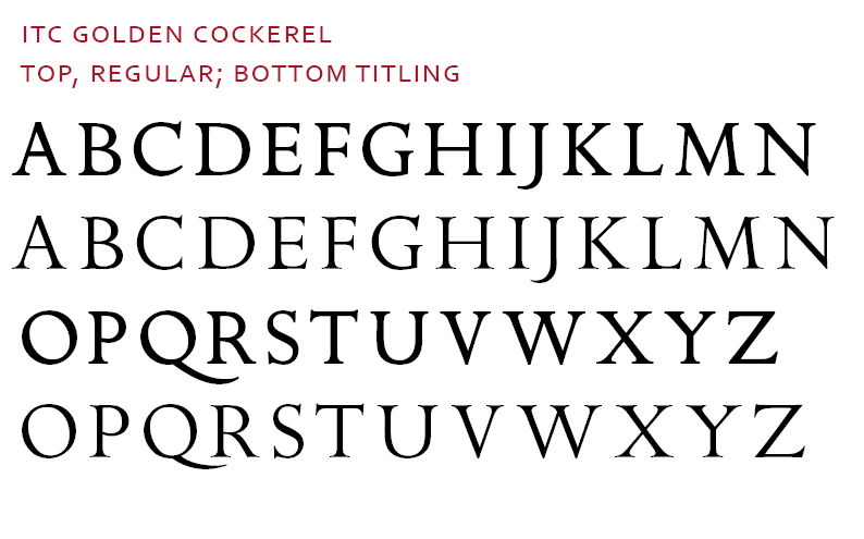
I disagree with Thomas that ’titling caps’ implies a large optical size of the regular caps, although that is certainly one common kind of titling caps. I think there is a lot of stylistic leeway in the design of titling caps, and they may be lighter or darker and may be significantly different in proportion and detail from the regular caps. Eric Gill’s Golden Cockerel type — shown here as drawn for digital type by Dave Farey — is an interesting example of a design in which the treatment of some letters varies between the regular and titling caps (note the C and Q):
William made reference to Jonathan Hoefler’s comments on the subject, and I think one of the most important points Jonathan made is that in titling caps there can and perhaps should be more variation in the width of the letters (hence, for example, the famously narrow E and F in the Trajan letters).
Also note that the relative height on the body has varied in some classic titling sets, such as Mardersteig’s brilliant Dante:
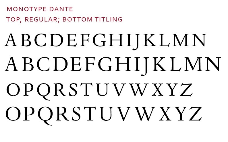
Dante just is fabulous.
ChrisL
Thanks guys... It is clear now. .. .
Eric, Is it bloody clear? :-)
ChrisL
Clear as biscuits.
As long as you don’t want gravy on your biscuits :-)
ChrisL

> the relative height on the body has varied
In metal, titling caps almost always fill the entire EM height. This is for reasons of efficiency as well as the lack of negative leading: if you wanted tight multiple lines of all-caps the lc descender area would get in the way! In digital, because of the ease of sizing and negative leading, and because there can always be an advantage to lining up baselines (between a titling font and normal one) I think it’s better to avoid the old metal standard.
> the J and Q would be designed not to extend below
> the baseline since there was no metal down there.
Sometimes they kerned though.
> in titling caps there can and perhaps should
> be more variation in the width of the letters
This can be considered an optical compensation though. When Thomas focuses on optical compensation, I think he’s about 90% there actually - at least in relation to a text cut - the further elaborations can be said to explain the differences between titling and display cuts.
As for the nature of titling caps, I’d just
add one thing: you need a lot more... Drama.
hhp
Let me re-phrase that slightly. The difference in optical compensation is the required element of titling capitals compared to a text face. An optional element is to have design differences, which may be minor or major.
If it is a really different design, I think of it as more of a companion titling face rather than the titling version of the same face. For example, Michelangelo is being renamed and re-released as “Palatino Titling.” I can understand the marketing reasons for it, and it also clarifies the use of the typeface, which are both good things - but from a design perspective I am not sure that I agree with the naming, because it’s just a little too dissimilar to Palatino.
Cheers,
T

“> the J and Q would be designed not to extend below
> the baseline since there was no metal down there.”
Funny, I was just about to point out the detail of descending J being better for all caps, and baseline J being better for mixed use.
> I think of it as more of a companion titling face
> rather than the titling version of the same face.
Good point.
The problem is that this entails greater education of the user.
> descending J being better for all caps
Especially if you’re Slovenian.
Also: metal type could kern down below (and up above) as well as laterally.
hhp
Captured from web.archive.org on 12 Oct 2007. view this capture