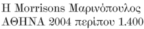
In 1980 the Greek government decreed that the polytonic alphabet would be replaced by the simplified monotonic system.
Prior to that, there had been a popular/commercial movement towards this, featuring various forms of the simplified tonos accent -- dots, vertical dashes, and triangles.
In 1982 the Greek government (perhaps in a move to combat the tackyness of many of these accents nouveaux) decreed that the tonos would be angled, like an acute accent. This has subsequently become the Unicode standard.
HOWEVER
The tonos in Lucida Grande (Apple OS font) is a small vertical dash, quite different from the acute accent.
The tonos in various Adobe Pro fonts, such as Minion and Myriad, is slightly angled a few degrees off vertical, again quite distinct from the acute.
SO
Is this like the Euro symbol situation, where a typographic standard has been set, but found wanting and freely interpreted in practice?