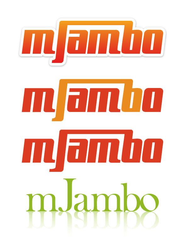
This logo is for a music based company that is designed with artists in mind. It helps them get matched up with appropriate venues. The name of the company is “mJambo”, which means “hello” in Africa, and also harks back to the roots of music itself. I have designed two very different styled logos. I’m leaning toward the first one. The client has specified that he wants the “m” lower cased and prefers just a type treatment as opposed to an icon. I’d love to hear a critique of the logos I have provided, as I know they need to be fine tuned.
Thanks.
(please note I have attached all revisions made on this first post)
| Attachment | Size |
|---|---|
| mJambologos.jpg | 22.17 KB |
| mJamborevisions.jpg | 57.71 KB |
| rev3.jpg | 14.43 KB |
| rev4spacing.jpg | 14.43 KB |
| m_oneserif.jpg | 13.6 KB |
| flippedserif2.jpg | 14.75 KB |
| Jchange.jpg | 14.81 KB |
| spacing.jpg | 13.92 KB |