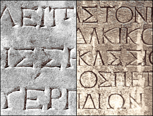
Many of the Greek capital characters share the same glyph form as Roman capitals.
For an OpenType font, where there are different character positions for Roman and Greek capitals, is there any reason, other than convenience, for the glyphs to be identical?
In typographic situations where both Greek and Latin text appear together, harmony may be necessary, but if that can be achieved with different versions of the common capitals, why not?
Ideally, as with the ClearType faces, it makes logical design sense to start from scratch and consider the criteria for all the alphabets which are to be represented in a typeface. However, even then the situation still ends up with the usual tally:
Roman caps: approx. 50 serifs
Roman Lc: approx. 50 serifs
Greek Caps: approx. 65 serifs
Greek Lc: approx. 15 serifs (many of which are "fudged" terminal endings)
I'm including Greek characters in a typeface I'm working on at the moment. It's a revival of a Roman typeface with large serifs. Going the usual route of having common cap glyphs, there is the usual stylistic disparity between Greek caps and lowercase, slightly more pronounced than in Constantia and Cambria, for instance, but as there are plenty of other common stylistic elements (stroke weight, contrast and angle of stress in particular), it's perfectly acceptable.
However, while remaining within the overall mien of the face, it would be quite possible to create a separate set of Greek cap glyphs with fewer serifs, and certain Greek caps could be more easily made properly Greek, such as Upsilon, with curved arms, rather than aping the Roman Y (in fact, Cambria does have this distinct form). Delta and Phi would also benefit by fewer serifs elsewhere among the caps.
Has this already been done?
Is the disparity between Greek caps and lower case, in a traditional serifed face, the desirable norm?
Or do you think the idea of a full set of different cap glyphs is worth pursuing?