Typophile

Type ID Pop Quiz V2.0

Bald Condensed

This is how it works:

  • A portion of a glyph is published in the Type ID Pop Quiz.
  • Try to identify the glyph and the typeface. To win, you need to name at least:
    1. typeface

    2. weight
    3. character/glyph
  • Show off your knowledge by casually mentioning additional trivia, like who designed it, when and by whom was it (first) published, and other cool stuff to impress your fellow Typophiles with.
  • The winner produces a new challenge — a portion of a glyph, black on white background, presented in a 288 x 288 pixel square, including a R204G000B00 1 pixel border.

In case of any disputes, I will act as judge, jury and avenging angel of wrath.

Good luck everyone, and have fun. ;^)

With respectful thanks to the originator of this utterly useless but highly entertaining waste of time, the often imitated but never duplicated Cheshire Dave.
You’ve been clamouring its return, and now — finally — we witness its triumphant rebirth. Laydeez and gennelmun, I’m humbled and honoured to kickstart Version 2.0 of the ridiculously popular Type ID Pop Quiz!

OK kids, playtime’s over, let’s get down to bizz-nizz. Last one out the gates is a smelly sock.

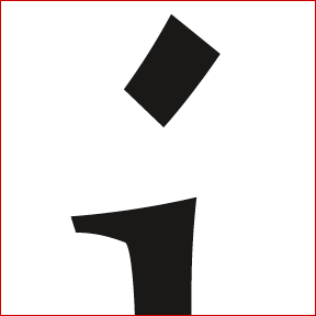
Character i (or j) from Maiola Regular designed by Veronika Burian.
She designed this typeface in 2003 in partial fulfilment of the requirements for the Master of Arts in Typeface Design, from The University of Reading.
Maiola was one of the TDC2 2004 winning entries. This typeface was recently added to the FontFont library, and first appeared in its Catalogue 2004-05 Addendum, on page 3. It covers Extended Latin, Greek and Cyrillic.
I find it amazing the way she handled the curves. It’s a beautiful typeface full of (Czech) character.

Yes, Maiola is a very nice piece of work indeed.

T

Whoa, Miguel, you know how it’s done. :^D

Perfect ID, it was the “i” indeed. You’re up next. You’ve got let’s say 48 hours to post a new challenge. Make it a good one! ;^)

Hurray! :^D
Ok, I’ll try to do my best.

Here it goes...

Woohoo, we’re back on the right track! :^)

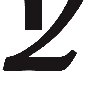
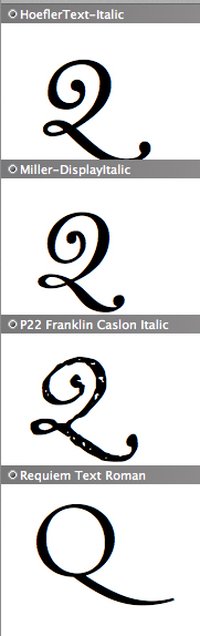
I think this might be a Q of some sorts, but even that I’m not sure of. Don’t answer and give away the glyph just yet, let’s wait for some more contenders. ;^)

This might also a part of Z or 2 or iz or...

Wow! Big challenge!

That’s armenian! (maybe)
Maybe r, but I don’t think it’s from Calouste.
At any rate it’s non-roman, yes?

Nope, it’s latin, and in the a to z scope.

(I would never be that presumptuous. Besides, using Calouste would have made the quiz too easy. I can’t underestimate you guys that much ;^)

As Randy think, Is this could be the Armenian small letter JHEH? If so, now I’ve to find the typeface...

At any rate it’s non-roman, yes?

Let’s agree not to use any funky scripts, OK? It’s already hard enough as it is! :^P

Hey Yves, not nice! :-)
Then at least make a separate non-Latin sister to this.

hhp

Re:Nope, it’s latin, and in the a to z scope.
Wow. Very funky.

I think it’s italic.
I think it’s a z. Yes?
I think the typeface is... well I have no idea.
How’d I do on the other parts?

R

After some ’yes’ and ’no’ questions, I found out that the straight stroke is the part sitting on the baseline.

It isn’t a q, nor is it an n, and neither is it a z.

> After some ‘yes’ and ‘no’ questions

You mean off-line? Is this allowed? Yves, DISQUALIFY THE MISSY! ;-)

—

Must be a cap-Q, no?

hhp

So far, the only one closer is Randy. Yes, it’s italic.
And again, it is Latin!

What else can I say...
The designer published a typeface family with Linotype in 1999, and recently published this one under his/her own foundry name.

Is it an italic y?

Yes Nick, well done!

Now the typeface...

Hmmm looks familiar...you’d think I’d know it but the fact of the matter is I haven’t got a clue.

...by Gary Munch ? - he designed Really 1999

…by Gary Munch ?
No

At last...

Tim Ahrens’ Lapture (Italic) (Just Another Foundry).
http://justanotherfoundry.com/Lapture/index.htm

Linotype Aroma was the 1999 font family.

(Thanks everyone who knew what it was but were feeling sorry for me because they thought it would be unfair to gazump me after I had correctly identified it was a y!)

Congratulations!
Your turn :^)

Shouldn’t take too long.

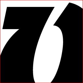
5

Yes, 5. (Not E or F.)

trade gothic?

No, a bit older than that (this version is younger though).

When I say older than Trade Gothic I mean older than 1948 but younger than News Gothic 1908. The version I captured above was designed in 1979 if that helps.

news gothic

No, not News Gothic (see above).

> younger than News Gothic

Alternate Gothic 1903?

1979? It’s not Franklin Gothic is it?

- Lex

> After some ‘yes’ and ‘no’ questions

> You mean off-line? Is this allowed? Yves, DISQUALIFY THE MISSY! ;-)

Tiff, I know you’ve got an inside track to the Portuguese guy, but do that again and you’re barred from the Type ID Pop Quiz for life. Hrant has a point. :^D ;^) :^P

What did I tell ya? Avenging Angel of Wrath, baybee. Didn’t know the abuse of power would taste so sweet... :^D

BTW Great challenge, Miguel. And a beautiful face too. Very nice angularity.

Nope, its not Franklin Gothic either.

The 5 is not italic.

It this Johnston’s Underground?

You are very close, Jan. I think I’m going to have to let you have it.

It’s New Johnston Medium (by Colin Banks of Banks and Miles 1979) which I think has recently been overhauled for Transport for London (formerly London Transport).

I would also have allowed Dave Farey and Richard Dawson’s ITC Johnston Medium.

Here are all ten numerals. I still don’t understand why the arm of the 5 is cut off at such a strange angle.

Your turn...

OK, here we go...

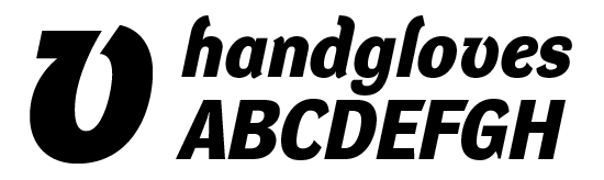
italic lowercase v

yes, it’s italic lowercase v.

The sharp corners lead me to believe this is by a young designer. Is this true? (silly theory)

Storm’s DynaGrotesk DC Bold Italic

Frantisek Storm. 2001.

> The sharp corners lead me to believe this is by a young designer.

Killer observation (although more “young at heart”).

hhp

Very Good Tiffany... Not 100% perfec thou, it’s not “DC” but “D”.

Correct answer is also StormType’s DynaGrotesk D bold italic

your turn, Miss Tiffany.

(BTW, is it OK to post these “explanatory” images in this thread?)

I think DynaGrotesk is one of the most beautiful sans serifs currently available. With the roman being a good masculine counterpart for the curvaceous and elegant italic.

So I have 48 hours?

(BTW, is it OK to post these “explanatory” images in this thread?)

Yes, please do. One of the nice things about this game is that it allows us to direct our fellow Typophiles to maybe lesser-known faces that we like and admire. That’s also why I added the trivia bit in my introduction to the game.

So I have 48 hours?

Don’t take that too literally — I just added that to avoid the thread dying out. If that ever happens, I’ll step in and post a new challenge myself. You can certainly take your time to look for a really interesting challenge.

Killer observation (...).

Miss Tifanny knows her type, that is a fact.

Ok. Sorry. I’m old, memory is bad. If my stroke color is wrong or too thick ... tough.

Is this Brothers?

Huh, what’s that extra pixel at 2-o’clock?

hhp

it’s an 8, isn’t it?

Nope, the counters in Brothers seem to be round...

huh? nope. nope.

Foundry Gridnik Bold (is it a B?)

nope. nope.

I thought I had it — the B of JAF Mashine, designed by the talented Tim Ahrens, available through his inadequately named Just Another Foundry.

But alas... :^/

So it’s a sneaky 3?

yep.

Teco, but I know it’s not really.

And I thought it was one Identikal job.

nope. nope.

LTC Octic Gothic #2.

Link, Nick! We wanna check them out! ;^)

:^D Good job, Nick! Glad to have helped you waste that past 45 minutes. Your go!

Apologies, LTC Octic Gothic here from P22:
www.p22.com/lanston/products/octicgothic.html

New one...

A lower case r?

something from star trek? =^>

Closest I’ve gotten is Soda Smooth, but it’s missing the 3-D effect.

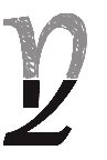
I am so not qualified to play this game, but this form intrigues me. There’s something really **** up about the perspective. When i extrapolate the lines, i get something kinda like this:

is this on the right track? Some kind of “m” or ...???

-marian

nick you’re going to have to give of some sort of clever pun -slash- clue.

nice visualization, marian. i’m seeing one of those cool old 3d seventies fonts.

Marian

> I am so not qualified to play this game...

I think you’re better at it than you think. Your just missing the stem on the left for a perfect m - great sketching!

It looks kinda 70s but this “weight” wasn’t actually designed until mid-80s. Yep, its a 3D version of a simpler font, which was my favourite font at university.

BTW, it comes in italics only. There’s no upright to my knowledge but can you imagine if there was...!

Profil?

Nope. Not Profil although I’m loving that.

Is that font could be :

Crillee Italic Inline Shadow

the Crillee Italic Inline Shadow lower case m :

You know it is! I love your graphic.
Your turn!

What a challenge!. I wonder if it’s not harder to choose a glyph than finding the response
; )

Here the mine, one of my favorite glyph.

lowercase g?

That’s a lowercase g.

Typeface or weight now

Crillee Italic Inline Shadow

Oh, His Divine Shadow! (obscure Canadian pop culture in-joke) No wonder I couldn’t understand the perspective.

Why has this thread fallen off the front page? It took me ages to find it again.

-marian

Hmm.. it’s still on my front page?

Hmm.. it’s still on my front page?

Freaky weird. All the “Newest Links” are current, but “Hottest” starts with “Non-Common Greek Caps” with this thread nowhere in sight. [yes, shift re-load, yes, quit and restarted Safari]. Anyway, I know where to find it now.

-marian

This g appears to sit exactly on the baseline, is that true? Then it’s all about the ear. Still have no idea.

He effectively sits on the baseline. Do you want a clue?

How about Charlotte Sans Medium.
I’ll try to get a sample up soon.

Hmmmmm... just a wee eentzy-teentzy off :-(

whoops, sorry, double post. :-|

Yves
I guess what Marian is asking is why is the quiz no longer on the handpicked list...?

It is not Charlotte Sans Medium, although that there is a resemblance.

Keep going ; )

Hmmmm... looks closer to Stella by Mário Feliciano.
Trying to find a larger sample to compare.

It is not Stella either! I admit that she is close, but you have to continue to look.

Why has this thread fallen off the front page? It took me ages to find it again.

In short, here’s how it works: the Newest: category is quite self-explanatory I guess. The threads that go into the Hanpicked category are indeed literally handpicked by the moderators. For example I promoted Joe’s birthday thread to the front page for one day only and removed it after that. The Hottest: category is somewhat more complicated, so I’ll let Christian do some ’splainin’:

“The algorithm that picks the hottest simply picks the threads that have the most posts in the last four days. So a thread that got a lot of attention on the first day, but none on the next three will drop off quickly. A thread can’t just rest on its laurels, it’s got to stay hot. We decided to do it this way so that the content would cycle pretty quickly and stay fresh.”

Is it a sans serif typeface?

Yep! A sans serif

This typeface was developed in two series, and began as a custom typeface developed for the Paris Metro network (RATP) to improve signage legibility and space economy in 1996...

...

You got it Lauri - antiphrasis - Your turn.

Is the inside of the join of that “g” supposed to be so cruddy?

hhp

Thanks André. I’ll try to dig up something somewhat obscure!

Here’s the new challenge:

Mazarin Y by David Nalle from Scriptorium?

Norbert, good guess, but not quite. It’s by a different designer.

You’ve got the right letter though! It’s an uppercase Y.

Is it something from any of these type designers?

Miguel,

No, it’s by someone well-established, and it’s not freeware.

Hint: created in 1992, and renamed in 1998.

Is that Y could be :

Elephant typeface, 1992
Renamed Big Figgins, 1998
Typography Design: Matthew Carter?

Big Figgins Italic:

André,

Perfect, that’s it! You go next!

Thanks Antiphrasis, I’ll post new one monday a.m.
André

Here my second one. Not too far from us…

wowsers! what the heck is that?! no one wants to touch it.

Isn’t it something from Emigre’s Soda?

hhp

Isn’t it something from Emigre’s Soda?

No, Hrant, not Emigre’s Soda.

It «could be the result of a happy marriage of Kabel and French Script.»
dixit: type designer

That must by Coquette Light’s o
by Mark Simonson.

Oooo... Good thing Mark Simonson isn’t playing the game. Otherwise that would’ve been mighty embarassing (not recognizing your own typeface), don’t you think?

Wow! Your’re fast Randy! That’s it!

http://www.ms-studio.com/FontSales/coquette.html#

Your turn.

I’d have never know if not for Stephen Coles’ Coquette fetish.

Give this a shot:

Uppercase K from Democratica?

Oops, not quite, there’s a serif missing.

Capital R?

...Or lowercase k

Cap K.

This is the least characteristic design from this designer (IMHO). It’s designed for text, but some people might be skeptical on principle. I’ve used it for text to good effect.

Randy

something by Nick Shinn?

Walbaum Text bold?

Walbaum Tex bold

Storm’s Walbaum Text Bold Cap K.
Fewer clues next time :-)
Go for it!

R

I’ll prepare a new one within the next 24 h...

Finally…

Here my new one.

That’s a really good challenge — I was all, how many different slabs could this be, but then, this section really does lay out a uniqueness to the face in question, which I haven’t found yet. I got pretty close, though.

Oh, and a belated thanks to Yves for resurrecting this game.

André,

Lowercase D or A?

Lowercase D or A?

Antiphrasis : Could you confirm your choice?

well either way it must have a huge x-height.

She effectively has a huge x-height compare to Garamond.

André,

Lowercase D. But I don’t really have a clue on the typeface yet. Almost looks like some squarish typewriter font.

ITC Fenice Light (one of the ugliest typefaces in the world)

aldo novarese, 1980 (you can tell it is from the 80s, sadly)

Tiffany, You got two third of the answer :

The ITC Fenice, Light version was good, the letter was the a.

Aldo Novarese of Italy. Born: Pontestura Monferrato, 1920, Died: Turin, 1995.
He also designed those one: Augustea Open, Belizio, Central, Egizio Condensed, Eurostile, EF Feder Fraktur, ITC Fenice, Fontella, Microgramma, ITC Mixage, Nadianne, ITC Novarese, Sprint, Stop, ITC Symbol

Good work Miss Tiffany.
Your turn now...

ITC Fenice Light (one of the ugliest typefaces in the world)

Did I miss something? I didn’t read in the rules, we had to find nicest or ugliest typeface. Typeface is often a personal point of view isn’t it? ;^)

Jeez, Tiffany!
I think ITC was responsible for a lot more UUHGLLY designs than Fenice.

Take ITC Ancestor fer’instance.

Ooops ... Totally forgot. Here’s the next quiz.

Is it Newton from Para Type?

Hmmm... nope, not close enough.

:D nope. but you have the glyph correct.

Is this X could be Antiqua Medium?

Rotis Serif Bold 65? I don’t think so.

Nope. Nope.

Hollander™ Std Bold seems to be pretty close.

Nope

I think your’re right on Dave.

Is this X could be Le Monde Livre Classic:
http://www.typofonderie.com/alphabets/try/LeMondeLivreClassic

We will wait the verdict from Miss Tiffany.

Ding Ding Ding ... but, which weight and family?

Family: Le Monde Livre SC
Weight : Demi

Or

Family: Le Monde Livre
Weight : Normal

Here my final answer:

Letter: lower case x
Typeface: Le Monde Livre Classic
Weight : Regular

Ding Ding Ding.

Your go.

See how sneaky that was? I cracked the ID and made Andre come up with a new quiz! ;)

Hard one your posted Tiffany. Good work!

I’ll post the new one tomorrow.

Here a new one:

The Ampersand of ATF Bodoni?

You got it fast, Jan!

You go.

Here we go...

What is that? Is it a ’q’? Is it even latin?

- Lex

It’s latin allright. It’s not a lowercase ’q’.

Jan,

That one is pretty hard... I haven’t even figured out what glyph it is yet.

I’ll give you some hints tomorrow if there isn’t any progress :)

Cap H with a crazy crossbar?

Jan,

Kiitos, kuullostaa hyvältä.

Nick, no...

hint: read one of my above posts very carefully.

antiphrasis, en tiennytkään että myös Los Angelesissa puhutaan suomea!

Jan,

Kyllä jos äiti on Suomalainen ja Ruotsissa syntynyt ja asunut. :-)

It could be a lowercase a or i

This seems so difficult that I’ll help you out...

Believe it or not, this is an uppercase ’Q’.

???

Nick, do you have the typeface family name for this amazing Q?

Call me a novice, but all I’m doing is trying to guess how the shape in question can be a Q in anyone’s world! When I’ve done that, then I’ll start looking for the typeface. Jan, please tell me it’s not a Q with straight sides.

“Jan, please tell me it’s not a Q with straight sides.”

It’s not, it has a round portion at the left. the whole glyph looks a bit like a regular lowercase q.

I was flipping my fonts to find something to post and this character catched my eye “what the *** is that?”. I’ll also add that this typeface is for display purposes and has also an alternative Q that looks more “normal”.

Dalliance roman

Here the Dalliance Roman caps Q:

Sim, great! I was already a bit afraid that I posted a too difficult image.

That Q is totally weird.

Your turn!

Wow, that was a good one.

hhp

Really hard one, but this is how I love them. The one from Miss Tiffany (Le Monde Livre Classic, wasn’t easy either).

Wow, that was a good one.
Hrant, will you be interested again?

I’ll post new one soon.

I’m afraid I have neither the nose nor the stamina to be
anything more than a spectator in these wonderful hunts.

hhp

im not good enough to be the first one in any of these (except for crilee which i’d have known.. but have seen too late), but i would have SUCH a nice glyph to use here. so if anyone of you doesnt know which to take and wants to give it away, please give it to me :)

(or maybe i could post this one glyph and then shutup forever? :D )

Hard to refuse something to ask so friendly.

Your turn kesh.

André

wow, thanks! i hope you find this somehow.. a good entry.

stage fright.. :)

a little hint: the most important thing is to find out which glyph this is. it IS a roman glyph, but it does not normally appear without the use of opentype - should be clear enough what i mean. (i hope i understand the word glyph correctly.. but it should be correct)

Is this a ’LA’ ligature.? :)

Dav, formlos

yes, its an LA ligature :)

I would say probably an A, but it is probably too easy, isn’t it?

Oups! too late. The family and weight now?

yes :)

i cut the L there at the bottom (~ in the half of the width), all the straight lines are cut by me.

Ah - that makes a little more sense now. I was wondering how that could even be recognised as LA with so much cut out.

- Lex

i cut the L there at the bottom (~ in the half of the width), all the straight lines are cut by me.

Did you do the same for the bottom right part of the A glyph?

yes, thats why i wrote “all the straight lines are cut by me”..
ehm, i meant “every of those straight lines was cut by me”, thats probably the correct way to say what i meant :)

shall i post the whole A, just the L cut off? i wouldnt, but if its too hard that would maybe work for you.

No, No. I think we will ride alone for a while.

Well, I think after almost 24 h of search, I’ll need a clue about typeface this LA ligature come from.

Is there is other people think the same?

Yeah. I checked all the ligature fonts I know, and I still can’t figure it out. A little hint would be helpful.

- Lex

ok, lets try it. i’ll give you several hints:

- it is an original font, its not an imitation of an old one.
- it is a textface but can also be used in titles.
- the creator is named john [..]
- its name in some ways also predicts its use.
- if im not totally wrong, its a 2005 release - if not, 2004.

well, now it should be a possible one.. i only saw this ligature because its in my name (BLANCPAIN). i really love it.. it gives my name a very special look :)

Ah. That’s just what I needed.

It’s gotta be Paperback (96 Roman?) by John Downer, distributed by House Industries.

- Lex

Oops - it seems from the House site that Paperback 96 doesn’t have the ligatures. It’s most likely Paperback 48 Roman.

- Lex

yes you’re right! im sure it was paperback 96, i dont think there are ligatures shown at all with “lettersetter”..

which one gave you the “final hint”? :)

Hard one. Congratulations Lex.

When you said it was designed in 2005, I remembered wanting Paperback for all its cool ligatures when it came out. It’s a very beautiful face. Maybe when I win the lottery (or at least a very rich client) I’ll buy it.

I just have to install flash 8, then I’ll get my image up.

- Lex

...And thanks to you Kesh for this nice glyph.

-André

Here it is. This one’s pretty distinctive, so no hints yet.

- Lex

American Text Regular BT, letter caps F

It may having an other name on an other foundry

Spot on. It’s even the bitstream version. Your turn (again).

- Lex

Here it is.

oh wow, whats that? capital C or G?

It’s a small caps of one of this two glyph.

How about Bank Gothic?

Bank Gothic Light small cap “G”
Morris Fuller Benton (from Para Type)

Great Norbert! You go!

More info: A set of square capitals developing from the interest in geometric forms stimulated by the Bauhaus, Bank Gothic was designed by Morris Fuller Benton for ATF in 1930, the same year that Georg Trump designed City for Berthold.

BTW, what you’ve done with the Chapelle Sixtine on “Typographic exercice / challenge” is really good!

Huwaaaa!
Wow... finally.

Thank you for your comment on my Sistine joke, but now I’ll probably never look at it the same.

On to plan for new type quiz challenge, but forgive since I cannot get to it until later this evening. So, everybody — you can rest easy for a while.

This one might actually be easy, but it happens to be one of my new favorites.

This is really all you need to make the ID. Bonne chance.

It’s the ear of a g !

Could also be a kind of an «ear» of a lower case q

Mais oui, c’est une “g”

Hmmm... twelve hours with no guess.
Now I am getting dupressed.

Could it be Font Bureau’s Zingha Bold, designed by Xavier Dupré?

: ^/
I wasn’t fast this time...

Good... now I’m less Dupréssed but not quite bold.
Maybe I should join Weight Watchers lose a little weight.

YES... but it’s ZINGHA medium.

Good catch. I pass the baton to Robin.

— Now I am getting dupressed.

Wow! Norbert, tu es subtil... Bravo!

Thanks , but I also left previous clues:

1- it happens to be one of my new favorites. (clue that Stephen Coles might have guessed since Zingha was my candidate for Typographica’s best design survey.)

2- This is really all you need to make the ID. Bonne chance.

3- Mais oui, c’est une “g”

As I rarely post in French, I thought looking for a French designer or foundry was a clue.

Last and final clue: Now I am getting dupressed.

André: You must close the italic tag from your previous post!

Cool! Great clues by the way; I would never have got it without them.

I’ll try and get a new challenge up tonight.

> Typographica’s best design survey

When is that coming out anyway?!

hhp

I dunno, but the candidates for best release during the first half of 2005 had to be in months ago.

Here you are. Have at it!

Gee... we’re running a “g” marathon for quizes.

The choice of letter is significant.

Time for another clue? It’s a recent, custom design that’s been discussed on Typophile.

Is it FTF Stella Roman?

Not FTF Stella, sorry.

You’re more likely to see the bold version of this character. You might even see it every day.

’Georgia’.? :)

Dav, formlos

Guardian Egyptian (Text Regular) by Paul Barnes and Christian Schwartz.
I guess you chose the ’g’ because the ’masthead’ is all l/c?

He probably chose the g because the name of the newspaper is guardian as he wrote on one of his clue «The choice of letter is significant».

BTW Nick, good job, that one wasn’t easy.

sorry...
no post intended. As you were.

Is the new challenge will come soon?

Good job, Nick!

Sorry for delay...next one below.

crazy. cap X?

Nope.

W or w?

- Lex

Probably a cap W?

Cap W from Benguiat Gothic EF?

Or the lower case w still in Benguiat Gothic?

Is it a W from Locator Display?

http://www.processtypefoundry.com/typefaces/locatordisplay/index.html

ack, zoomed in on the pdf and it looks like it’s not.

It looks like an outlined face to me.

- Lex

No to most.

It’s a w, Lex.

Cholla Sans?

Nope.

Sansa Light lc w?

-marian

oops, not Sansa.

-marian

There seems to be a general lack of inspiration. Do you want a clue?

To me, it woud be a good idea : ^/

Clue: There seems to be a general lack of inspiration.

At that size, it’s got to be a light weight, possibly some kind of monoline script, except it’s not cursive, and if there’s a lack of inspiration, maybe it’s ... um, some kind of emulation?

-marian

General Electric’s proprietary typeface “Inspira”? I can’t find it online, but the character was already solved - “W”, so I’m guessing on the weight either light or regular.

I’m anxious to see this Inspira typeface if it’s the good one.

Correct. GE Inspira Regular ’w’

www.ge.com


Your turn.

Inspira appears to have been designed by a lot of people. Patrick Giasson/Mike Abbink/Adam Throup/Douglas Sellers/Jim Wasco/Carl Crossgrove...

You can see it in action in GE’s annual report.

Where could we find this typeface? Or, is there a foundry who sell it?

I think you need to be a supplier for GE. You can then download it for free from www.gebrandcentral.com

May be that one, was funny if you’re a GE supplier : ^/

> Correct. GE Inspira Regular ‘w’

I can’t believe I missed this one! GE is a major client of mine. 90% of the time, the only typeface I get to use at work is Inspira!

> Where could we find this typeface? Or, is there a foundry who sells it?

It’s proprietary — so only for use on GE stuff.

(When they first rolled out the new branding, they had their Brand Central site open to the public, but my guess is that too many unqualified people were downloading their creative materials, including this font. So they locked it up with a password).

WOW! I can’t believe it, do I win a new refrigerator? I do like this typeface, and it’s very forward thinking for a large corporation.

So I guess it’s my turn to post the next clue? Which, I guess I need the new flash plug-in for?

> I do like this typeface, and it’s very forward thinking for a large corporation.

I remember when they introduced it, our entire agency replied with a resounding “YUCK.” But after working with it for over a year, it has really grown on me.

I know this is lame, but how do I post an image? I’ve got my clue ready to go...

>So I guess it’s my turn to post the next clue? Which, I guess I need the new flash plug-in for?

It would be better to see your portion of the glyph. Easier to work with.

Chris,

You need Macromedia Flash Player 8. Once you’ve got it installed, “Insert image” should appear below the Comment box. Just click it and upload your image.

- Lex

Here the link to get Flash Player 8 (found by Eben Sorkin)

The player is here for OX
http://www.macromedia.com/shockwave/download/download.cgi?P1_Prod_Versio...

OK, thanks guys. I’ll get this posted as soon as I can, hopefully a little later today...

OK, I think it’s time for something a little easier. Hopefully this won’t be tooooooooo easy...

it’s a lc g... ;^P

Before I launch my search, is that glyph come from an custom typeface for a company somewhere in a unkwown country? ; ^)

FF Alega Light cleverly cropped before the rounded terminal starts?

Not to far from us that one. Good work Brian ; > )

Yes! Brian you are correct - FF Alega Light, and Paul had it correct lc “g”. I guess maybe that was too easy, at least it was “cleverly cropped” :) This is one of those typefaces that I just had to have, but haven’t been able to use on an actual proejct yet. I still think it’s fantastic. Brian, you’re it.

I will post something in 10-15 minutes.

Thanks Chris.

Here is the next one...

It’s a caps, small caps or lc E ?

yes, it is an E. The lowercase slots in this typeface are filled with uppercase letters ... there is an alternate ’A’ in the ’a’ spot, and plenty more alternates throughout.

I’m stumped on this, doesn’t look vaguely familiar...

would anyone like a clue?

> would anyone like a clue?

Yes. Who’s the designer? :)

- - - - - - - - - - - - - -

Herculanum - Adrian Frutiger?

Bingo! David, you are up.

>> LINK

Thanks. I’ll post soon.....

Here we go....easy one:

Avalon cap M?

...easy one :) Yes. By Richard Lipton, FB, 1995.

OK,

I’ll post it first, then offer clues if needed.

g Eagle?

The section symbol? From something like Gill Kayo?

- Lex

No and no.

Clue: It has been released in MM format.

I just have to say how strong the figure/ground relationship is on this cropping...i bugged out and thought the figure was the negative space in the image, heh.

That would go against the rules.... ;D

Motter Corpus - Othmar Motter?

OK David,

What letter, from which style?

well.....g or 9 ( I think there's 1 axis - width; condensed to normal)

Uh huh... Which one? g or 9? Condensed or Normal?

> Uh huh… Which one? g or 9? Condensed or Normal?

ahhhh...I start my day 4am.....I need more coffee....

- - - -
g, normal

YESSS!!! your turn David. Go tomorrow if you need to sleep on it. I'm done for today anyway.

Thanks. new glyph... tomorrow; if that's ok guys

The 3 last one was very interesting, keep going.

Here we go again.....

Lower case r, n, m or b, p, k, h or p? Great challenge!
Light version?

Alinea Incise?

U-case; light version - no.

edit: Alinea Incise - no.

If it's not a lowercase neither an uppercase, so it's a number?

>edit: Or small caps?

ahh, sorry. this is uppercase. "no"- to the light version.

hint #1: there's a thread....about the name/style...

hint #2: a sun dried brick of straw & clay

Castellar roman caps K?

no.
hint # 3:

So, caps M italic?

yes.

Pouty Regular from Font Bureau?

no. see my hints; #2 is the type foundry :)

more hints?

Is it the swash M from Adobe's Garamond Premier Pro?

Like this:

?

Yes. but - style? weight?

Style? Italic of course.

Weight? There are an awful lot to choose from, if you count the opticals as different weights! My sample above is from the regular weight, and seems pretty close to me, but it could also be Medium…

:) ok.ok. M -swash -italic-regular. your turn Robin

- - - - - - - - - - - -

Cool! I'll rustle one up in a bit.

Your “thread’ hint made me think of Ariadne, which is indeed an alphabet of swash caps; but it didn't fit. I guess you were just referring to a boring old typophile thread after all! :)

hint #2:
Adobe - a sun dried brick of straw & clay

Yeah, once you said that hint 2 was the foundry, I realised what you were getting at and that's what made me think of Slimbach's new Garamond. I've got an idea for a new quiz (easier than my last one, I hope!). Just got to make the image…

Okay, here you are:

(The slight blurriness is just because I made the image from a scan. This is more than sharp enough for ID purposes, I hope!)

lower case t, no?

Hey, you're good! :)

No problem for the slight blurriness.

Hey, you’re good! :)

I'm no Yves, but thanks...I like checking this thread even though my knowledge isn't wide enough to participate in IDs. :)

Is this t could be a Oberon Serif EF-Book
?

Some clue to give?

Not Oberon.

I'll give a clue later on today, if nobody's got it by then.

It’s the work of a very well-known type designer.

Hermann Zapf?

Good one Nick! Especially as it's not a typical Zapf 't' (which is why I posted it). Nearly there now. :)

Is that t comes from : Zapf Renaissance H EF Book?

't' from Zapf Renaissance Antiqua, not sure which foundry though.

André looks to have swooped!

Sorry Nick, probably that our messages crossed themselves.

Your turn.

Yes, it's Zapf Renaissance. Although Renaissance is very similar to Palatino in most respects, the distinctive Palatino 't' has given way to a more conventional form (although close-up it's still very distinctive).

(Maybe I'm a bit obsessed with the crossbars of t's. I have posted the Utopia ‘t’ to this quiz in the past.)

The image I posted was scanned from Elements of Typographic Style, p. 254 (version 3.0). I guess it's the original Scangraphic version, but I'm not sure.

After you, André, I insist. Your post is clearly before mine and I think I owe you one after GE Inspira!

You're a gentleman Nick.

So, I'll post a new one tomorow morning.

Here the new one (the ragged edge is due to the low res image imported from the foundry)

Er, an upper-case K or R?
A bold brush-scripty sort of face?

Not an upper-case.
Yes i'ts one of your two choice.

>A bold brush-scripty sort of face?

Yes it's a sort of script style. The regular one for that family of two weight.

year +- ?

+- 2002
This type designer has studied at the Musashino Art University in Tokyo, and later followed this up with a calligraphy course at the London College of Printing. Freelance type designer since 1997.

k from ITC Scarborough by Akira Kobayashi?

Congratulations Nick! Nice k btw.

Also find at FontShop
https://www.fontshop.com/index.cfm?fuseaction=catalog.fontdetail&display...

Your turn now.

Aww, from "Musashino Art University" I'd have sussed the designer if I'd got online and seen that early enough - and I've got a book with samples of Scarborough in it, so I should have recognised it!

Well done Nick, though!

_____________________________
Ever since I chose to block pop-ups, my toaster's stopped working.

Here we go again...I'm in an ungenerous mood.

>I’m in an ungenerous mood.

That's an euphemism ; ^)

Is this glyph could be a lower case c or Caps C?

May be an italic?

Obviously... Trying to trick us into thinking it's a c? I suspect it's an x.

No idea which one though.

Nick Cooke

We'll see...

Or, may be a k.

Italic k, André, well done.

Ok, let's get ready for the fun now ; ^)

Weidemann Italic

David, you are spot on. ITC Weidemann Italic k. Looking forward to your next challenge.

BTW David, what happened to your bird of paradise? First it shrunk, then it got drowned in custard.

Well done David, It was an hard one. : ^)

Thank you. The bird as my signature:

- - - - - - - - - - - - - -

Here we go.......

caps R?

no

lower case italic a, n, m or h?

Or may be a blackletter?

BTW Dave, did your forgot to use a 288 x 288 pixel square? ; ^)

lower case - yes. italic - no. blackletter - no. a,n,m,h - one of them... :)

> BTW Dave, did your forgot to use a 288 x 288 pixel square? ; ^)

shhhhhh.....I think Yves is here :)

lowercase n

no

maybe i should stop guessing...i have no clue. :o)

So, it's an h.

no. hint?

hint me

A huge hint: who's Pope Clement VII

hum... Not Medici Script :P Strange curves you got there...

Is the typeface name could be Bastard?

Anything to do with AntiType?

no,no, no.

>A huge hint: who’s Pope Clement VII

I tough he was a pope? ; ^ j

Another hint (even the answer :) )

Pope Clement VII is the Cardinal Giulio de' Medici.

Cardinal Giulio de' Medici commissioned the painting (masterpiece) in 1517 to_______ for the French Cathedral of Narbonne.

Good. but not h. the letter m.

> Good. but not h. the letter m.

Hard one David

The next one will come soon...

An amazing mixture of weight and category
(the ragged edge is due to the low res image imported from the foundry)

h Excelsior?

No It's not an h neither Excelsior.

Take in count my introduction : An amazing mixture of weight and category

k italic
btw serif or sans?

No for the k italic

Amazing, but it's a mix of that two category. I'd say it's a serif one but with some part looking sans. More, some part of the glyph look light, the other looks bold. Some terminal or serif are round other square.

btw, it's not an italic.

Somebody need an hint?

why not

lower case p?

No it' not a lower case p.

Here a clue:
From 1991, this type designer has continually released fonts through different foundries. His typeface designs span a wide range of styles: curly headliners, crisp text faces, reinterpretated historical faces, as well as spontaneous, rough experiments.

Pennsylvania - m or n?

No Pennsylvania

No m neither n.

Second clue:

Y'll find this upper case glyph in the 5 last letters of our alphabet.

Must be a W with a curly top

You got it Nick, it's a lower case w.

Any clue for the second part?

Third clue:

In 2003, Emigre published his last typeface design, Tribute. In September 2003 (shortly before his death), Gmeiner Verlag published his book featuring examples of his work.

With this clue you should find the type designer name which should help you to find the typeface.

Is that Frank Heine's Amplifier Light

You got it M. Forrest. Here the entire Amplifier light lower case w.

Design by :

Your turn now.

Hooray!
I'll post a new challenge in a bit.

Here is your new challenge.

enjoy

an x but may be to evident? an 8 ?

Is it an x or X from Triplex Condensed Sans (regular weight)?

nope not an X or an 8

So, an ampersand?

nope.

Ampersand from DynaGrotesk DC

ok, nope for the &, x, 8.

Could be a g?

nope.

it is a capital letter.

an H?

nope

do ya'all want more clues?

May be waiting to tomorrow, somebody else could have an idea. I'll take a break for tonight, no more idea about that glyph.

It's a good one Forrest
8 ^ j

Thank you. I guess I was a little mean in the character choice and cropping.

s,S or y,Y?

nope. not an S or Y

It's a K for sure!

Or a B, not easy that glyph.

If it's not a K, a B, it could be an A

not a K, B or A.

You'll find this in the last 4 characters of the alphabet. And we already know it isn't an X.

Unfortunately this is a typeface that I do not own (or have) so I took this character from a PDF sample. I didn't realize it until later last night but I chose one of the many alternate characters in this font. I know it isn't much of a clue, but the designer of this typeface usually builds a lot of alternates into his fonts.

a upper case W of course. Isn't it?

Yes, now What is the typeface and who is the designer.

more clues?

This typeface was originally designed for an art gallery, but is now also sold commercially under a different name.

you got it!

thanks Forrest. here's the next one ... good luck everyone.

is this glyph could be an S or s?

BTW, is the white space on the right edge is real?

> is this glyph could an S or s?

Yes. An S.

> BTW, is the white space on the right edge real?

Yes.

But it is not a stencil typeface.

clue: Art Deco

hmmm ... prominent East Coast foundry ;D

The Font Bureau, Inc. Bradley Initials

I'm up. ;^)

Glad to see you again in the quiz Yves after over 9 000 posts.
; ^ j

> is this glyph could an S or s?
Yes. An S.

I think it was the lower case s or small caps s not the cap S.

Congrats Yves.

> think it was the lower case s or small caps s not the cap S.

It seems to be an 'S' in the lowercase 's' slot... But the glyph itself is cap height so technically it's a capital 'S', not an 's' or a small caps 'S' ... imho. And it's on both the pdf at the FB site, and the .gif at myfonts.com ...

I'm sure you're right, but look what I get when I ask the lower case s at FontShop compare to the caps S. That's why I had my question.

ah, I see what you meant now. :)

So, ready for the next one...

§ ^ j

48 hours it over...

Will we have a new challenge or the Quiz no 2 is off?

: - /

OK Kids, the big name change party is over at my job (check our website tomorrow), I'm out of perpetual work mode, so at last I've got time to post a new challenge. Sorry to have kept you waiting.

BTW Tiff and I are going to be evaluating the Type ID Pop Quiz. It needs some minor tweaking in the rules, so expect a reboot in the next couple of weeks.

Oops, looks like the images have not yet been reactivated, so please bear with us. I'll check with the Punchcutters as to when we can expect inline images to be available again.

Captured from web.archive.org on 13 Oct 2008. view this capture