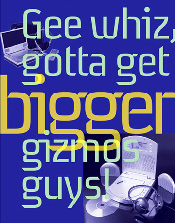
Here is one of the new type families I have been working on for the past few months. It started out as a display face but I pushed towards the text face side. There are 3 weights in the posted PDF: light, regular and bold. There are small caps and oldstyle figures as well as all the CE glyphs. See if you can tell what I have "almost" done.
Any help would be greatly appreciated. I really benefitted from my first font here last year and am hoping the comments will be as fruitful this time.
Regards,
ChrisL
| Attachment | Size |
|---|---|
| Align_postTpfle.pdf | 87.1 KB |
| Align_AltGTpfle.pdf | 49.93 KB |
| Gadget_Magazine.pdf | 148.46 KB |
| Gadget_MagUpdate.pdf | 377.83 KB |
| paulTerrific.pdf | 37.99 KB |
| Align_3weightAlign.pdf | 56.93 KB |