Typophile

Consist

tyleryoung

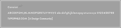
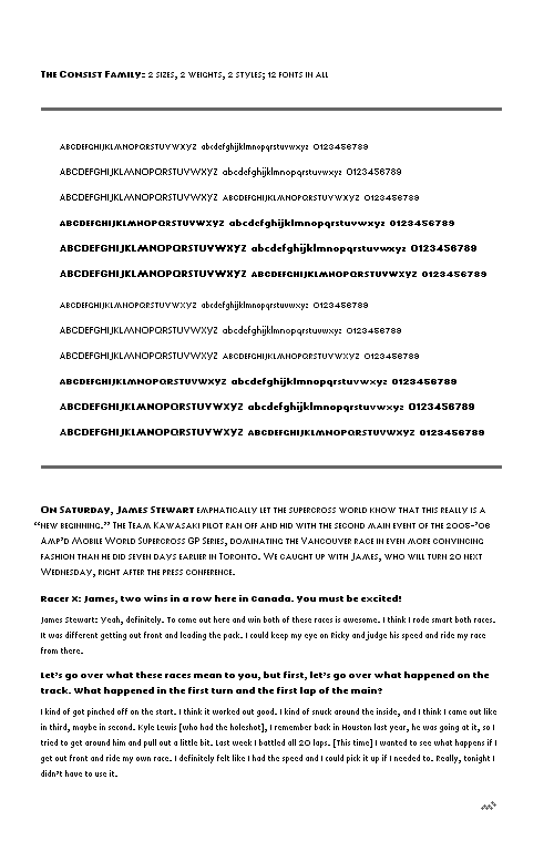
Trying to pack big font nuance into a teenie-tiny footprint—using grays, of course. A lot of these characters wouldn't work for me at this size, using traditional pixel building techniques.

The grays, however, allow me to put together a character set that looks more sophisticated than usual. Perhaps not 'book' sophisticated, but at least headed in that direction.

I don't think I used very many grays. Either five, or six, I think.

Any thoughts? Does the UC Y raise anyone's hackles? I was having trouble with it, so I borrowed from the UC J.

AttachmentSize
consist.gif1.45 KB
consist-complete.gif3.7 KB
consist-complete-r1.gif3.7 KB
consist-complete-r2.gif6.76 KB
consistFamily.png10.86 KB

Looks good to me!

ChrisL

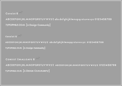
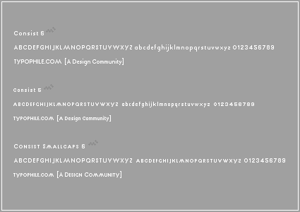
Never one to pass up the chance to make things smaller, I've tweaked the original set, and gained a 5px verion and a smallcaps version. Plus I tweaked the lc w to match the UC W.

A few more tweaks to the w's and v's in the 5px version.

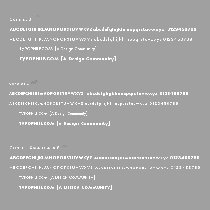
Added a bold version to all three...

Chris, thanks for stepping up to the plate and offering me some feedback!

Tyler

I like it a lot, it reminds me of futura which I also like a lot. What would be the use of sucha small screen face?

Héctor

Yah, I guess it does look a lot like Futura. The reality is, I began this set from experimenting with the diagonals in the UC M. Then came the rest of the set. The thing is, with grays, it's more difficult keep from infringing on other pixel designers' work, because a lot of character set variations over the years (in the pixel font world) came from the creative ways different designers would represent curvature and diagonals.

The short of it is, the letters were defined by the pixels you left out, as much as they were by the pixels you put in.

Now, everything is different in the grayscape. Building small characters actually fills in all of the traditional 'holes' that designers used in the past. Further, the 'nuance' of how a designer might use grays, or the patterns of grays, to build a character's features, are much more subtle at a glance than before.

So, the reason this font ended up looking like Futura, was that I had several cool-looking characters that I wanted to build a font out of, but wanted to avoid 'aping' other designer's character sets. In this particular case, I was really trying to distance myself from Susan Kare's work. At this pixel size, her work is really definative. There are other designers, like Craig Kroeger, who have some pretty amazing character sets too, and I wanted to stay away from all of them the best I could.

So, I really focused on character widths and the shaping of the tiny curves with different grays, all while trying to create a set that had some of the more classic proportions found in traditional typography.

A good example of this kind of classic look in a pixel font, in my opinion, is Quadratis, by Miguel Hernandez.

As for the purpose of such a small font: why, it may be used anywhere stylish typography is valued. As accent text on websites; see speakup. As navigation buttons and widgets; see slideshow pro. As small titles and subtitles on blog entries; see shaun inman. And of course, as small, sophisticated typefaces in hand-held devices and cell phones.

Thanks for your comments, Héctor. I really appreciate it.

Tyler

I have a soft spot for this feeling in type too. In some ways the M feels a little overblown but that could be character too. It does seem to stand out especially much because it looks like it is more generously spaced than the other glyphs. But I like it!

Here is the finished font family, all built in FL, rather than mocks in PS.

See the 'consistFamily' file at the end of the attachment list above.

-tyler

It's amazing. Congradulations. If so I wonder if it might not be a good idea to add one more larger size too. I know micro is the reason you made it - but think of the enhanced uses! Cheers.

I second Eben's request for a couple of larger sizes.

ChrisL

Yah, I agree that a few larger sizes would be fun to make. Especially the one-pixel-wide designs. The larger the point-size and the thinner the pixel font, the more unique the style.

We all have Mr. Hernandez to thank for that design lesson, in my opinion.

Thanks for your support guys, I really appreciate it.

-teewhy

Captured from web.archive.org on 23 Jan 2015. view this capture