hello
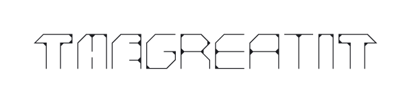
this is my eeemm typeface called " the great i.t.",
because it is derived from a logo i made for the world famous
electronic music group. i.e., a friends project. this logo is attached, as well.
the forms are very simple,and very thin,
so it is like the basic idea and form half finished:
uppercase letters have an exoskeleton, lowercase letters a endoskeleton,...
i hope for input, i need to hear what you typophiles think about my great i.t.
i am prepared for all kind of support,
and rotten tomatoes, as well.
| Attachment | Size |
|---|---|
| it-logo.gif | 2.55 KB |
| thegreatit_specimen.pdf | 44.57 KB |